
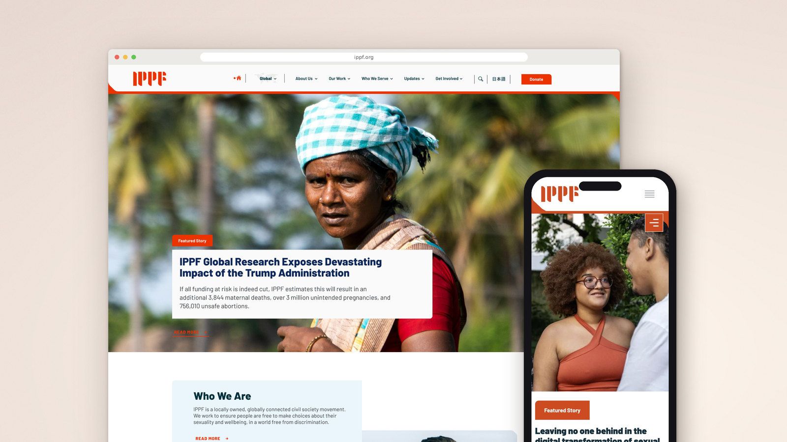
IPPF’s websites needed to reflect the way its federation works: organisations connected by a common purpose, with regional teams responding to different languages, audiences and political contexts. We worked with the International Planned Parenthood Federation to redesign and rebuild its global and regional websites in 2021–2022. In 2025, IPPF returned to us to bring a new visual identity into the websites.
- ClientInternational Planned Parenthood Federation
- WorkGlobal and regional websites
- Timeframe2021 to 2022, new identity 2025
- StatusIn use
The work
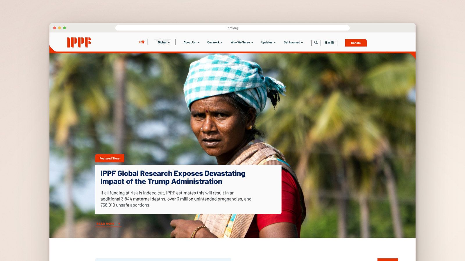
01We worked with the International Planned Parenthood Federation to redesign and rebuild its global and regional websites in 2021–2022.
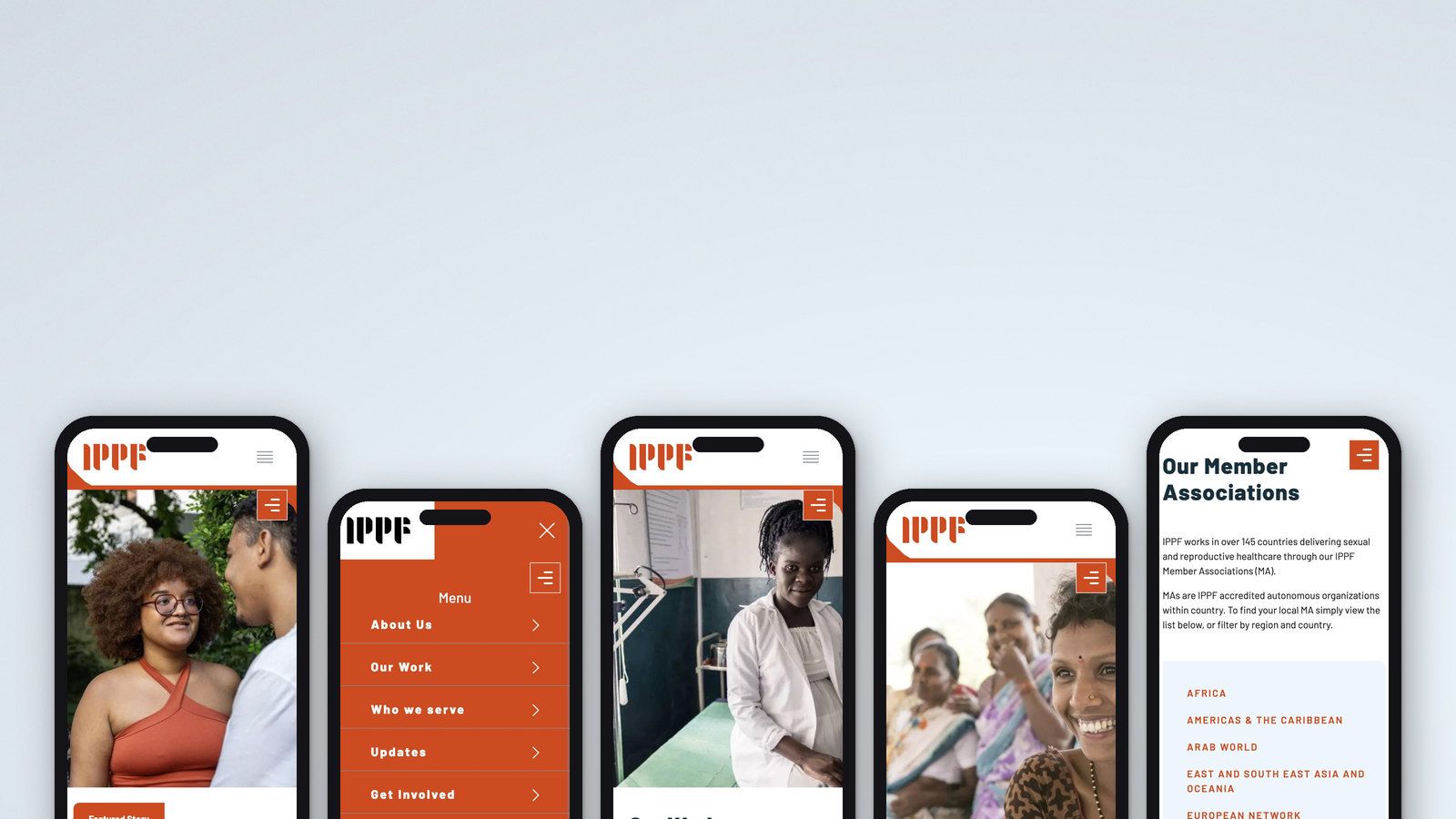
02We grouped that material into broad areas such as About Us, Our Work, Who We Serve, Updates and Get Involved.
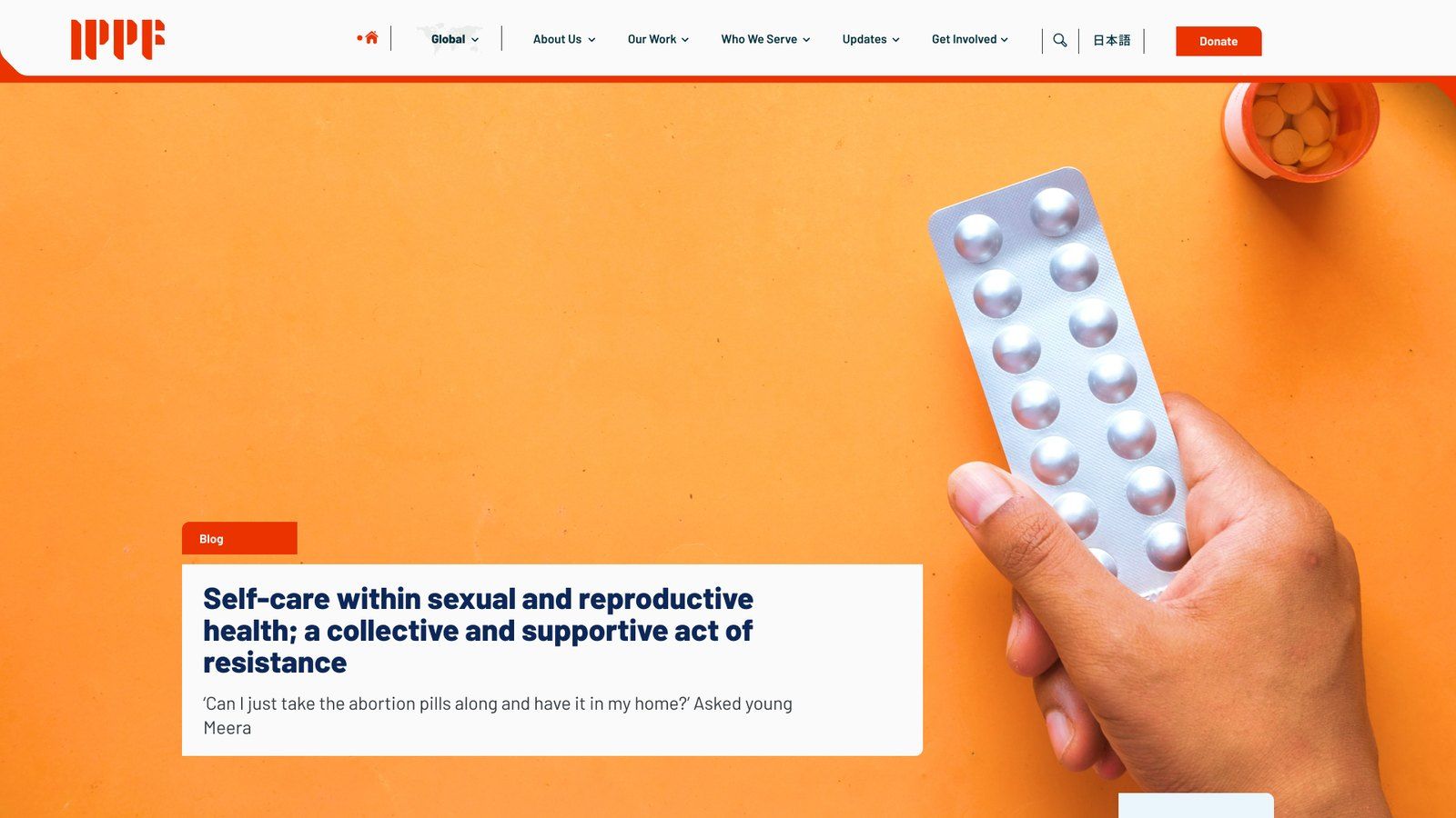
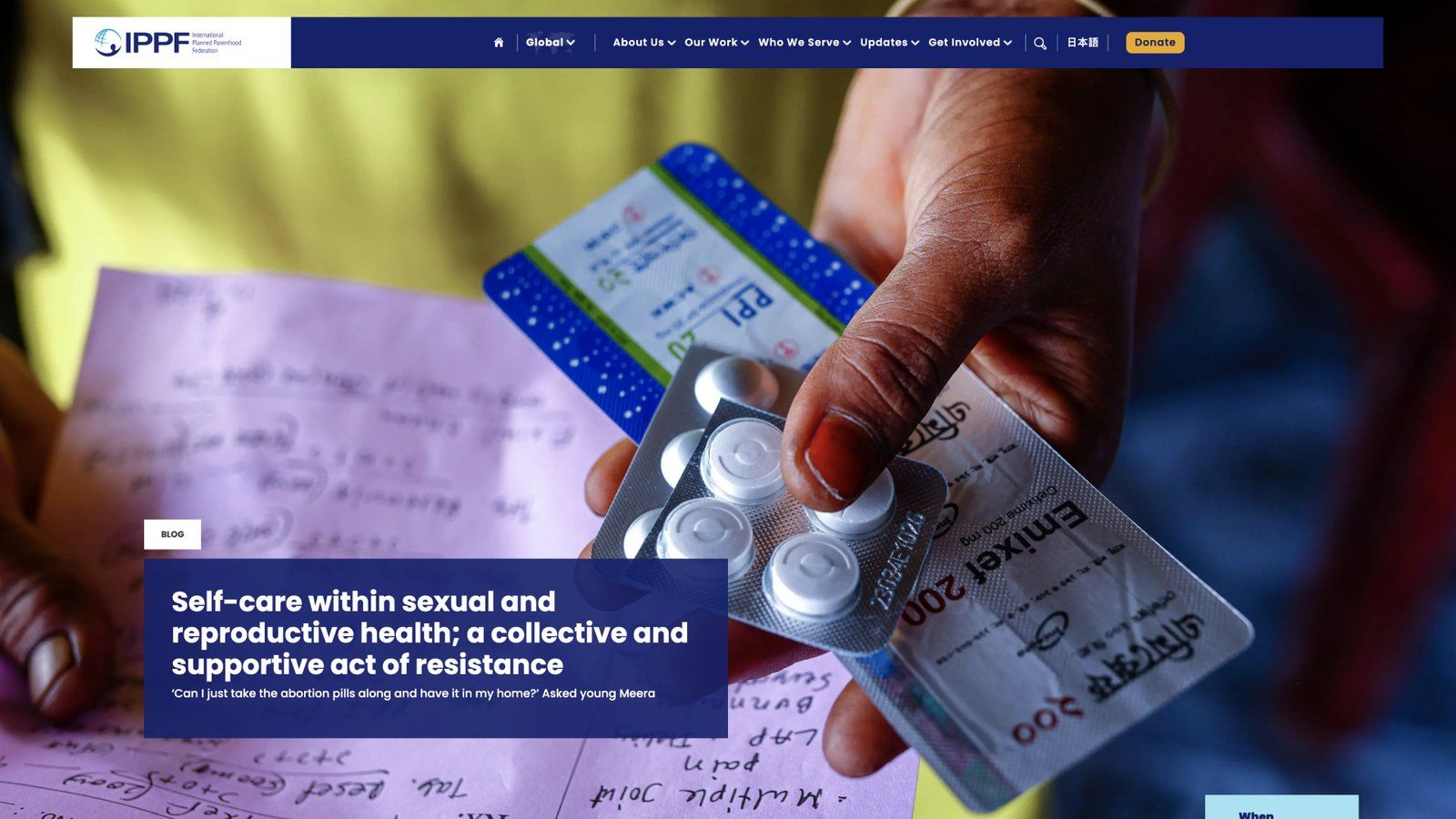
03In 2025, IPPF returned to us to bring a new visual identity into the websites.
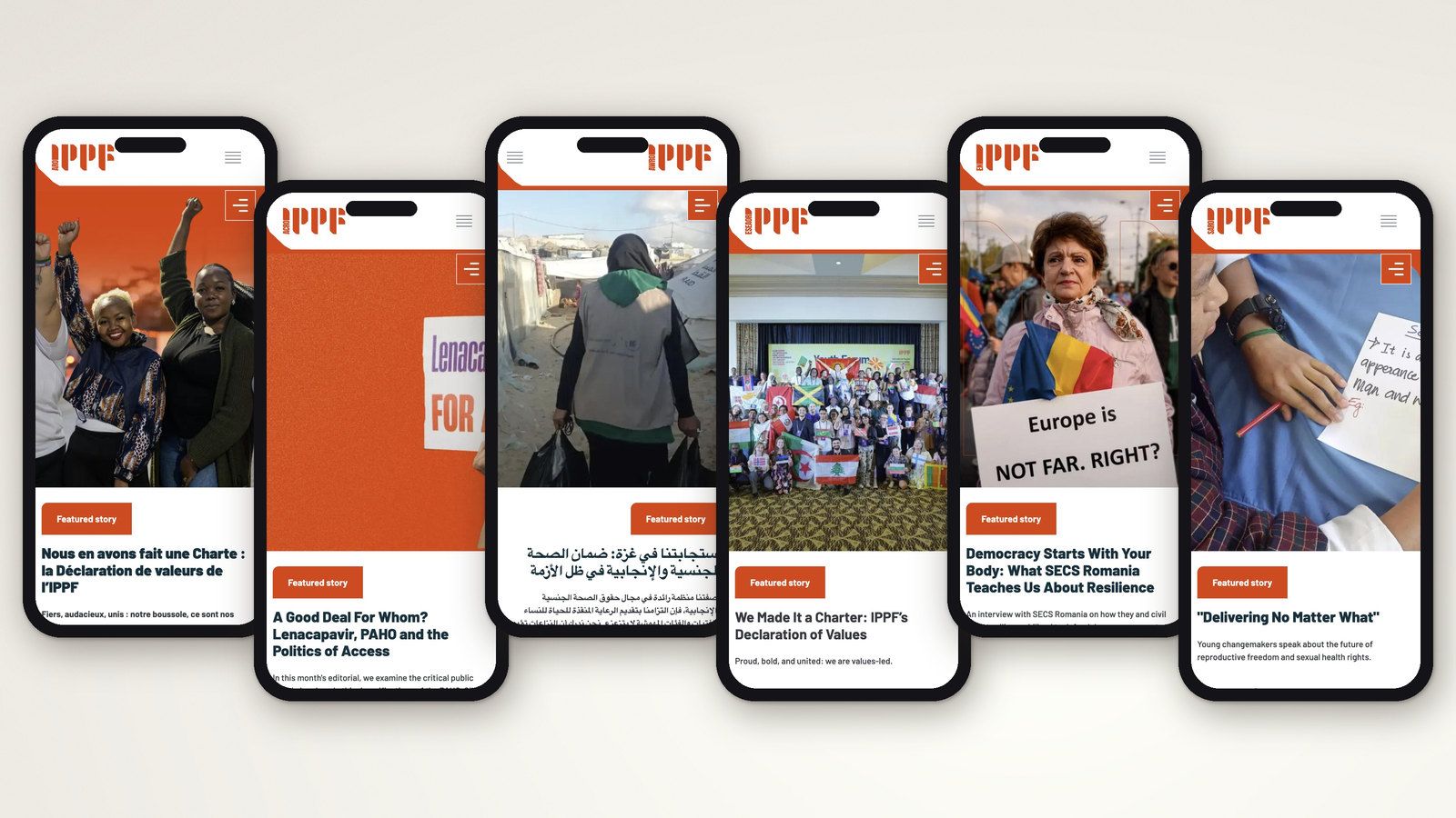
04The global website and regional subdomains sat under ippf.org, making their relationship visible in the web addresses as well as the interface.
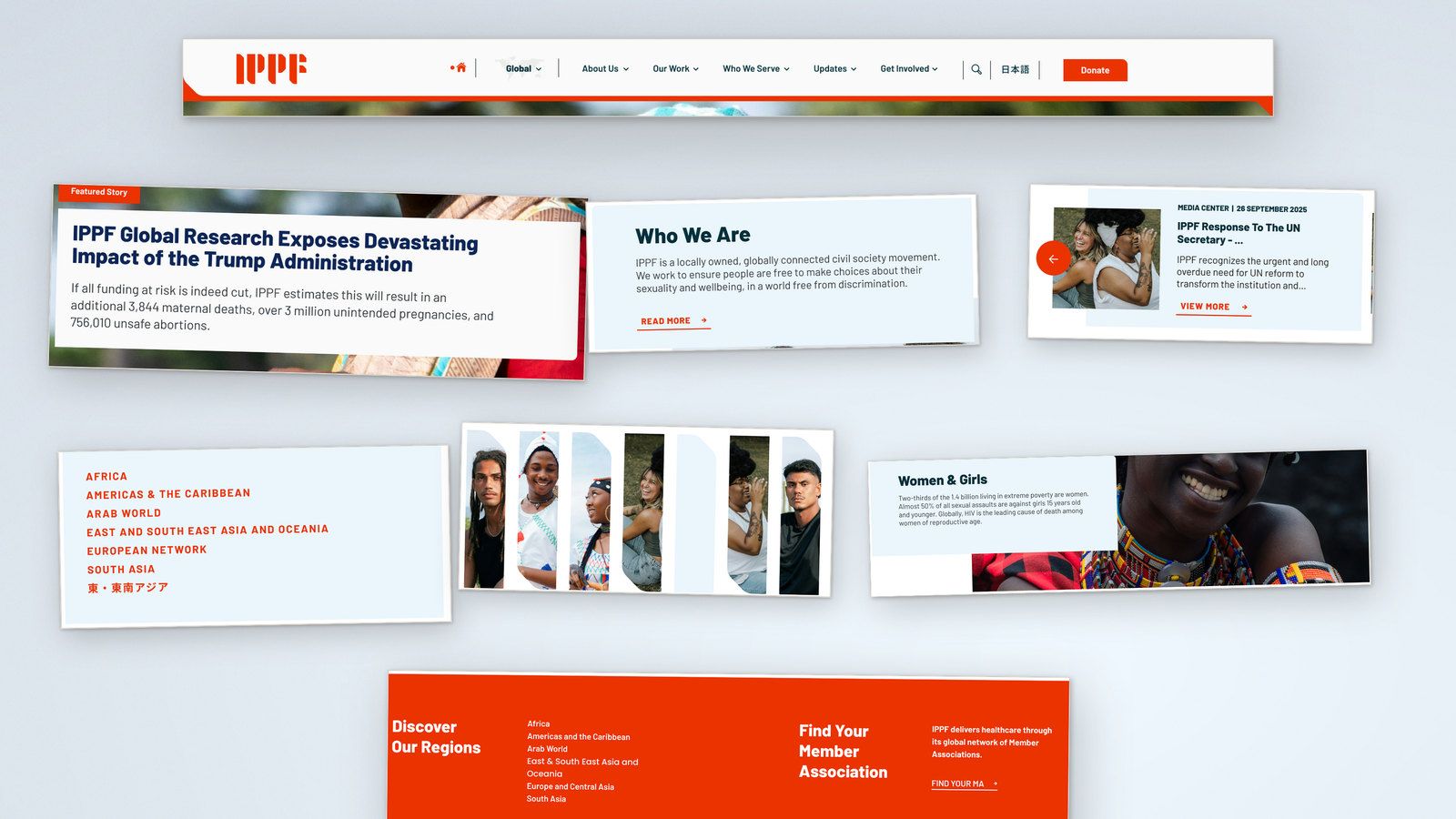
05We redesigned components and templates to give the identity a consistent expression throughout the websites.
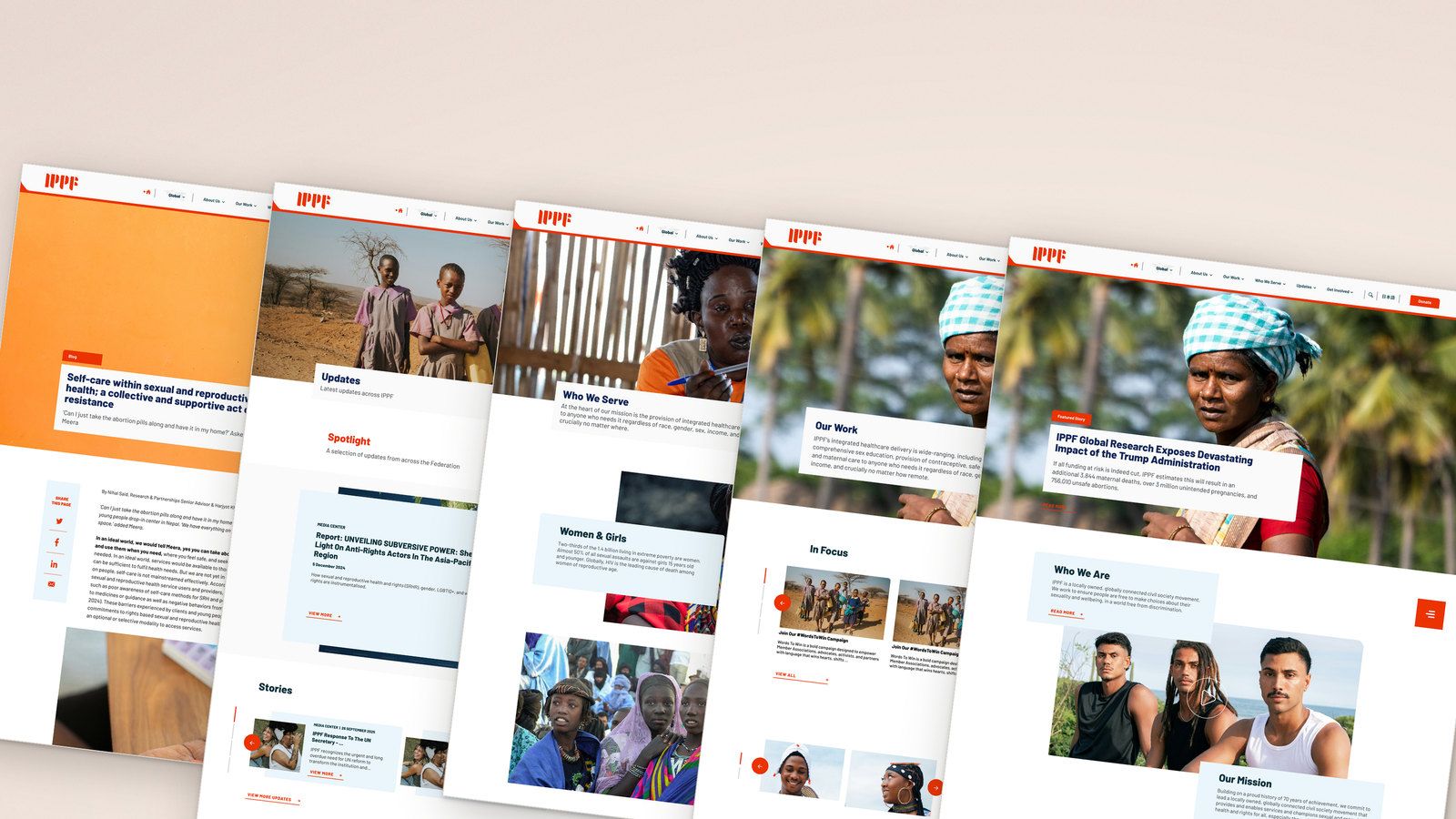
06One shared codebase provided the functionality and design components used across the federation.
The regional websites had operated as standalone sites. Bringing them together meant migrating their existing content and functionality into a common technical structure while preserving the independence of the teams using them.
- 7websites on one platform: the global site and six regional sites
- 5languages, including right-to-left layouts for Arabic
- 10,000scontent items migrated from Drupal 7
How we got there
In this case study
global and regional websites
multilingual publishing and editorial tools
2025 · New identity implementation
Migrated from Drupal 7
Separate regional databases
subdomains under ippf.org
Arabic and Japanese
and quality assurance
The challenge
IPPF is a global provider and advocate for sexual and reproductive health and rights. Its Member Associations deliver services locally, supported by regional teams and the Global Secretariat.
Its websites had to explain that relationship while serving people with very different needs. Someone looking for sexual health information, a donor exploring a programme and a Member Association looking for resources each needed a useful place to start.
The regional teams also worked in different cultural and linguistic contexts. They needed to communicate their own priorities and remain responsible for what they published.
The regional websites had operated as standalone sites. Bringing them together meant migrating their existing content and functionality into a common technical structure while preserving the independence of the teams using them. Language was part of that challenge: the platform had to accommodate different publishing needs, including Arabic interfaces read from right to left. The relationship between Global, the regions and Member Associations needed to be clear in the design and supported by the platform underneath it.
The brief
IPPF asked for a redesign covering user experience, information architecture and interface design, alongside improvements to multilingual publishing and editorial tools.
The objectives were practical: make Member Associations and their work more visible, become more relevant to younger audiences, and help visitors find reliable sexual and reproductive health information. Clearer routes to programmes, resources and ways to get involved were also part of the brief.
For the communications teams, the websites needed to be manageable in everyday use. Templates and publishing tools had to support a common approach across the federation while allowing each region to decide what mattered to its audiences.
These requirements connected the public website with the work happening behind it. Decisions about navigation, content and page layouts also had consequences for how teams would organise and publish their material.
What the research changed
We began with workshops and interviews involving IPPF’s Global Communications team and the communications teams from all six regions.
The conversations identified several areas that needed more attention. Member Associations and regional work needed greater visibility. Donors needed clearer routes to programmes, activities and evidence of the federation’s work. Humanitarian work also needed to be easier to discover.
Alongside these shared needs, the regional teams wanted to retain control of their websites and represent the particularities of their work. A common design needed to accommodate those differences.
That finding shaped both the UX and the technical architecture. We needed a shared set of components and content relationships, with regional control over publishing built into the system.
Reaching agreement across the Global team and the regions was a substantial part of the project. Working through their feedback helped us understand where a common solution would be useful and where the platform needed flexibility.
The early UX work organised the user journey around four questions: who is IPPF, what does it do, where can people explore its work, and how can they get involved? Those questions gave us a starting point for organising the content.
The response
Giving visitors a place to start
The websites contained programmes, campaigns, health information, publications, news and stories, alongside information about IPPF itself.
We grouped that material into broad areas such as About Us, Our Work, Who We Serve, Updates and Get Involved. Each introduced a subject and provided routes into more specific content.
Our Work connected an overview of IPPF’s activities with individual programmes and related material. Who We Serve brought content together around the people and communities at the centre of that work.
The detailed sitemap remained extensive. These entry points gave visitors a way to explore it without needing to understand the whole organisation first.
Making Member Associations easier to find
Member Associations became a more prominent part of the website, including on the homepage.
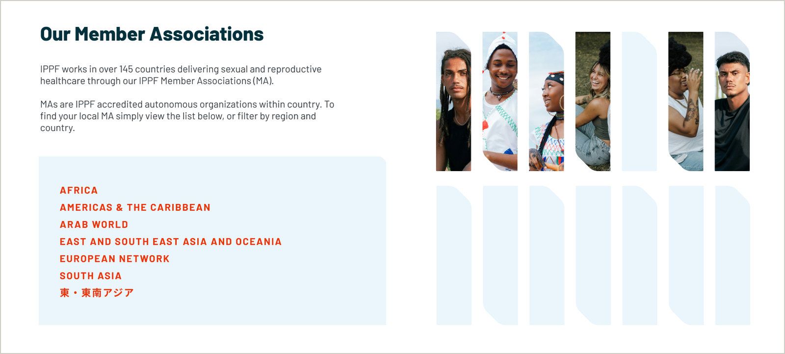
Visitors could browse by region and country, then open individual profiles with information about services, contact details and links to the organisation’s own channels. Related stories and resources connected each profile with its work.
This created a route from the global federation to the organisations delivering services in a particular place. It also gave those organisations more space within IPPF’s wider story.
Connecting content across the website
Navigation was only one way to explore the material. We also structured the relationships between content.
An article could be associated with a country, region, Member Association, subject or audience. The website used those details to display it in relevant places.
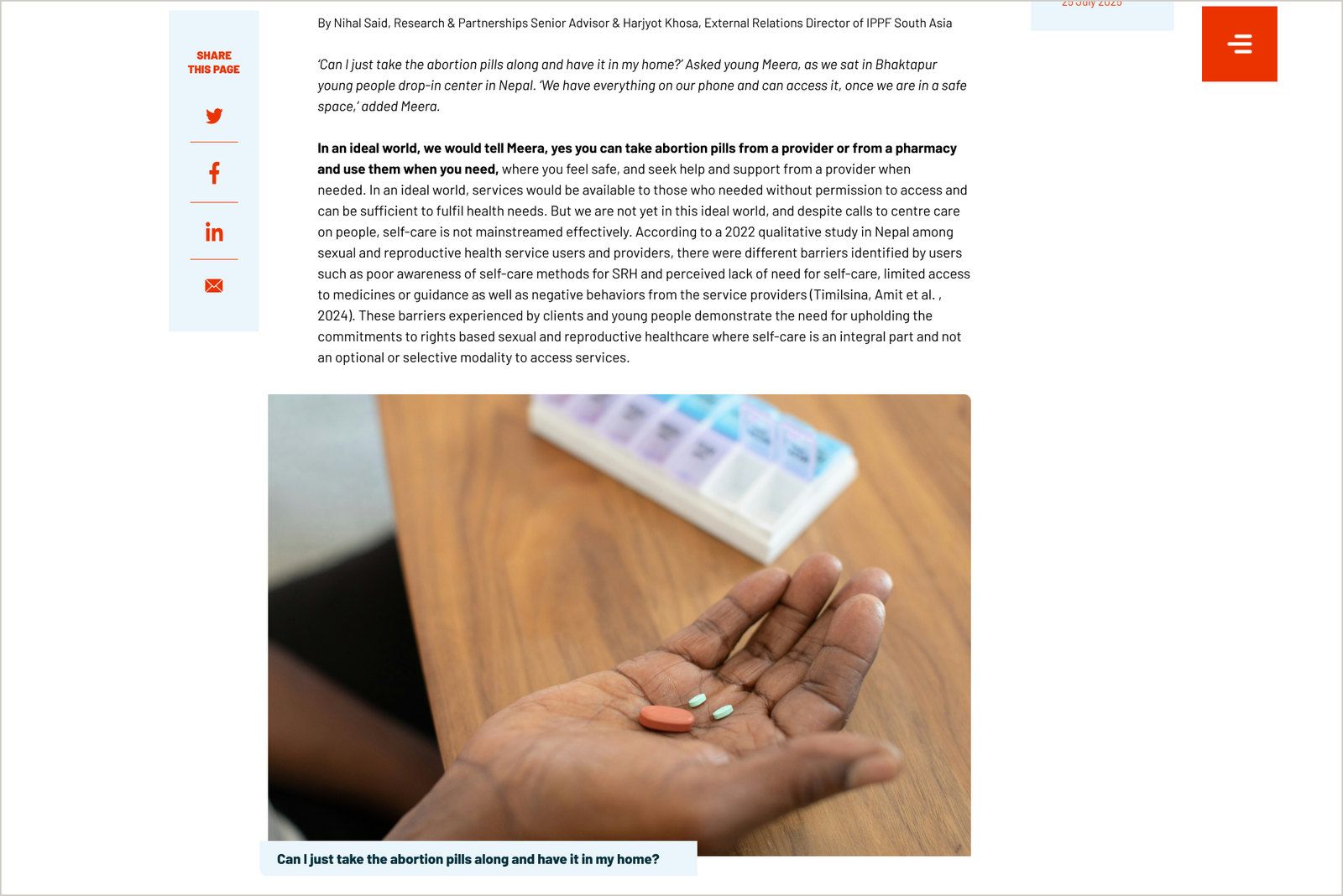
A story about a Member Association could appear on its profile. Material concerning young people could appear in Who We Serve. Resources on the same subject could be shown together.
Editors could publish an item and connect it with the appropriate parts of the website through its content fields, reducing the need to place it on each page individually.
Bringing standalone websites onto one codebase
We brought the previously standalone regional websites and the global website onto a Drupal 9 multisite architecture. One shared codebase provided the functionality and design components used across the federation.
Own database
Own database
Own database
This changed how the websites could be maintained and developed. Improvements to shared components could be made in one place and carried across the sites, giving the federation a common foundation for future work.
Each regional site retained its own database and administrative control. Regional administrators managed their websites, with editors given access to the sites they worked on.
The global website and regional subdomains sat under ippf.org, making their relationship visible in the web addresses as well as the interface.
This arrangement gave the federation a common technical foundation and regional teams control over their content, languages and publishing priorities.
Working across languages and reading directions
Across the websites, the platform supported English, French, Spanish, Arabic and Japanese, according to each site’s needs. Multilingual publishing was part of the shared architecture, with regional teams managing the languages and content relevant to their audiences.
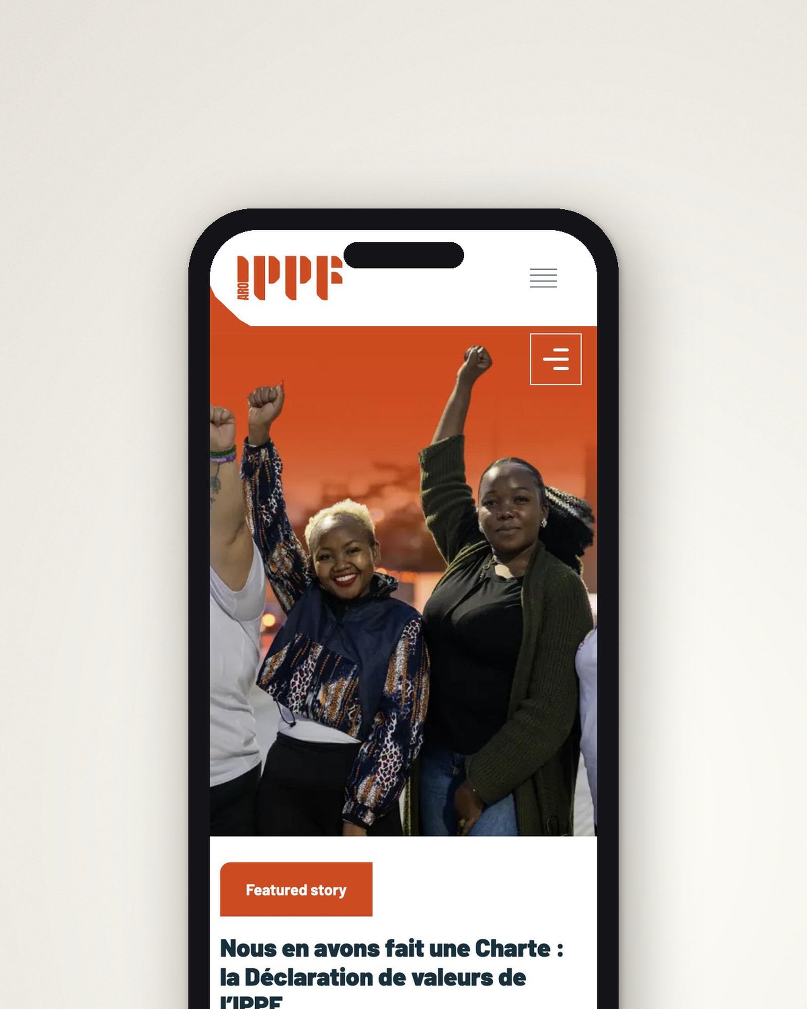
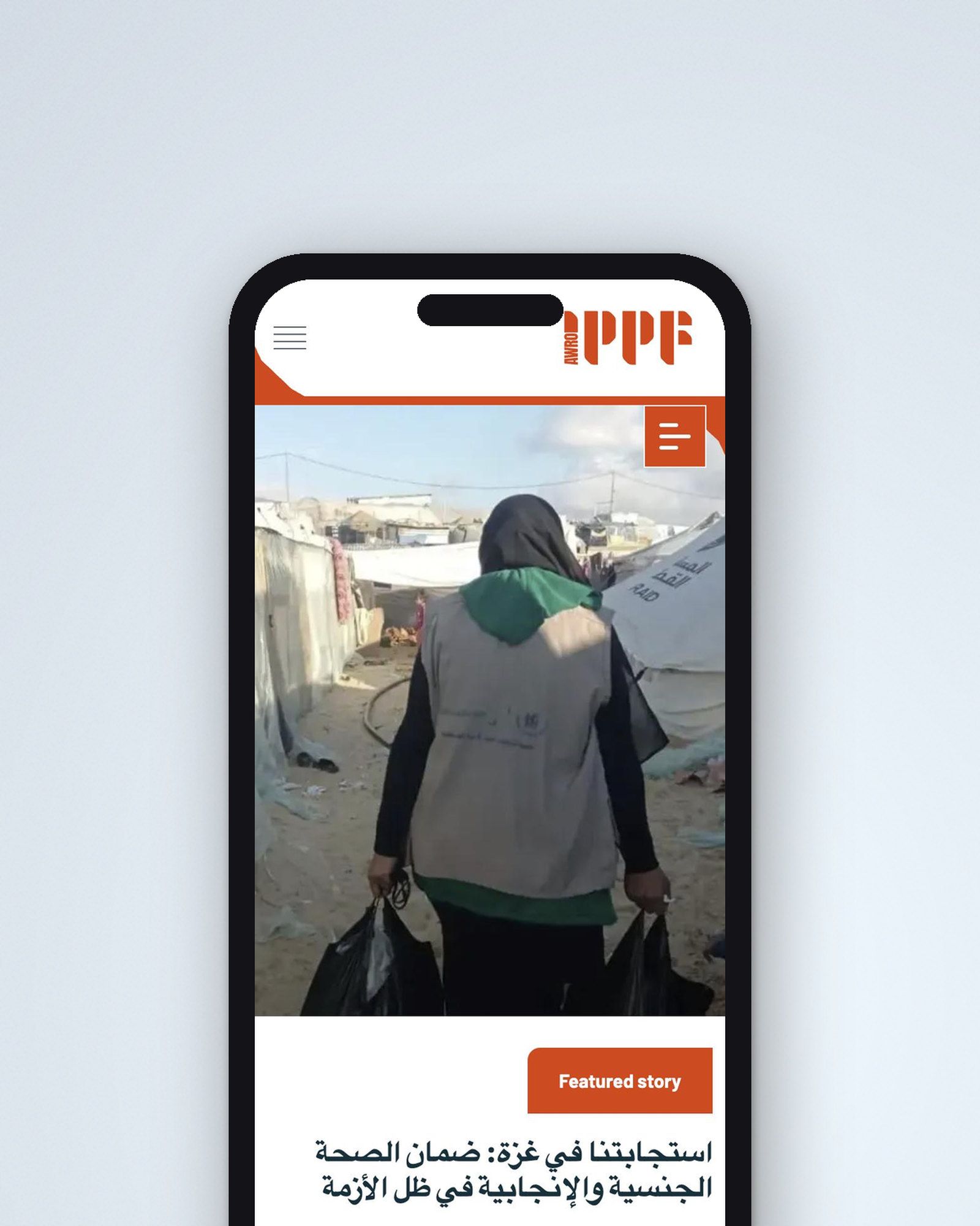
That work extended into the interface. Arabic required right-to-left layouts, so navigation, content hierarchy and page components had to work in a different reading direction. The shared design system needed to accommodate these differences across languages and screen sizes.
Together, the multisite and multilingual work allowed the websites to share a technical foundation while communicating in the languages of the people each team served.
Implementation
The build combined the move from Drupal 7 to Drupal 9 with the consolidation of the standalone regional websites. We migrated tens of thousands of existing articles, pages and resources across the global and regional websites into the shared multisite architecture.
Each site brought its own existing content structures and custom functionality. Bringing that material into the common platform required migration work alongside the design and development of the new interface. The migration and regional review process ran through 2021 and 2022.
We also considered the editor’s task as we designed each component. A featured story needed a way to select it. A Member Association profile needed structured information about its services and location. Related content needed rules that editors could use consistently.
The resulting templates supported material such as quotations, galleries, video and documents, together with the information needed to connect an article with other parts of the website. Communications teams could curate their homepages and manage content using a shared set of tools.
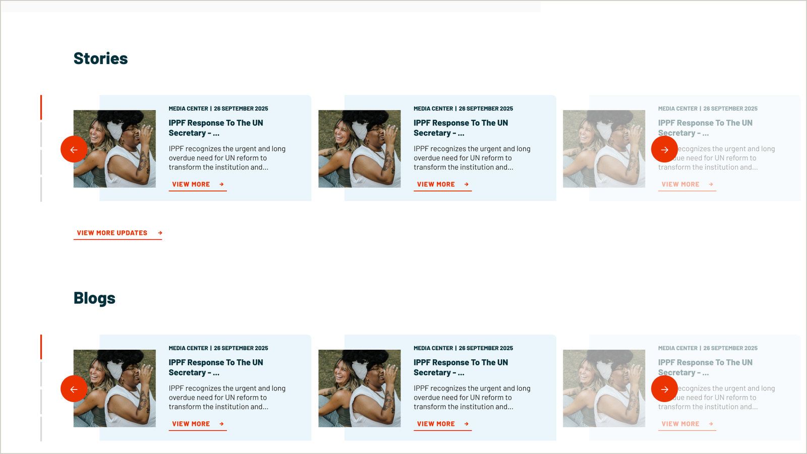
Accessibility testing against WCAG requirements formed part of development and quality assurance.
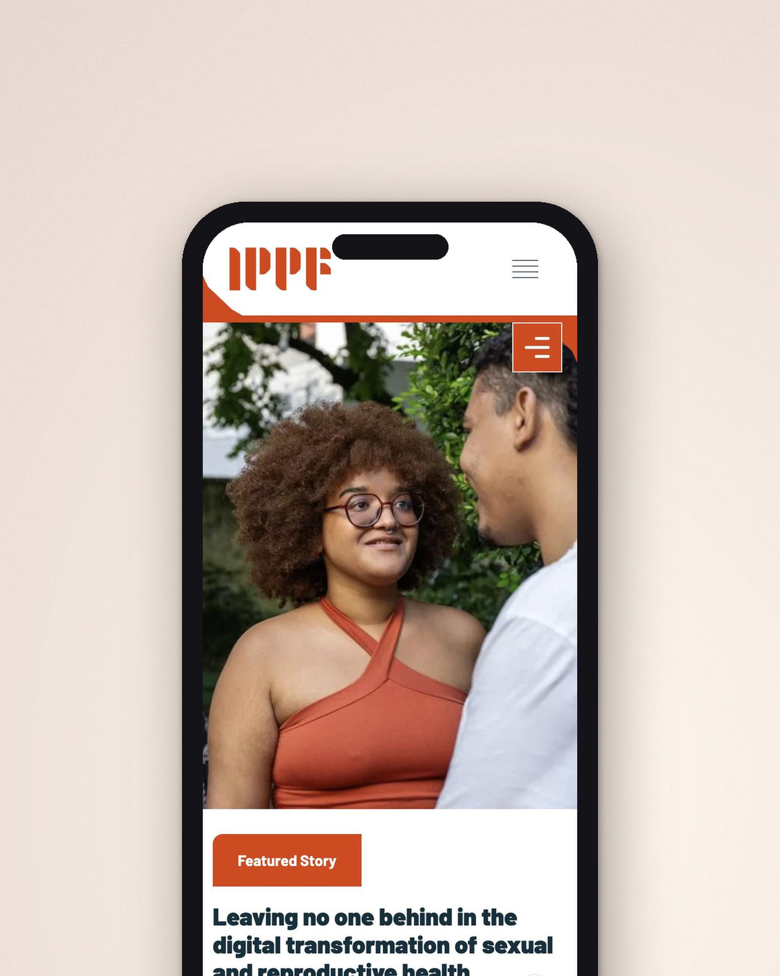
Bringing the new identity online
In autumn 2025, IPPF returned to us with a new visual identity developed by another agency.
Our role was to translate that identity into the websites. The guidelines established the visual direction; the interface required decisions about how it would work in use.
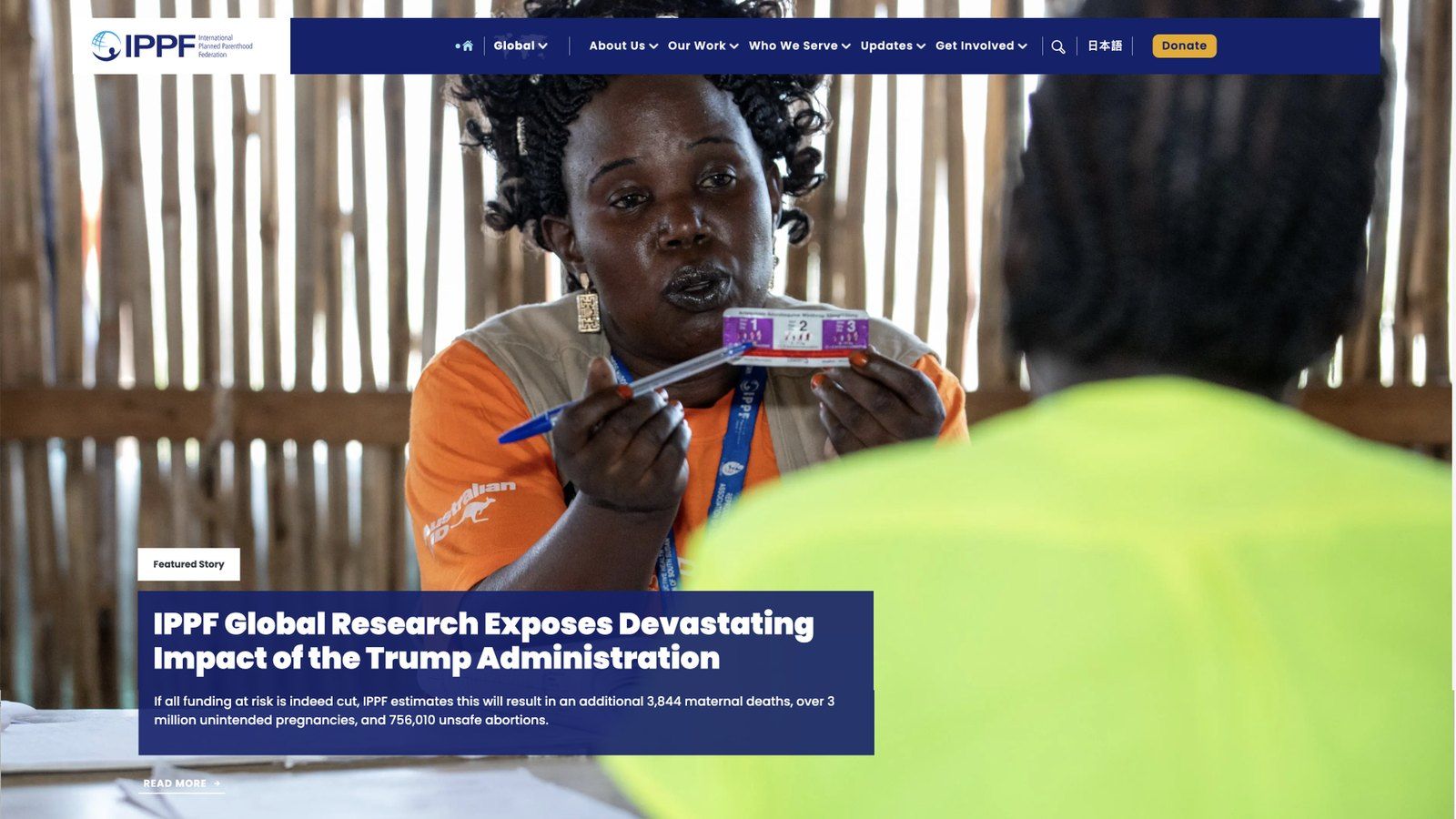
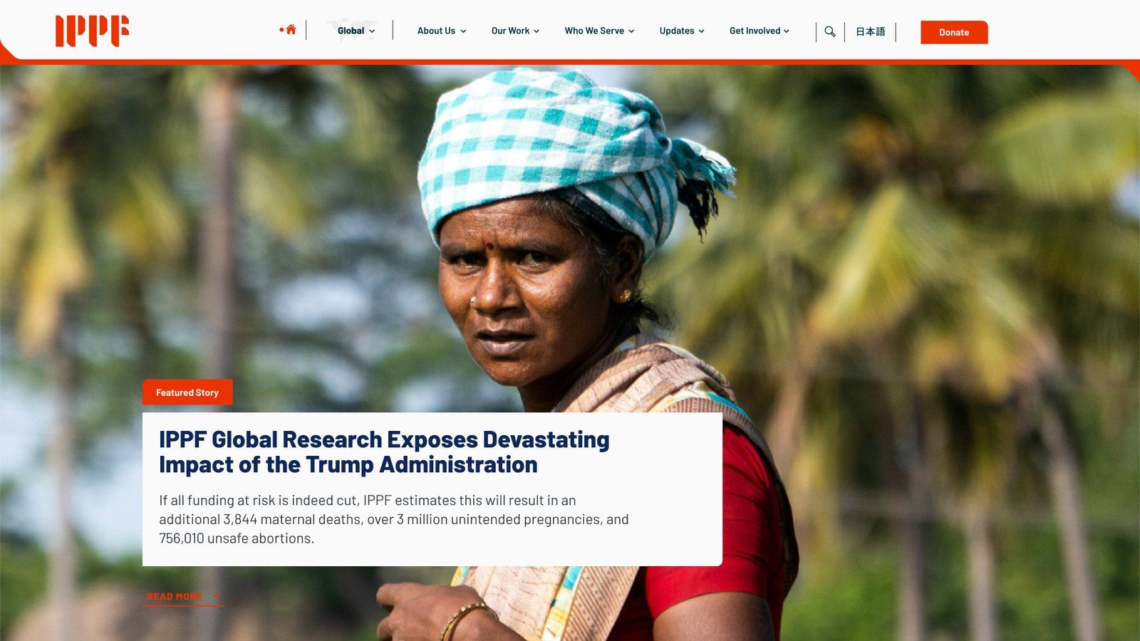
That included the hierarchy of an article, the presentation of content cards, the behaviour of navigation and filters, and layouts across screen sizes. We redesigned components and templates to give the identity a consistent expression throughout the websites.
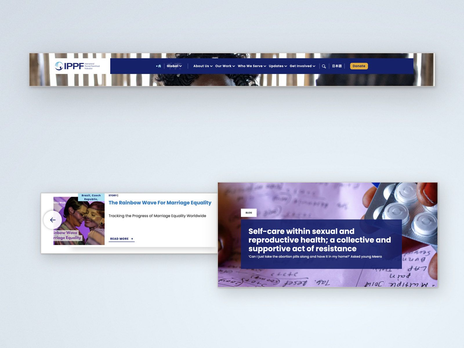
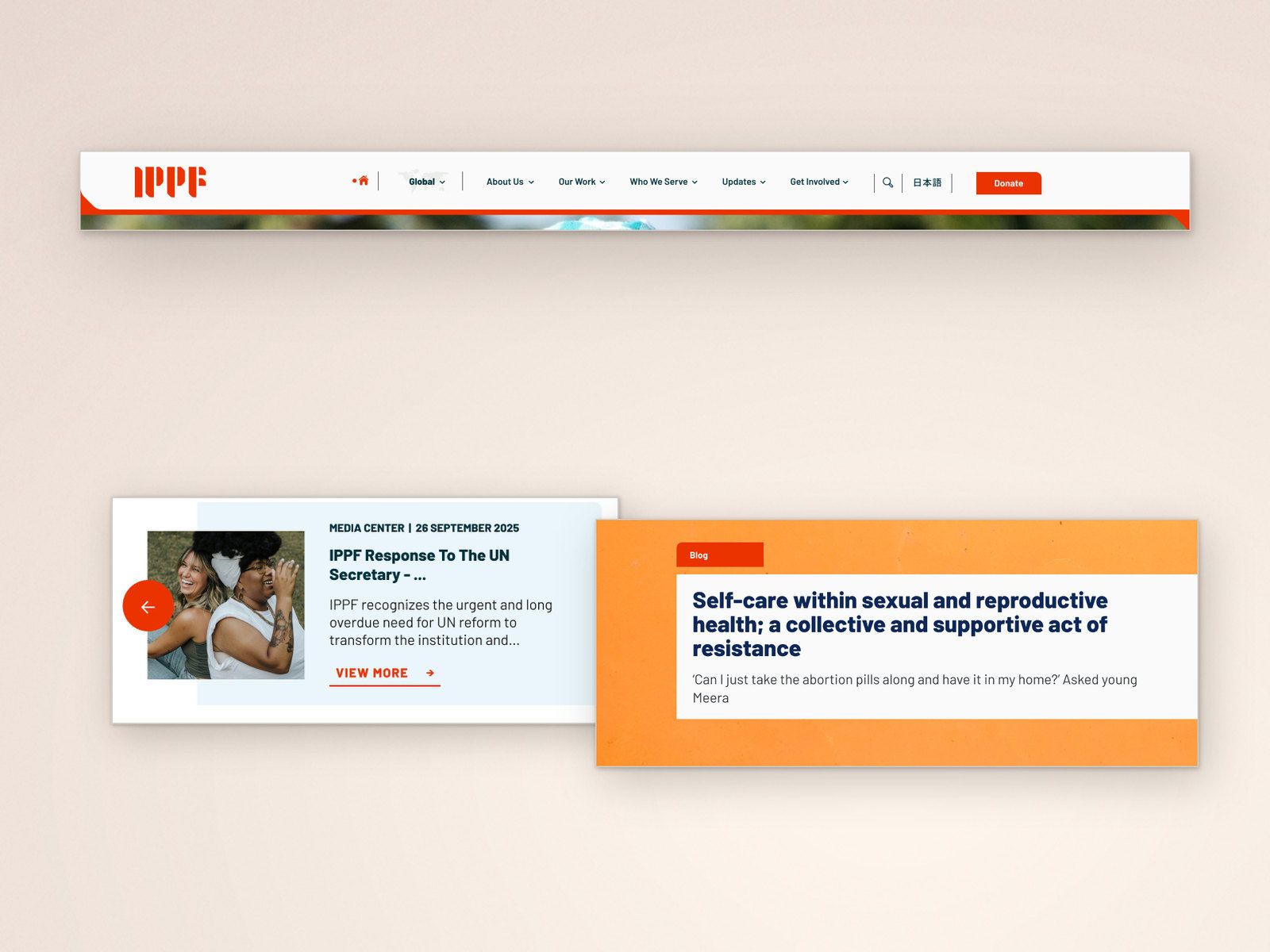
The UX, information architecture and content structure developed during the original project stayed in place. They gave us an established basis for the redesign and allowed us to focus on how the new identity should appear and behave online.
The two phases addressed different needs. The original project established how the websites would support the federation. The 2025 work gave that structure a new visual expression.
What the project made possible
The original programme consolidated IPPF’s global and previously standalone regional websites under one codebase. Common functionality and design components could be maintained together, while regional teams retained their own databases, administrative control and publishing responsibilities.
The multilingual foundation supported five languages across the websites, including right-to-left layouts for Arabic. It gave regional teams shared tools for communicating with their audiences in the languages they needed.
Member Associations had a more prominent place in the website. Profiles connected their services and contact information with relevant stories and resources, while the content structure gave visitors routes between the federation’s global work and its local organisations.
The 2025 redesign extended the use of that foundation. IPPF could introduce its new identity while continuing to work with the UX and content structure developed during the original project.
For us, the continuity between these two phases is an important part of the work. Understanding how the federation operated shaped decisions that remained useful when its visual identity changed.
Penrose
 Sorin PavelStrategy and architecture
 Elena ReghintovschiUX/UI design
 Bogdan PârvulescuDevelopment
 Cristi LunguDevelopment
The Global Communications team and regional communications teams contributed to research, design reviews and decisions throughout the original programme. IPPF’s 2025 visual identity was developed by another agency and supplied to Penrose for digital implementation.