
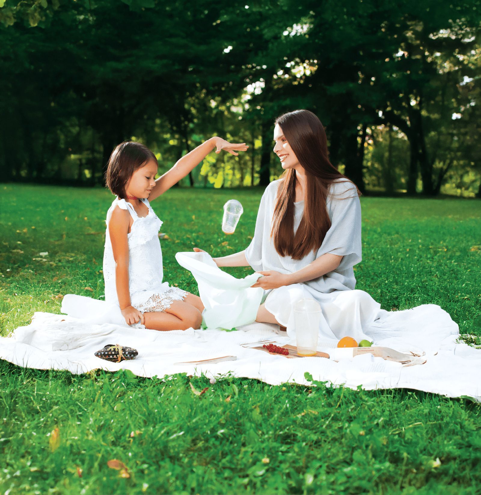
Prodplast was developing plant-based alternatives to everyday plastic products. We helped introduce the new range through a name, an illustrated identity and communication that gave people a reason to consider a different choice.
- ClientProdplast / Biodeck
- WorkStrategy, naming, identity, illustration, packaging, sales literature and animation
- Timeframe2017 to 2018
- StatusIn market
The work
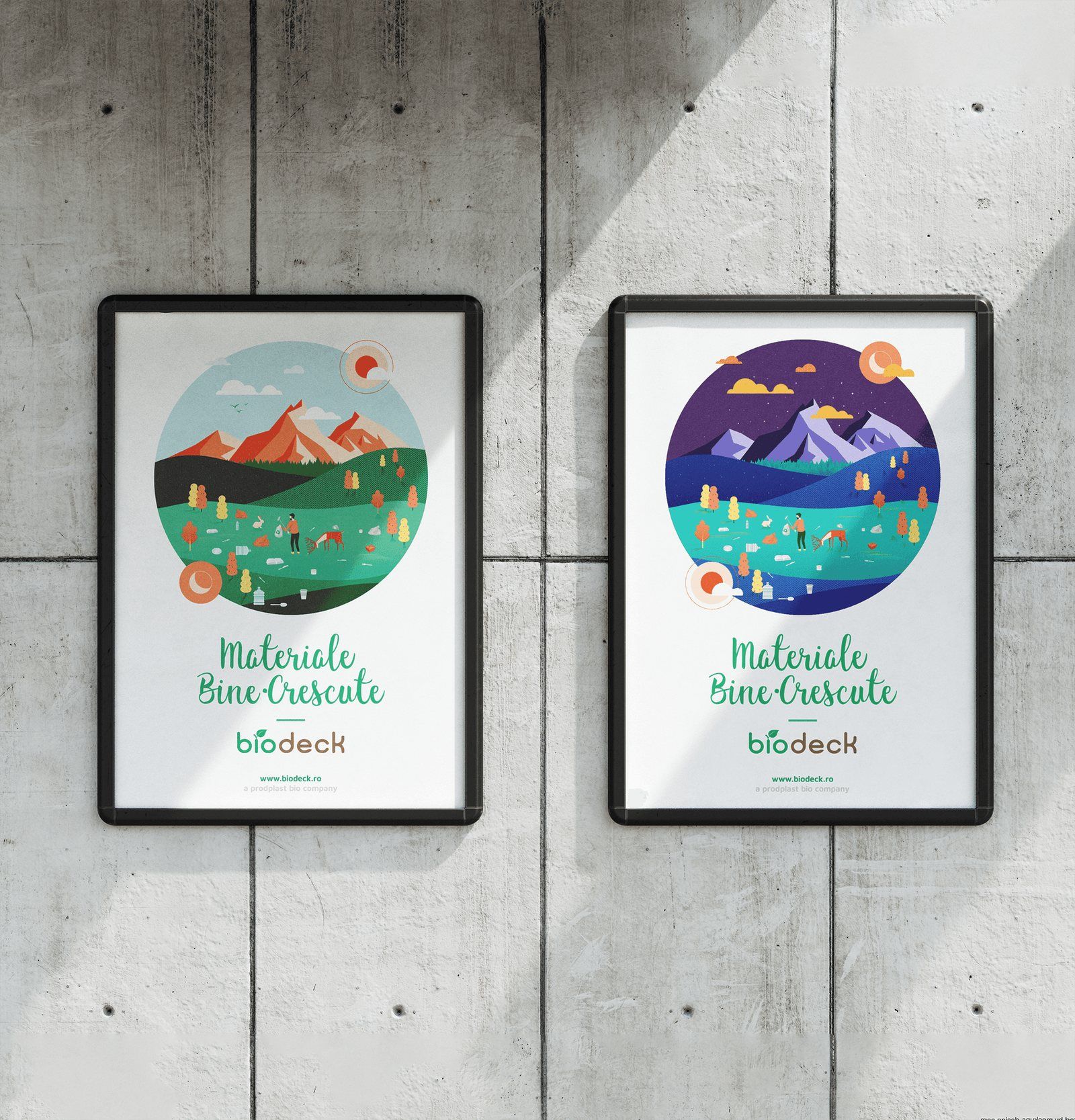
01An illustrated world that could change colour and format.
02The rounded wordmark incorporates a leaf.
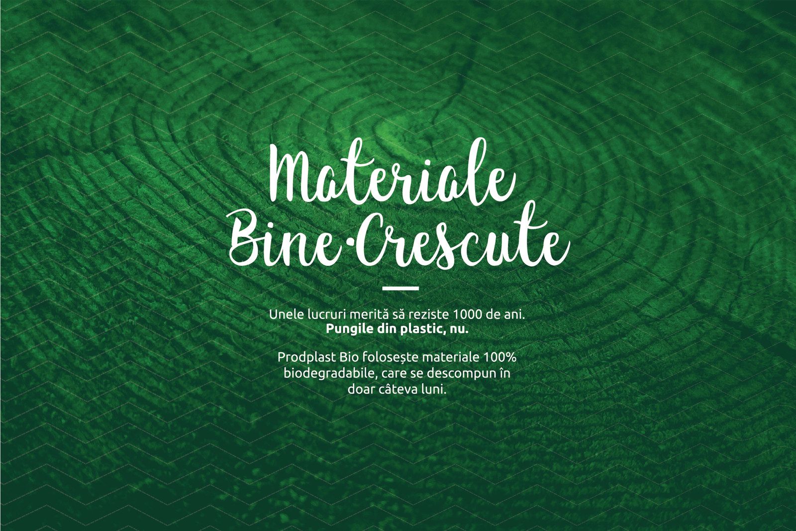
03The Romanian tagline, Materiale bine-crescute, plays on two meanings: materials that are grown, and materials that are well brought up.
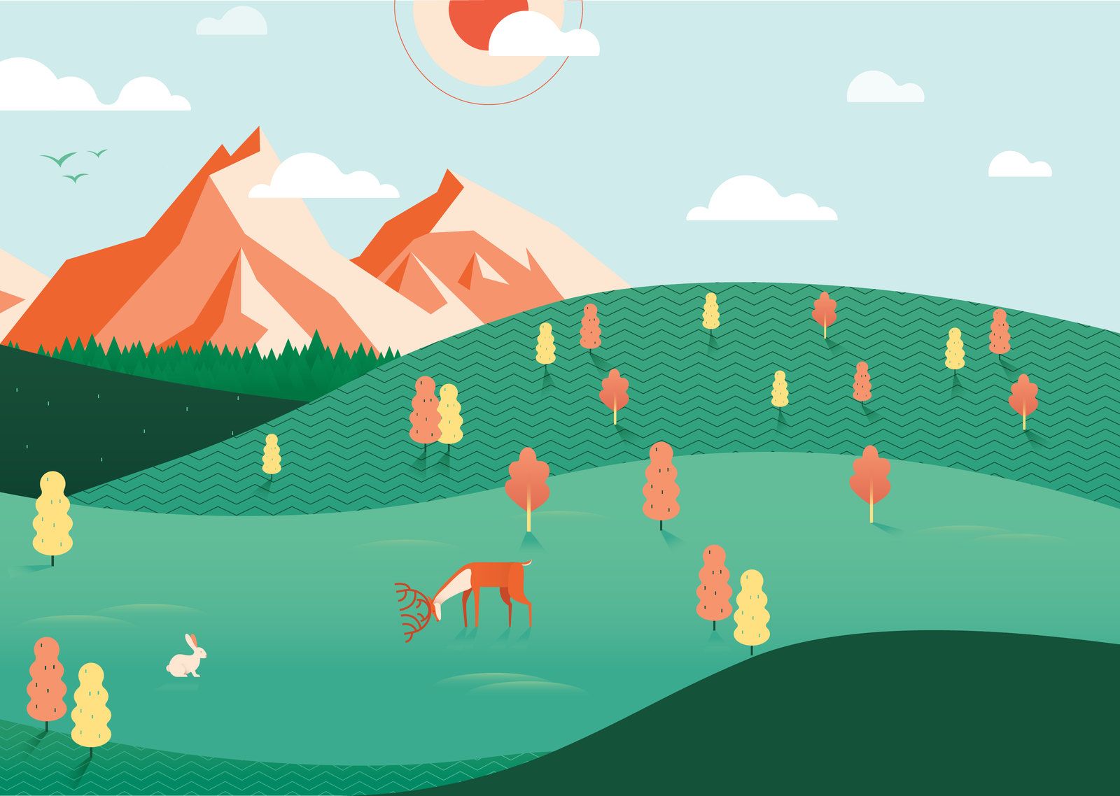
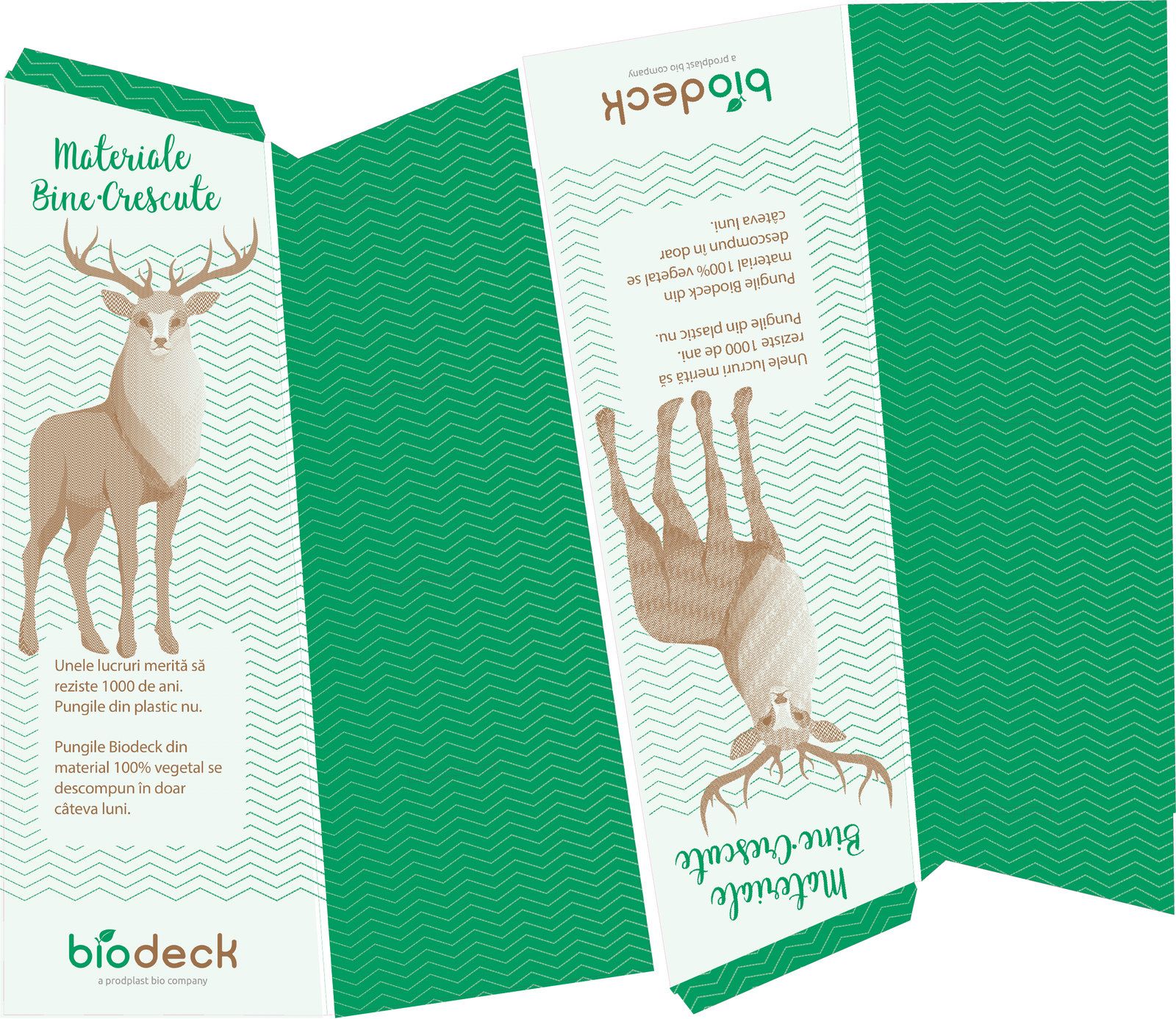
04The illustrated world developed for Biodeck. Original project artwork.
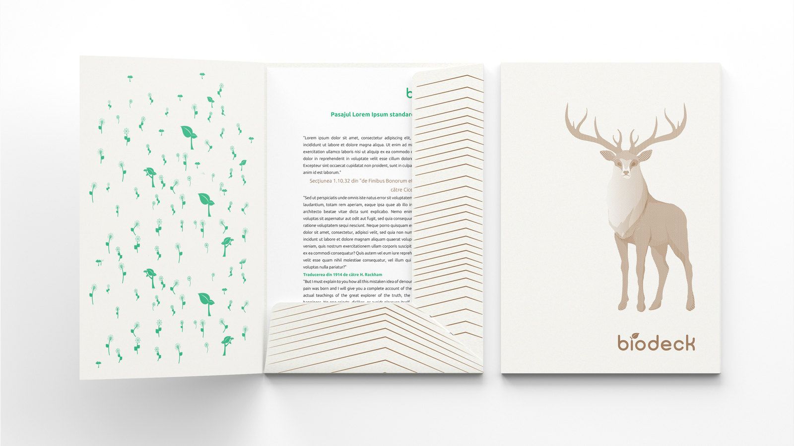
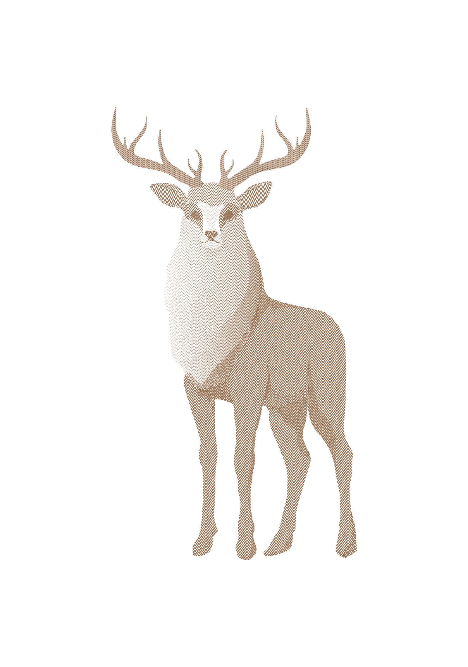
05The stag, a recurring character for a brand about changing habits.
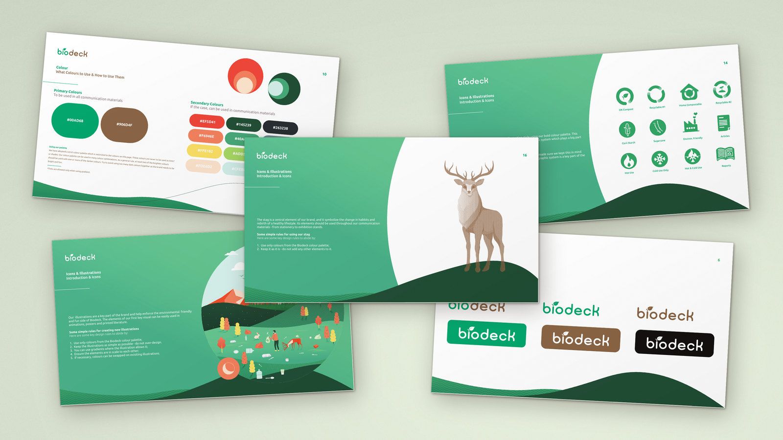
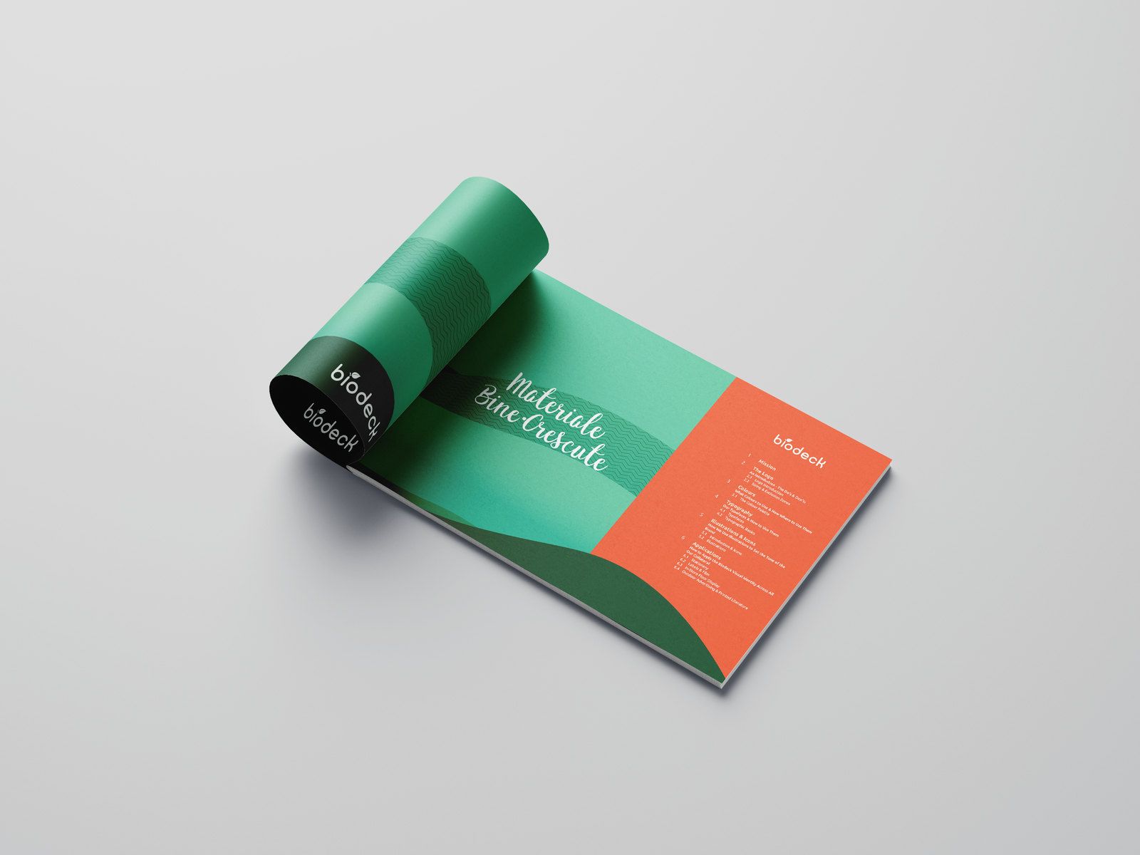
06Guidelines for colour, typography, illustration and everyday applications.
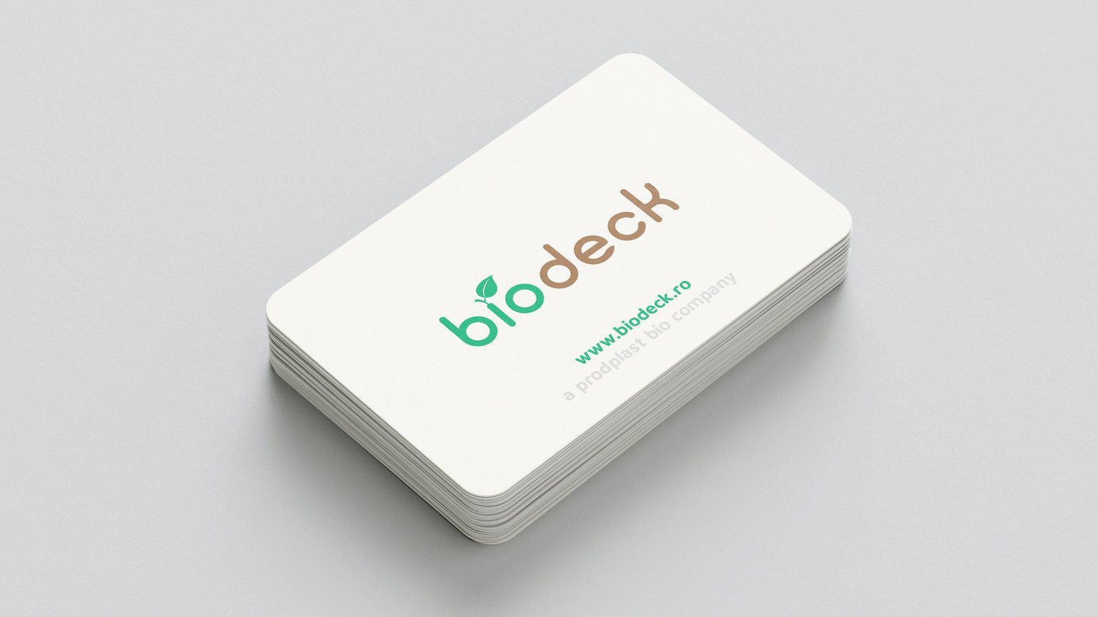
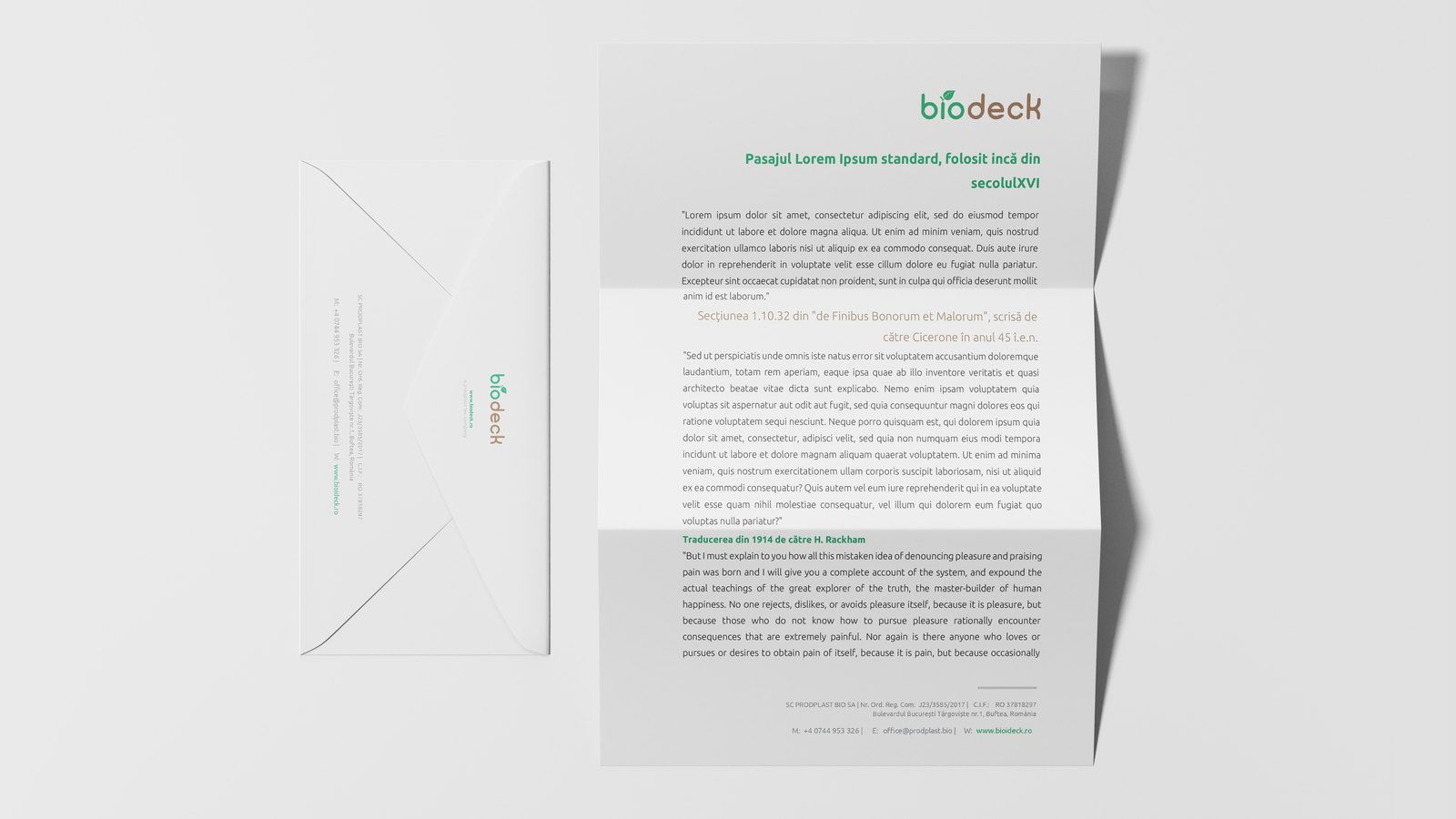
07Business cards, letterhead and envelope.
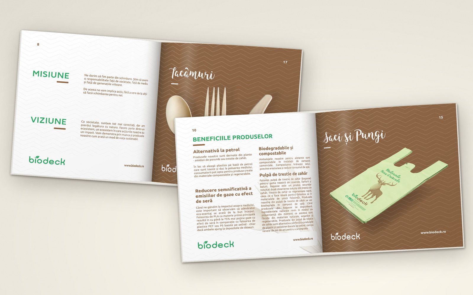
08Catalogue spreads for cutlery and for bags.
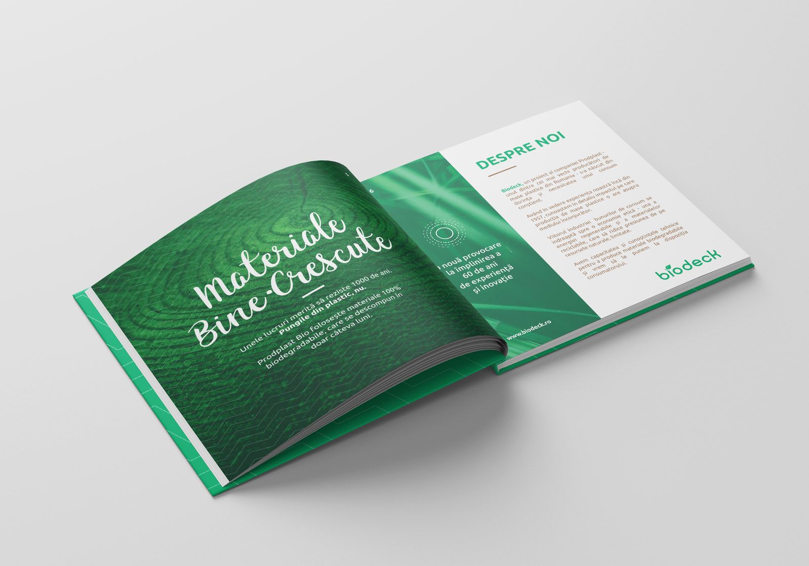
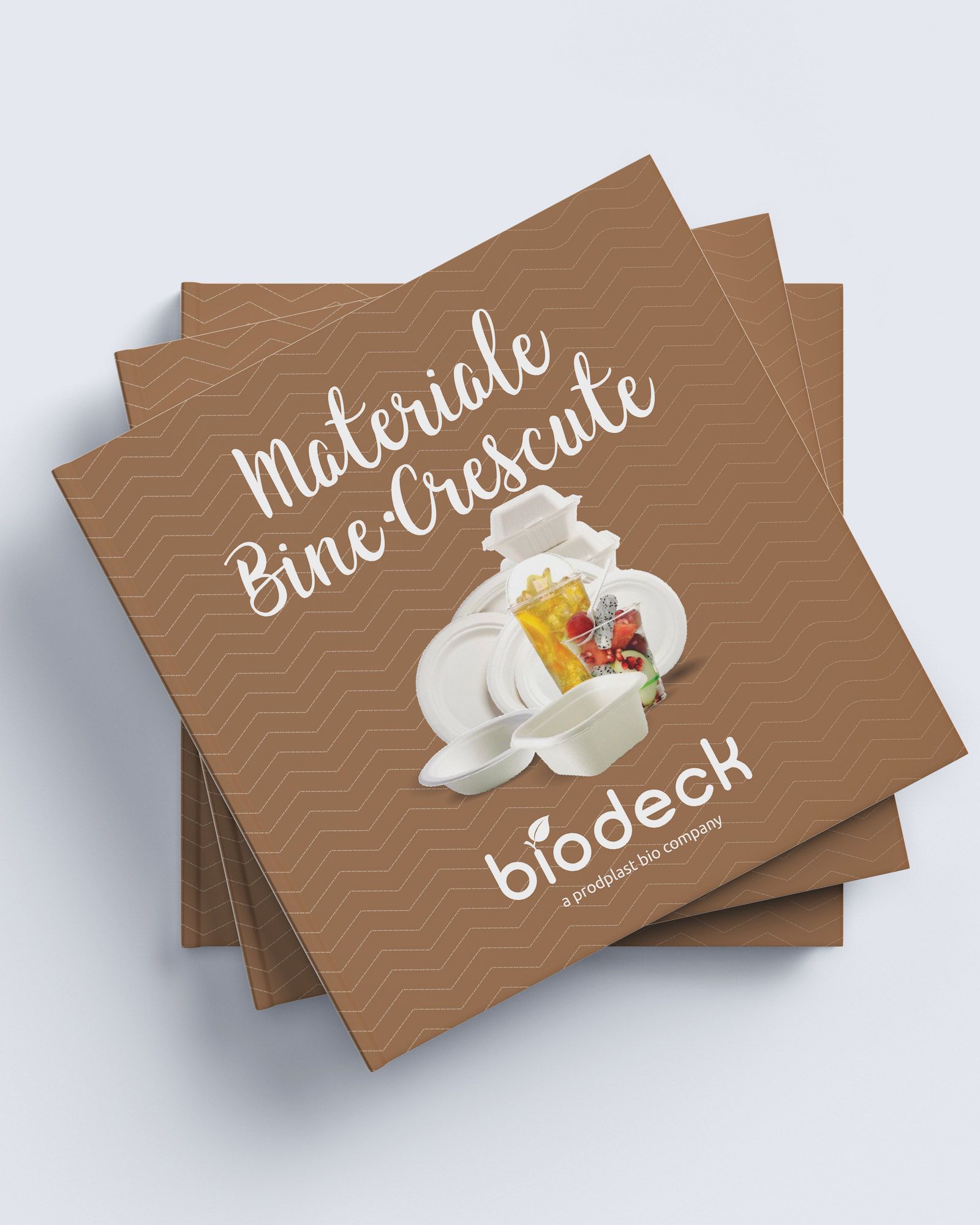
09Sales literature connecting the brand story with the product range.
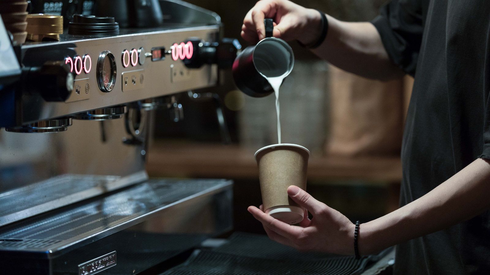
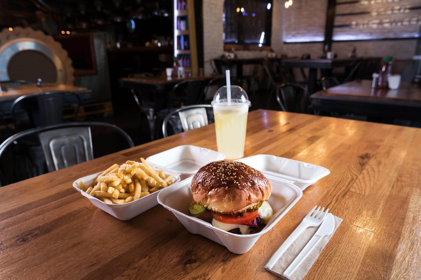
10Project photography placing the products in familiar daily routines.
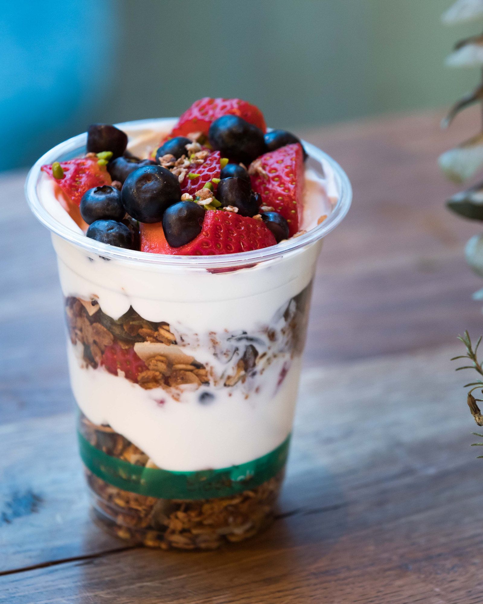
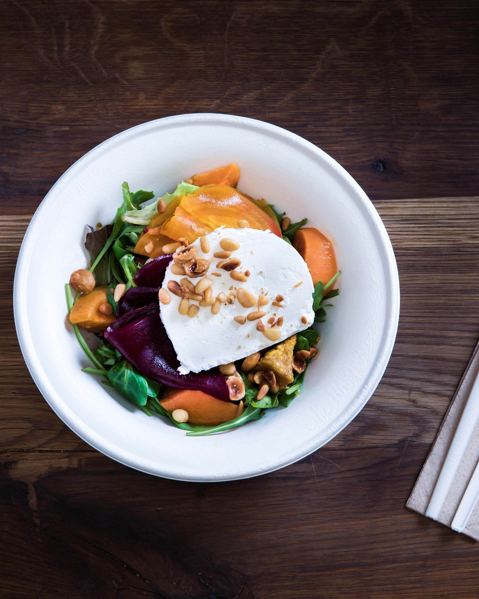
11Cups, bowls and cutlery from the range, photographed for the launch.
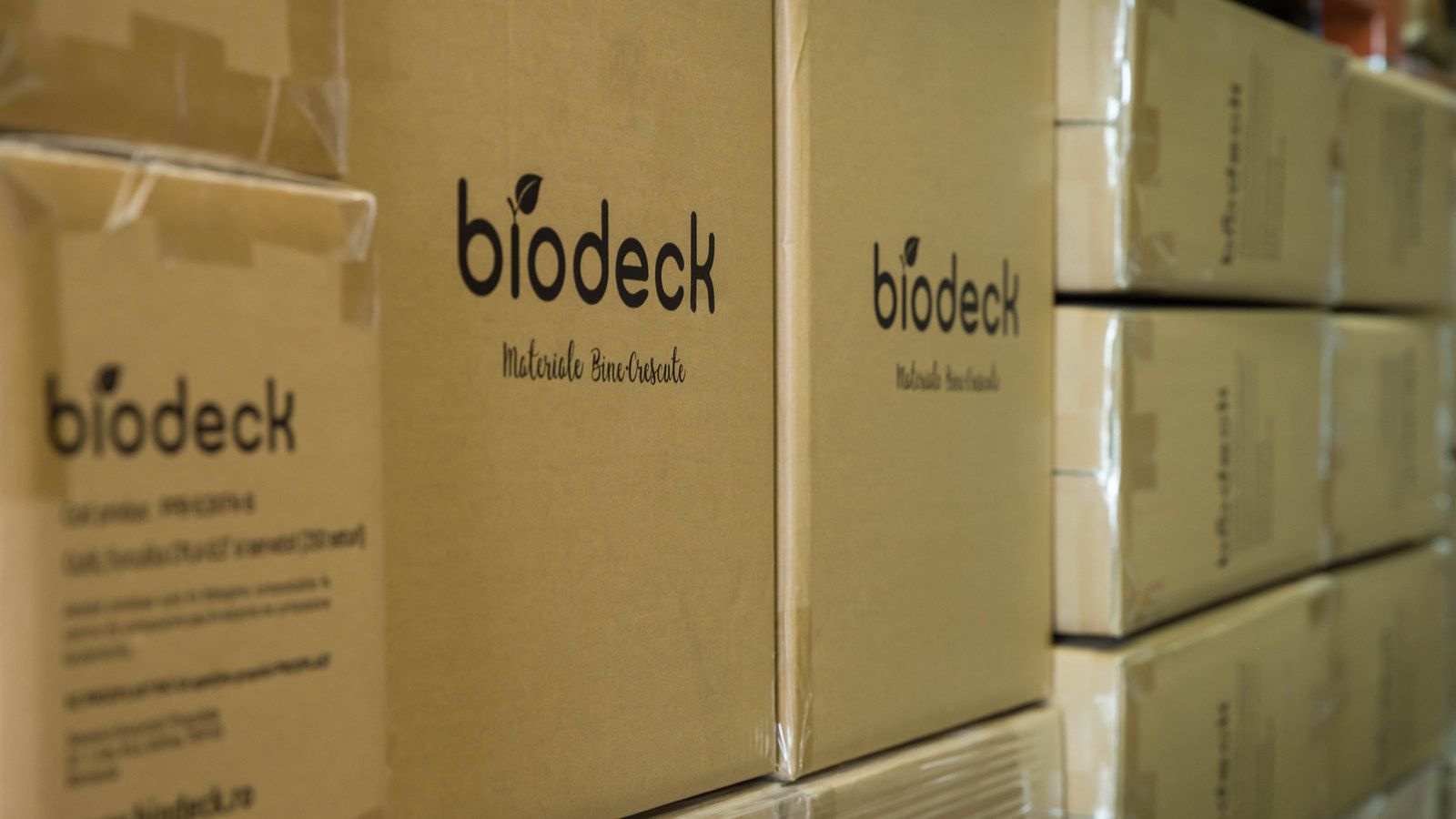
12Branded cartons, ready to ship.
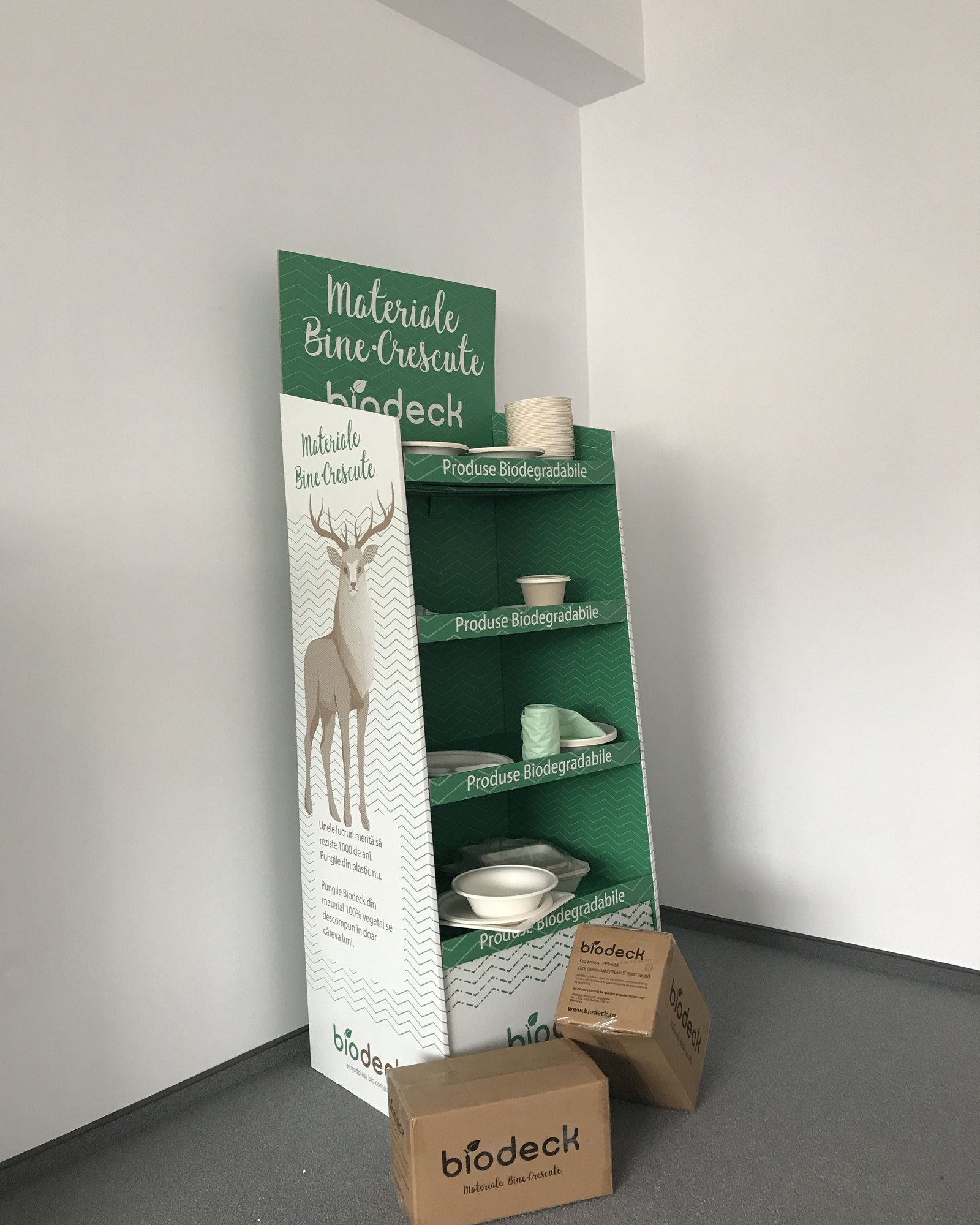
13The produced display, photographed with the product range.
A new material needed a reason to become an everyday choice.
How we got there
In this case study
The challenge
Giving a new material a place in everyday life
In 2017, Prodplast was developing a new direction for a business with roots in Romanian plastics manufacturing. Its plant-based product range needed a brand that people could recognise and a reason for them to change what they bought.
That change was still a choice. The products cost more than familiar alternatives, and the difference was not always visible. A cup still looked like a cup. A bag still needed to carry the shopping.
Prodplast was investing ahead of a wider shift in how single-use plastics would be regulated. The EU’s Single-Use Plastics Directive was proposed in 2018 and adopted in 2019, after our work had begun.[1]
Objective and brief
A brand people could choose and businesses could work with
We were asked to create the new brand, from its positioning and name to the identity, packaging and materials needed to introduce it.
It had to speak to people making everyday purchases and to businesses comparing products for their shops, cafés and restaurants. For both audiences, the brand needed to make an unfamiliar range easier to understand, while giving it an identity of its own.
What the research changed
The explanation belonged inside the brand
Our early work included interviews and a naming study. We considered how a name would be remembered, what it would suggest and how it would relate to the products sold under it.
The problem extended beyond recognition. Buyers needed to understand what made the products different before they could judge their value.
That shaped the role of the identity. Illustration and language would draw people in; product information would help them make a choice. Education became part of the packaging, sales literature and retail presentation.
The constraints
It had to work on the pack
The identity needed to survive the practical demands of labels, printed film and a varied product range. A small bag label had to carry the product size, quantity, material information, certification marks and handling advice.
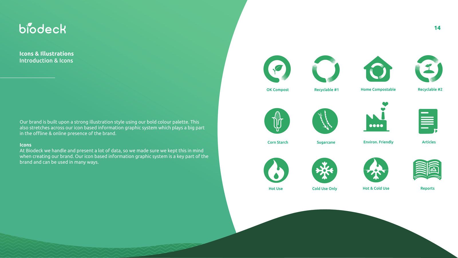
We organised this information into repeatable layouts, supported by a green-and-brown print palette and a system of icons. The same approach could then move between packaging, product literature and larger displays.
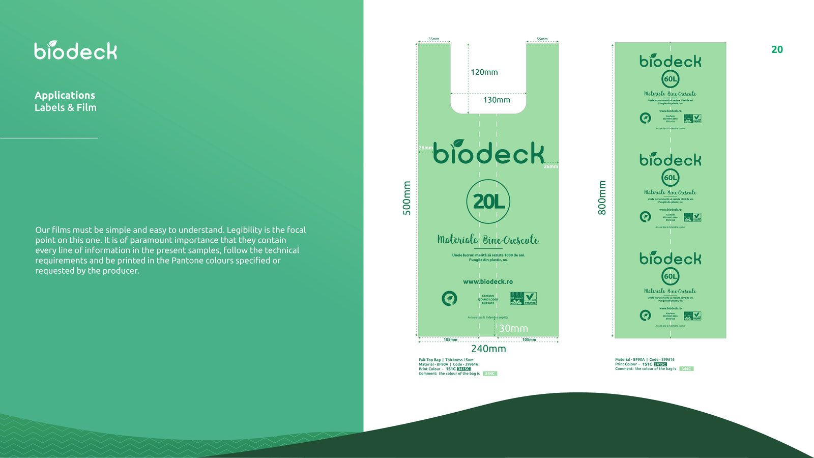
The information had to remain specific to the product: its source material, whether it was intended for hot or cold use, and the relevant composting or recycling information.
The response
Materiale bine-crescute
We named the brand Biodeck. The Romanian tagline, Materiale bine-crescute, plays on two meanings: materials that are grown, and materials that are well brought up. It connects their plant-based origin with the idea of behaving responsibly.
The English expression used in the project, Well-Behaved Packaging, carries that second meaning. It gave the brand a friendly way to talk about a serious subject.
A landscape with room to grow
The rounded wordmark incorporates a leaf. Around it, we developed an illustrated landscape of mountains, trees, wildlife and everyday objects, using a palette that extends from green and brown to brighter orange, yellow and blue.
The stag became a recurring character. In the brand book, it represents changing habits and renewal. It appears across stationery and retail materials, giving the brand a recognisable presence beyond the logo.
The system paired Ubuntu with King Basil brush lettering, balancing practical information with a more expressive voice. Product icons brought another useful layer: material sources, temperature suitability and disposal information could be presented consistently.
Implementation
Keeping the explanation close to the choice
We applied the identity to labels and bag film, business stationery, the product catalogue, posters and retail display materials. The catalogue brought the company’s purpose together with the details a buyer needed to compare products.
The illustrated world also became an educational animation. Its scenes introduced the materials and connected everyday choices with the wider problem of packaging waste.
In the final brand book, the floor display includes space for a tablet to play that animation. The pack, the display and the explanation were designed to work together where a purchase would be considered.
Guidelines documented how to use the wordmark, colours, typography, icons and illustrations, along with specifications for the main applications.
What happened
From a new range to a brand in the market
By June 2018, Biodeck was supplying bags to Carrefour in Romania.[2] Reporting in June 2019 placed its products in retail stores, cafés and restaurants, and documented exports to Scandinavia.[3]
Our contribution was the brand and communication system that accompanied this introduction: a name, a recognisable illustrated world and practical materials for presenting the products.
The project brought together the two things the new range needed to communicate: why someone might choose it, and what they needed to know before they did.
Penrose
 Sorin PavelStrategy, design and packaging
 Elena ReghintovschiLogo design, naming and tagline
 Andrei CotruțDesign and illustration
The whole team worked across the project; these are each person’s main contributions.