
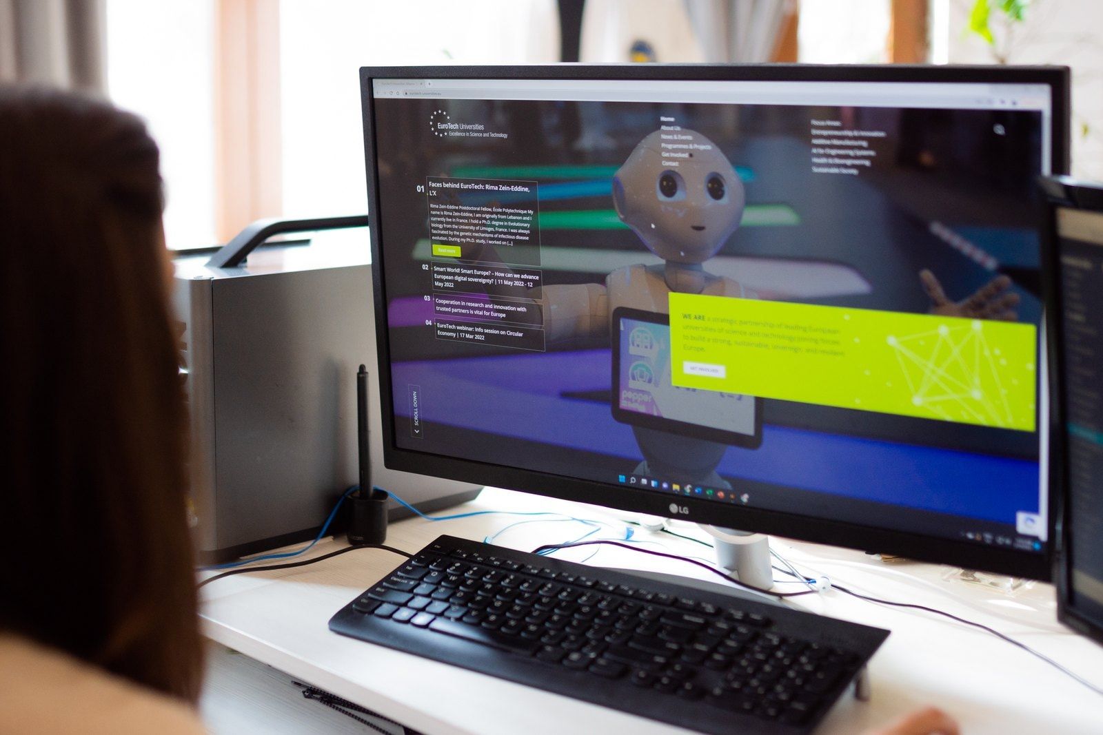
Six universities, each with its own identity, expertise and community. EuroTech Universities Alliance brings them together to advance research, education and innovation across borders. Its website needed to make that shared purpose clear, while representing the institutions behind it. We worked with EuroTech to rethink its website’s structure, design and development. The result gave the alliance a more confident digital presence and a foundation that could be adapted for related project websites, with tools its communications team could use themselves.
Visit the website (opens in a new tab)eurotech-universities.eu
- ClientEuroTech Universities Alliance, Brussels
- WorkInformation architecture, UX/UI design, WordPress development, project websites, hosting and ongoing support
- PartnershipSince 2020
The work
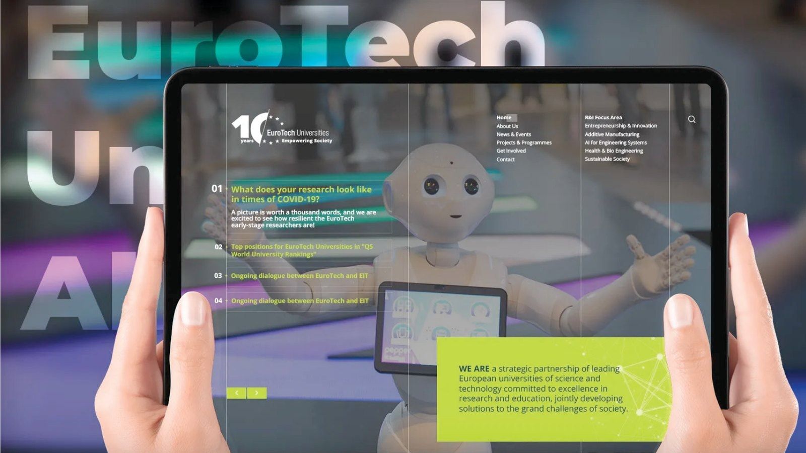
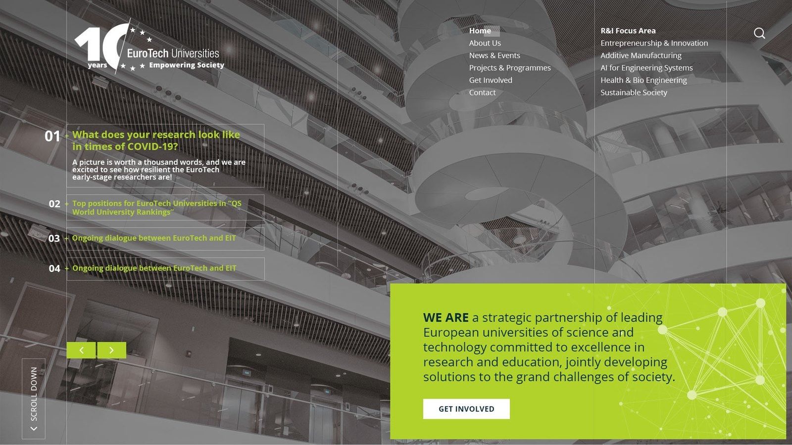
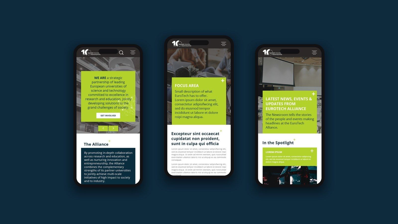
01The design combined large photography with a visible grid, bright lime accents and deep blue panels.
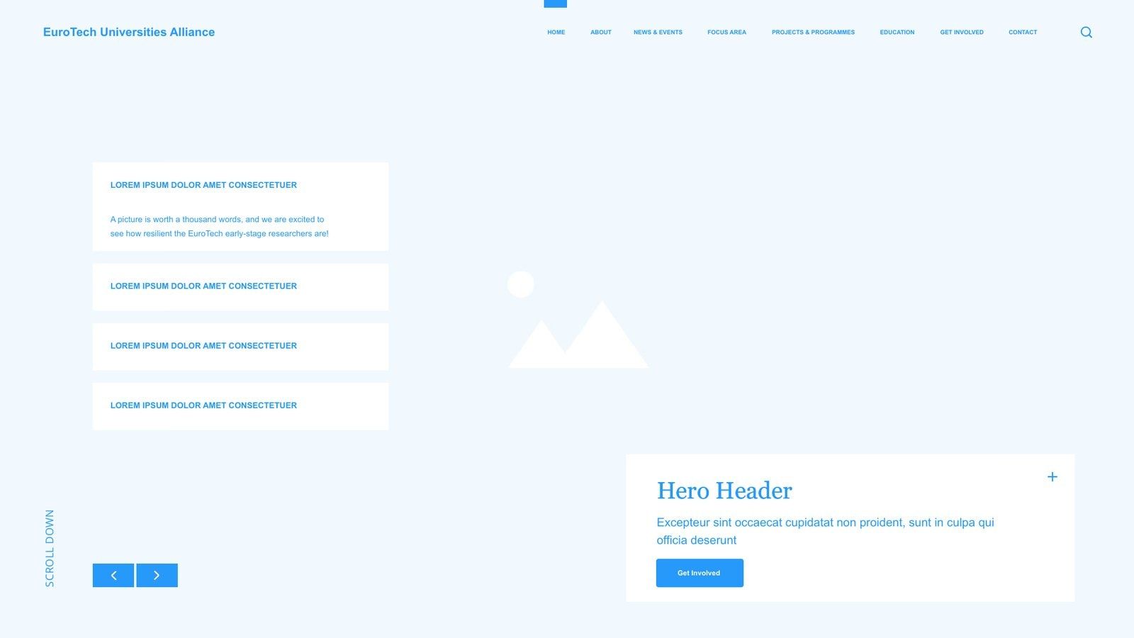
02We developed user journeys, wireframes and page templates around the alliance’s activities and the information people needed to reach.
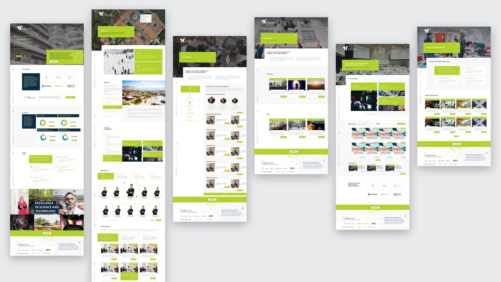
03Across the page templates, the aim was to give EuroTech a confident presence of its own while keeping the universities and their shared work at the centre.
04The approach allowed us to carry the work beyond the main alliance website, reusing and adapting the theme for projects with their own content and purpose.
05The collaboration continued through creative services, hosting and website maintenance, with support extended through 2026.
Its website needed to make that shared purpose clear, while representing the institutions behind it.
How we got there
In this case study
The brief
At the time of the redesign, EuroTech brought together six universities of science and technology in Europe and Israel: DTU, EPFL, École Polytechnique, Technion, TU/e and TUM. Each had an established reputation. The alliance created opportunities for them to work together and represented their shared interests in European research and innovation.
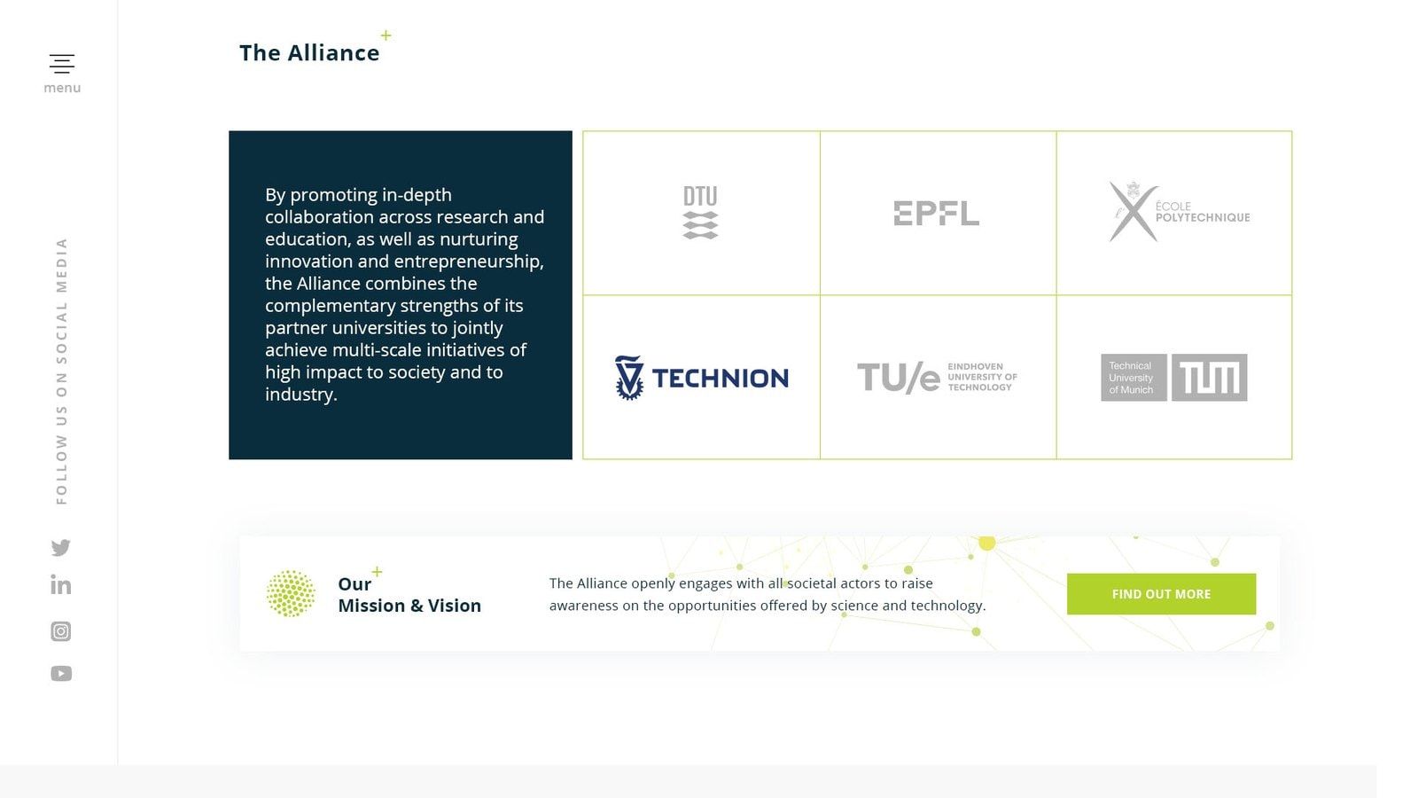
The redesign had to take those different institutions’ needs and perspectives into account. It needed to explain what connected them, give their joint activities a clear place online and convey the quality of the science and technology behind the partnership.
That meant thinking about how the alliance presented itself as a whole, from the organisation of its content to the experience of moving through the website.
Finding the common ground
Our work brought the website’s structure and user experience into the same conversation. We developed user journeys, wireframes and page templates around the alliance’s activities and the information people needed to reach.
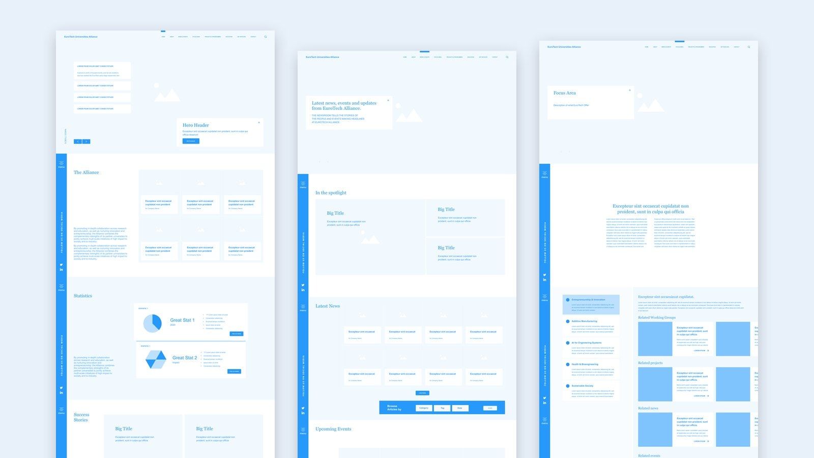
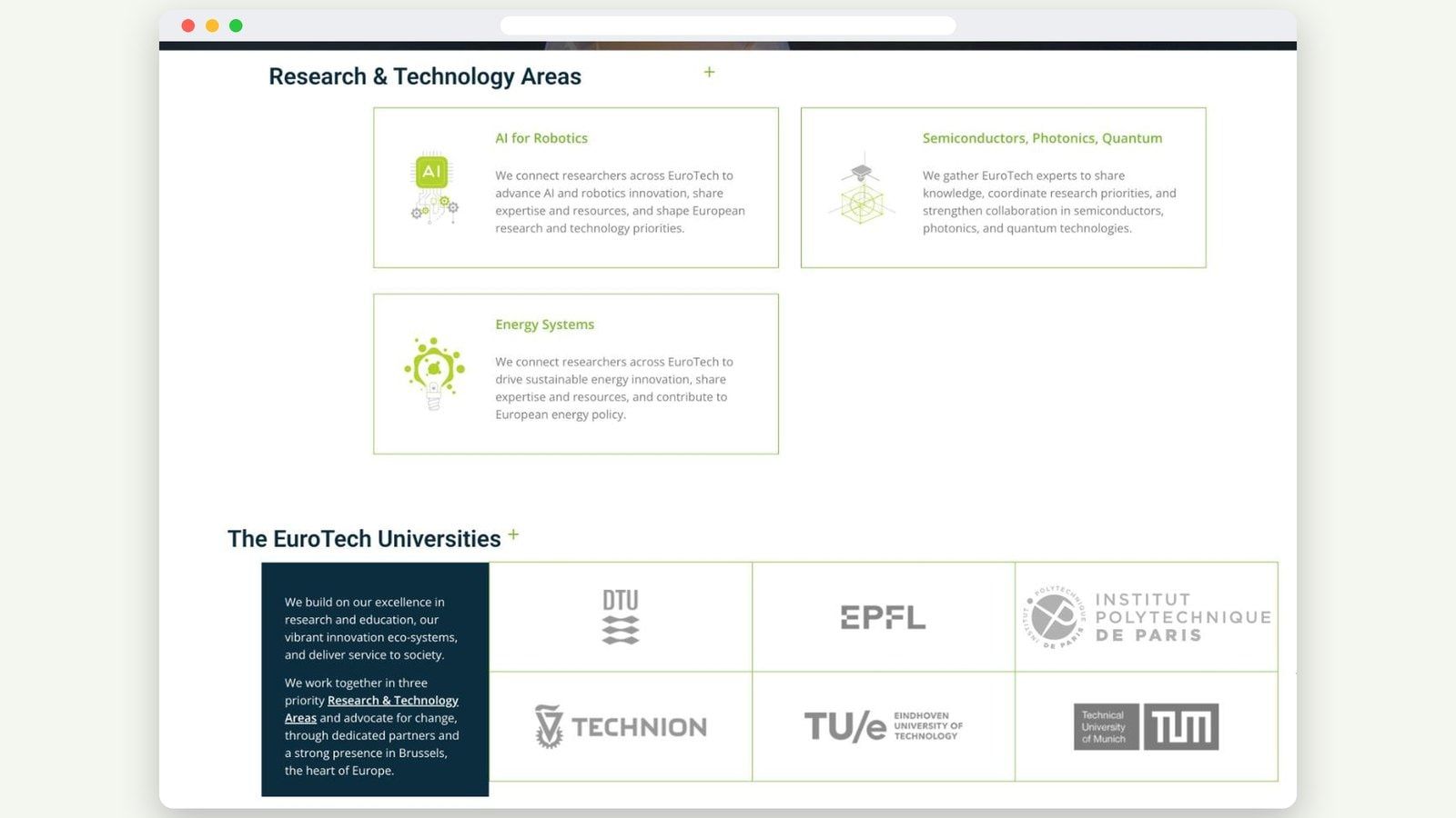
Research and innovation focus areas became a prominent route into the website, alongside information about the alliance, its news, projects and opportunities to get involved. This gave visitors a way to explore the partnership through the subjects that brought its universities together.
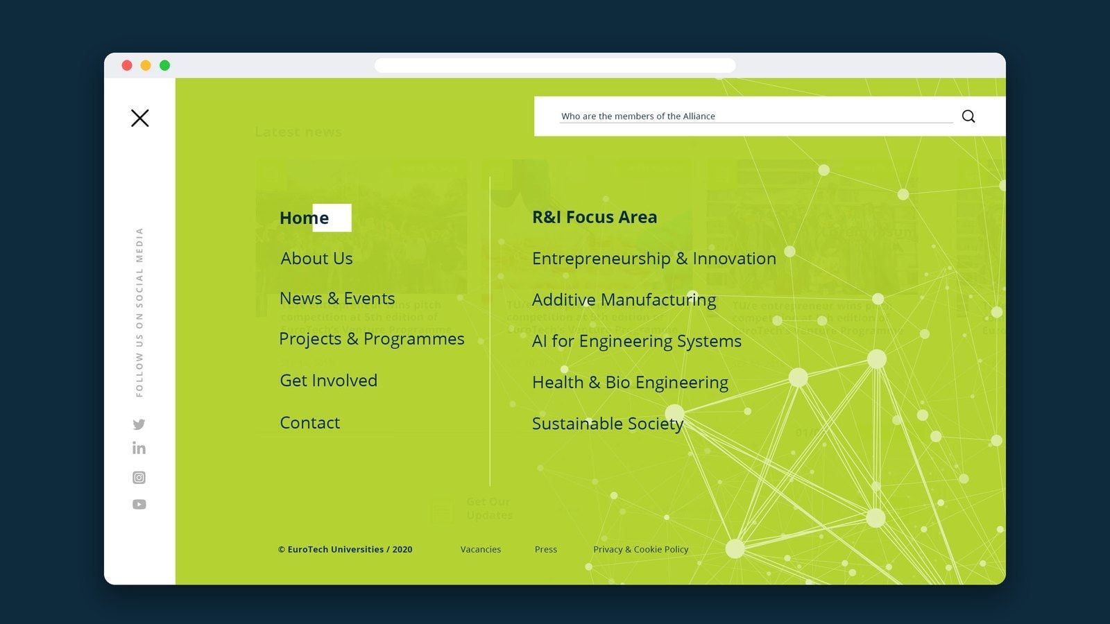
The member institutions remained visible within that wider story. Their identities sat alongside an explanation of the alliance and its collective strengths, helping the website show both who EuroTech was and what it could achieve through collaboration.
Giving the alliance a digital expression
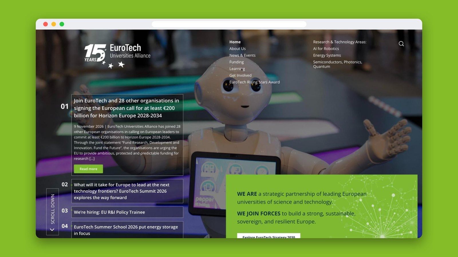
The design combined large photography with a visible grid, bright lime accents and deep blue panels. Strong opening images introduced the work and environments of the universities, while more restrained content layouts made room for detailed information.
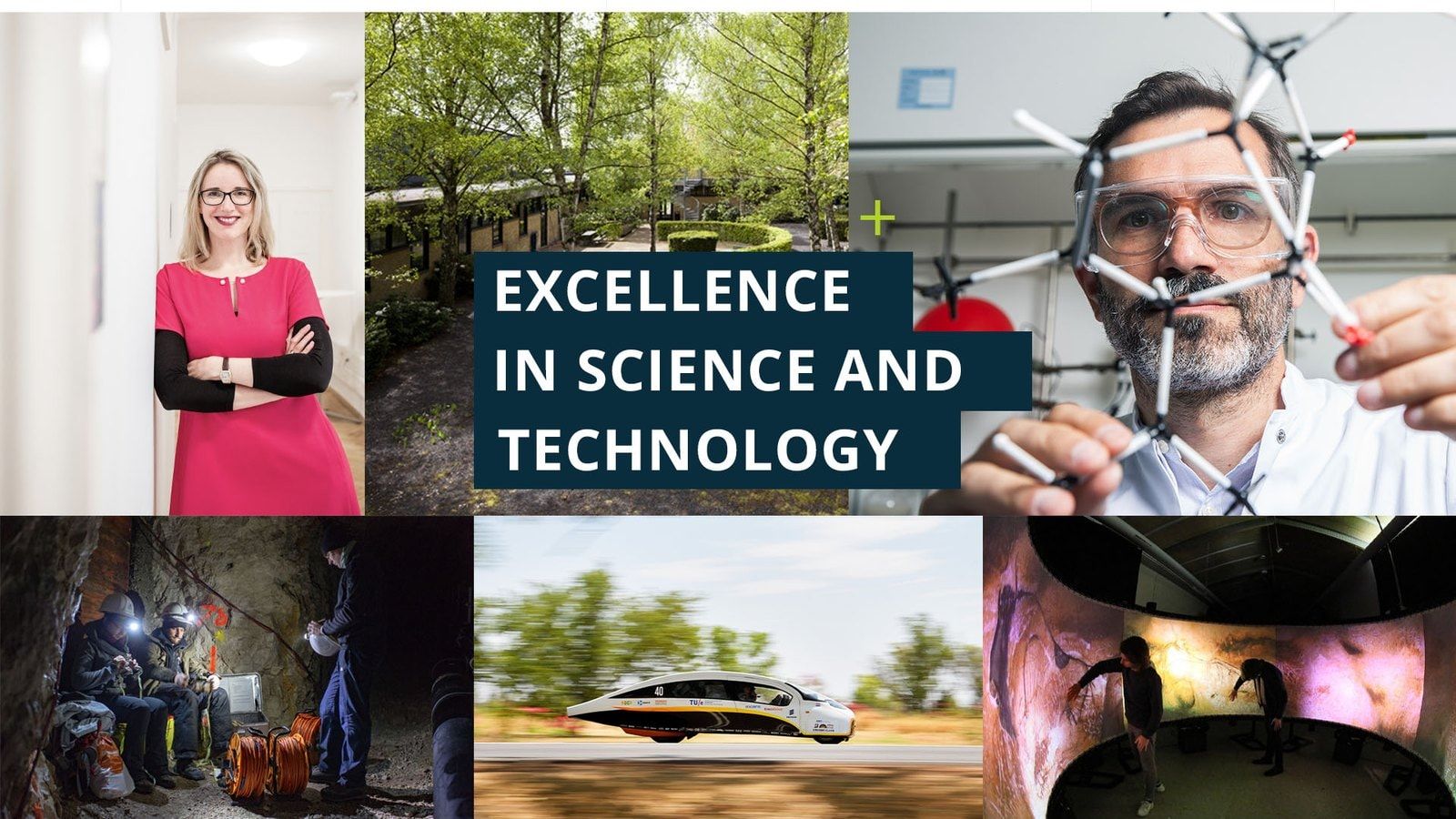
The contrast gave the website a distinctive rhythm: an expressive introduction followed by space to read, explore and understand. News, research themes, institutional information and figures could sit within a recognisable visual system.
Across the page templates, the aim was to give EuroTech a confident presence of its own while keeping the universities and their shared work at the centre.
A foundation for related websites
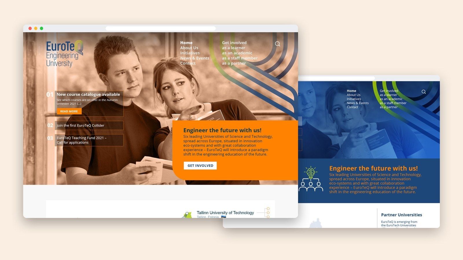
We continued with WordPress and developed a theme for EuroTech within a Multisite setup. That foundation was then adapted for two related project websites, EuroTeQ and Postdoc2.
The approach allowed us to carry the work beyond the main alliance website, reusing and adapting the theme for projects with their own content and purpose.
For the EuroTech communications team, Elementor provided a visual way to edit page content and layouts. This gave them flexibility in the day-to-day use of the website, supported by the templates we had designed and developed.
From a redesign to a lasting partnership
EuroTech gained a website that represented its six universities through a shared structure and design, alongside a technical foundation that supported related project sites.
The collaboration continued through creative services, hosting and website maintenance, with support extended through 2026. What began as a website redesign became an ongoing relationship with the team using it.
Penrose
 Sorin PavelProject management and UX
 Elena ReghintovschiUX/UI design and templates
 Bogdan PârvulescuWordPress development