
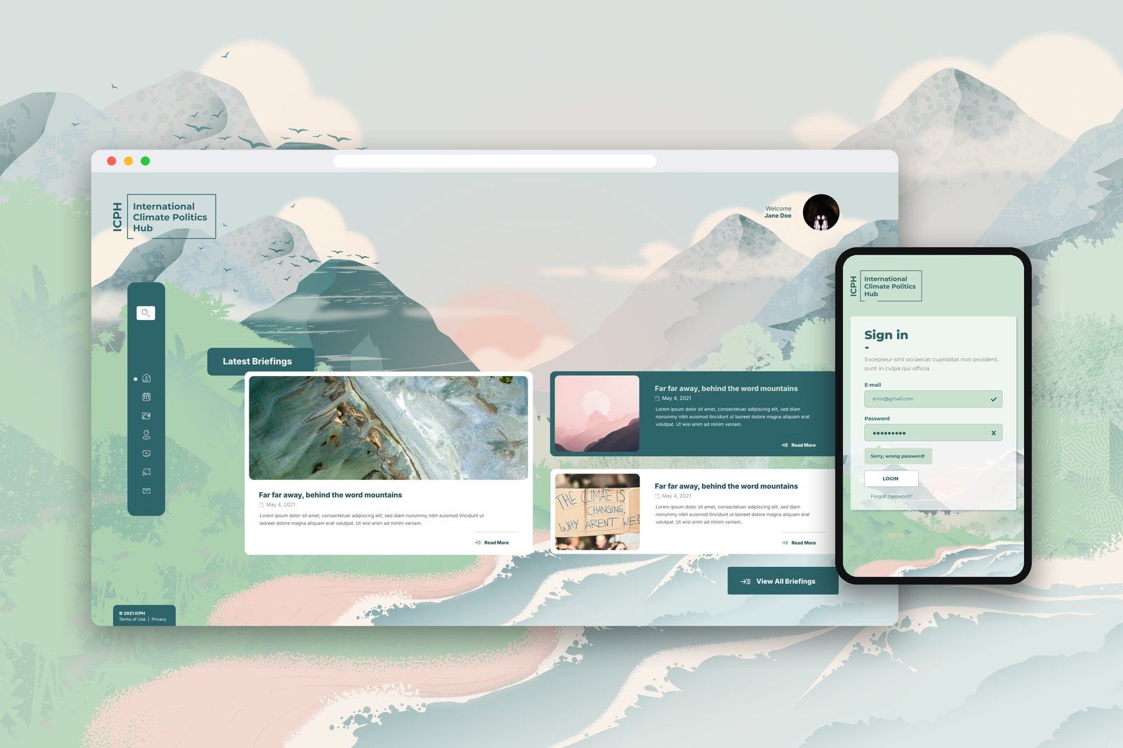
The International Climate Politics Hub brings together people working across climate policy, science, diplomacy and civil society. Its network shares analysis and coordinates around moments when international decisions can move climate action forward. We worked with ICPH to create a digital platform around that work: a place to find briefings, connect with colleagues and keep up with the network’s activities. The project brought user journeys, a distinctive visual environment and custom development together around the needs of a distributed community.
- ClientInternational Climate Politics Hub
- WorkUser journeys, information architecture, UX/UI design, custom platform development and integrations
- PlatformLaravel and Vue.js, connected to Airtable
The work
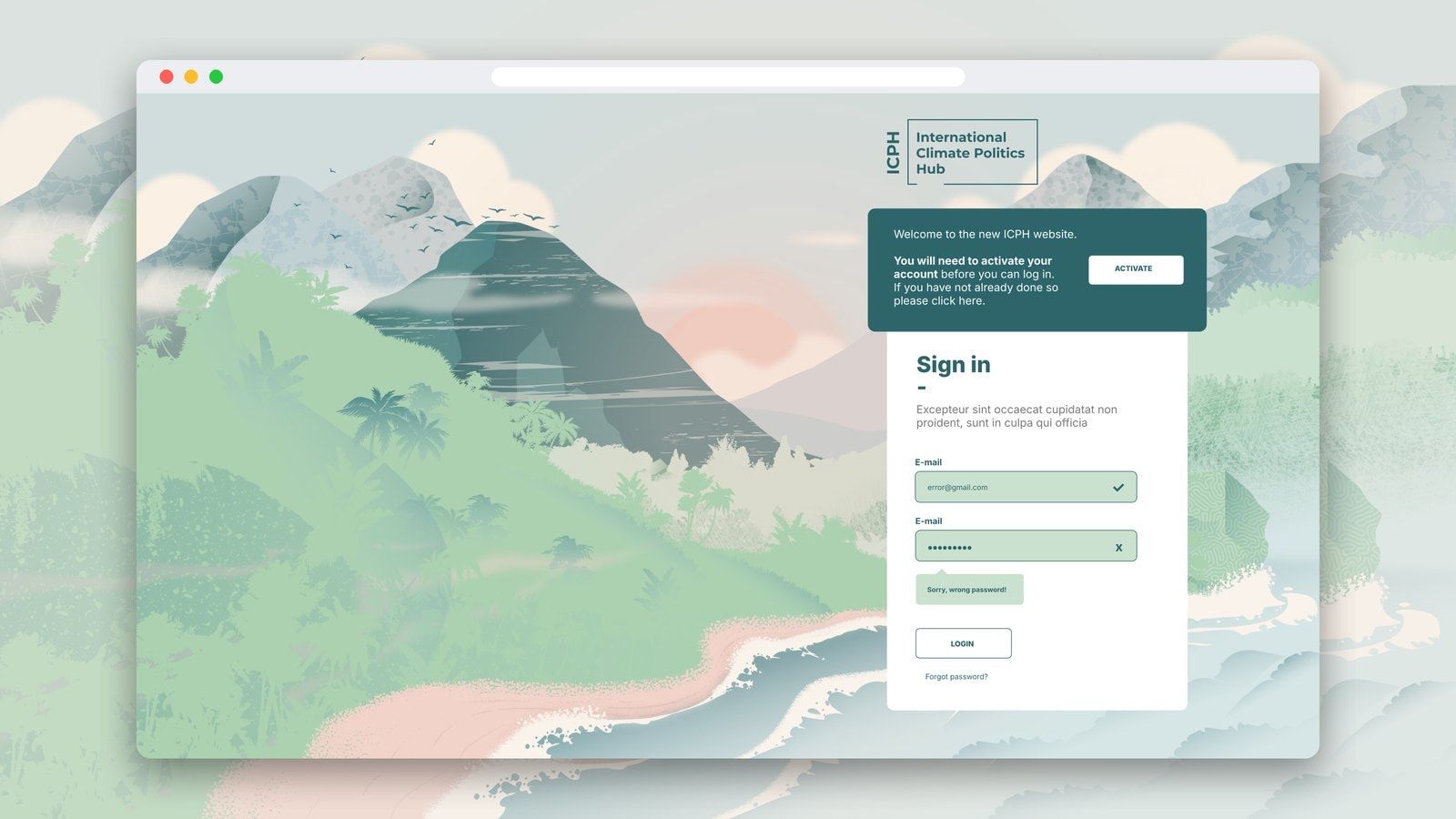
01Account activation and password recovery provided routes for members to manage their access, alongside administration tools for the coordinating team.
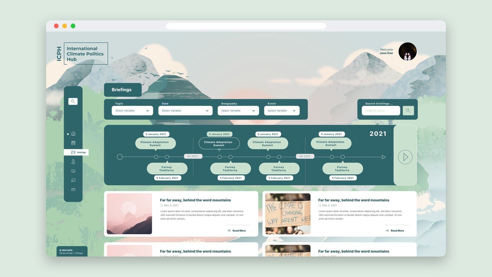
02A timeline offered another route through the material, connecting briefings to moments in the international climate calendar.
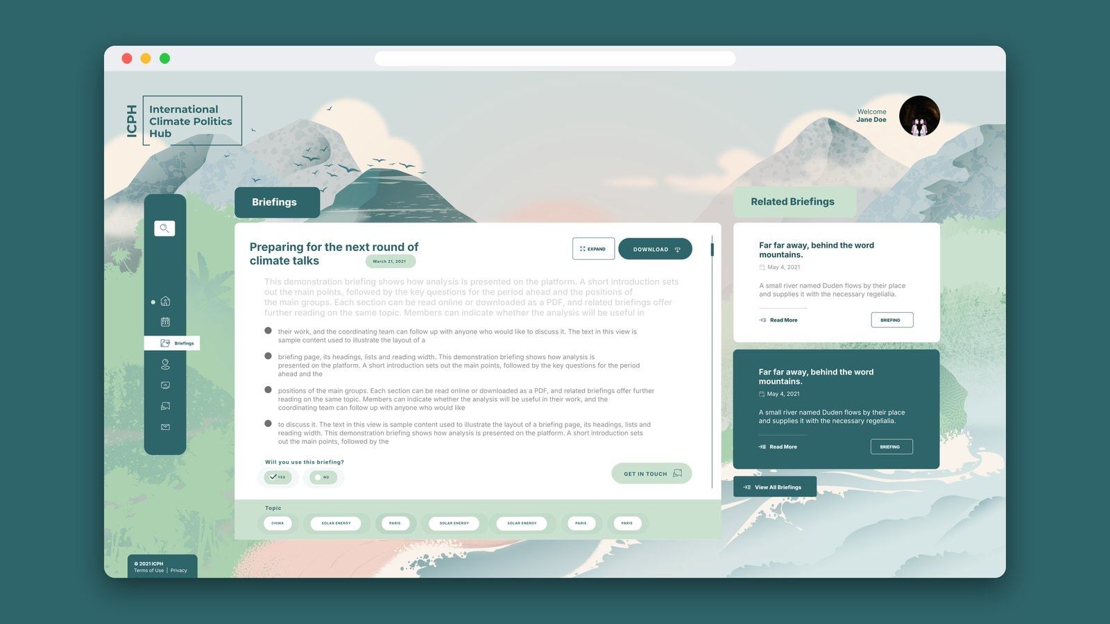
03The reading experience combined online text with access to the PDF.
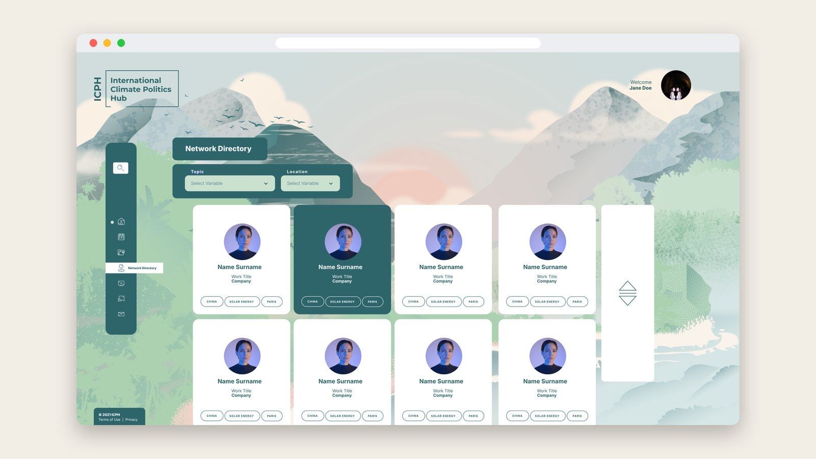
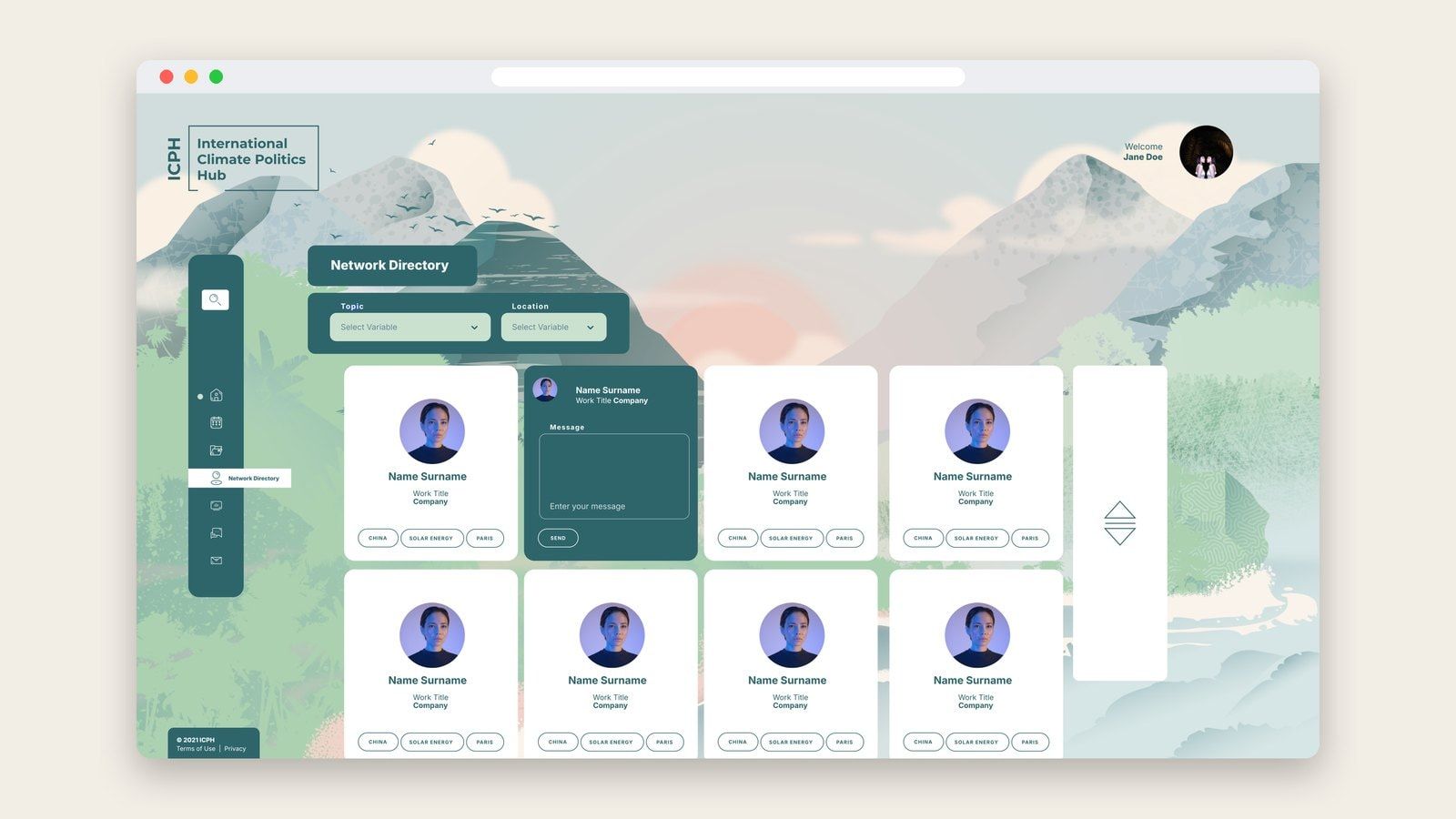
04Search and filters for topic, location and role helped members find people through the expertise and context relevant to their work.
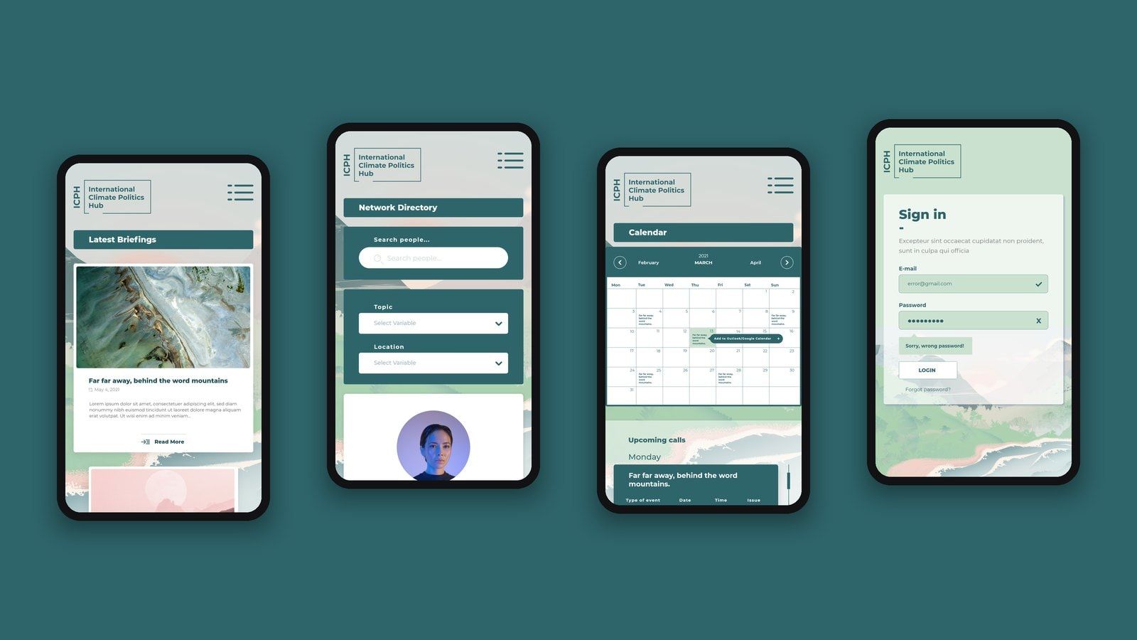
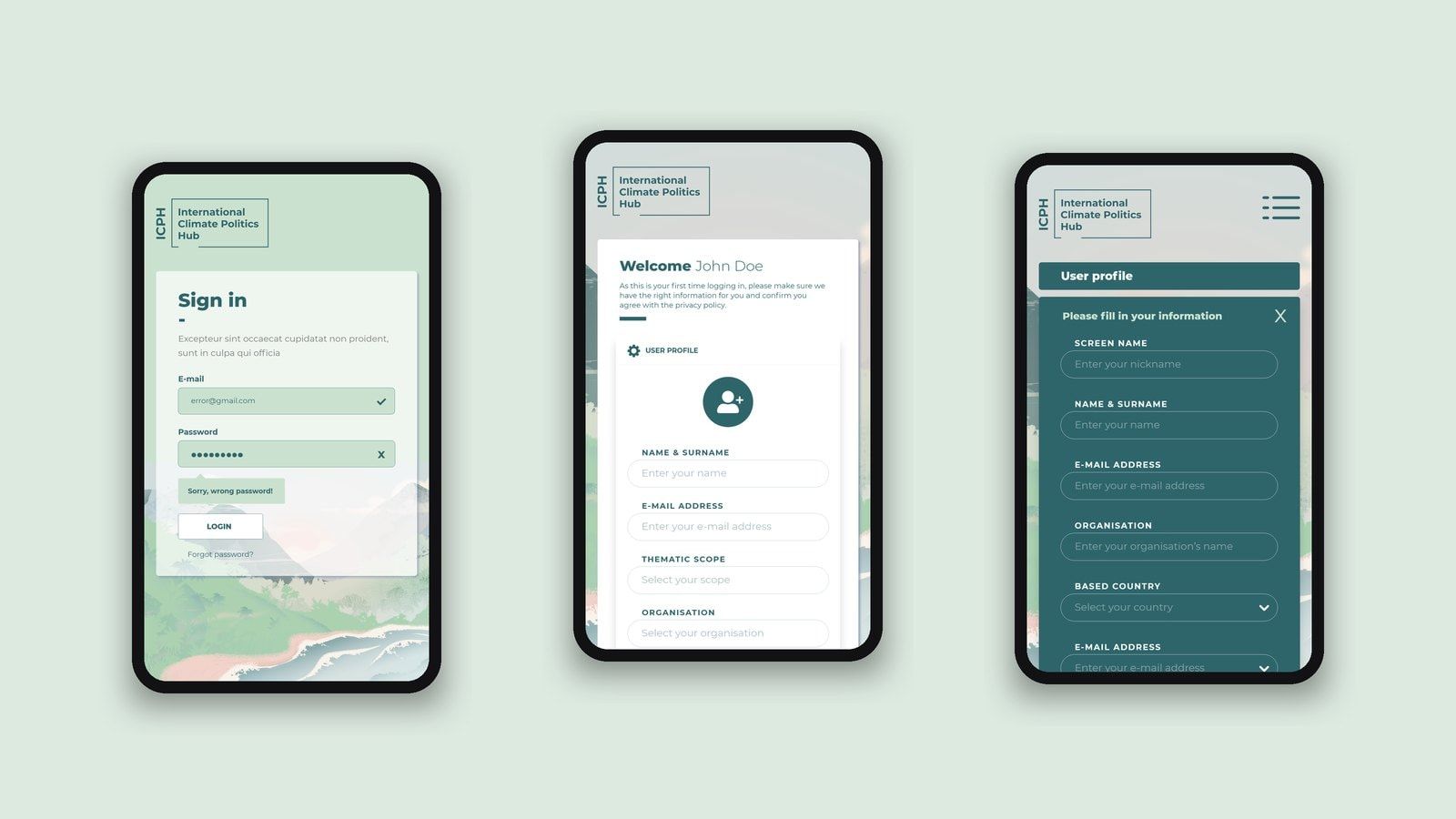
05The design extended to mobile layouts, adapting navigation, filters and reading views for smaller screens.
The challenge was to make these activities feel connected while respecting the different access needs within the community.
How we got there
In this case study
The brief
ICPH’s existing Drupal website stored the briefings distributed to its network by email. It provided an archive, but its design and limited functionality no longer reflected how the organisation wanted to work.
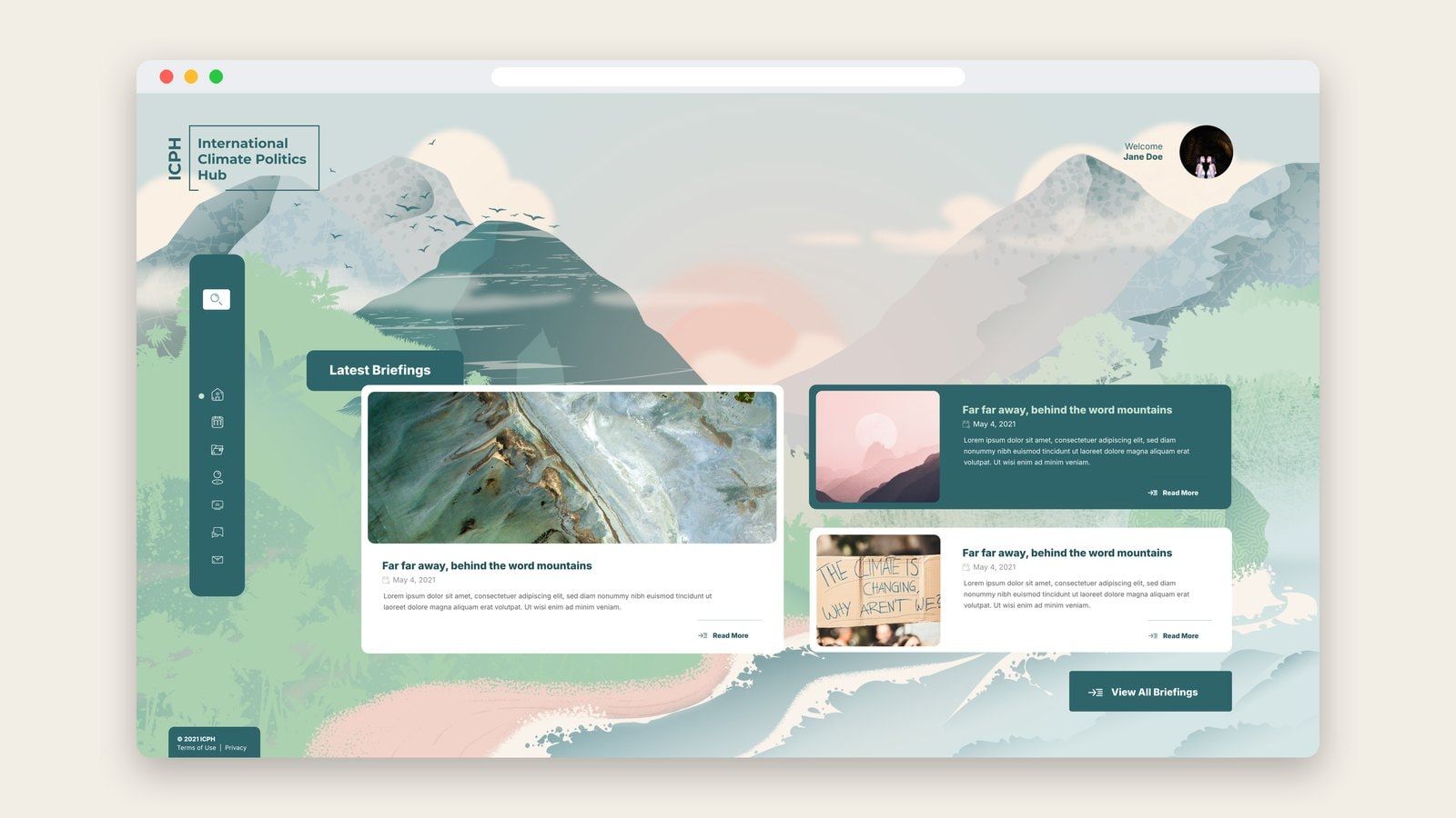
The new platform needed to make that growing body of knowledge easier to explore. Members needed to find analysis relevant to their interests, return to earlier documents and read briefings online as well as download them.
There was also a wider opportunity: to bring the network itself into the experience. A directory, shared calendar and connection to its conversations could help people work together across countries and areas of expertise.
The challenge was to make these activities feel connected while respecting the different access needs within the community.
Starting with the people using it
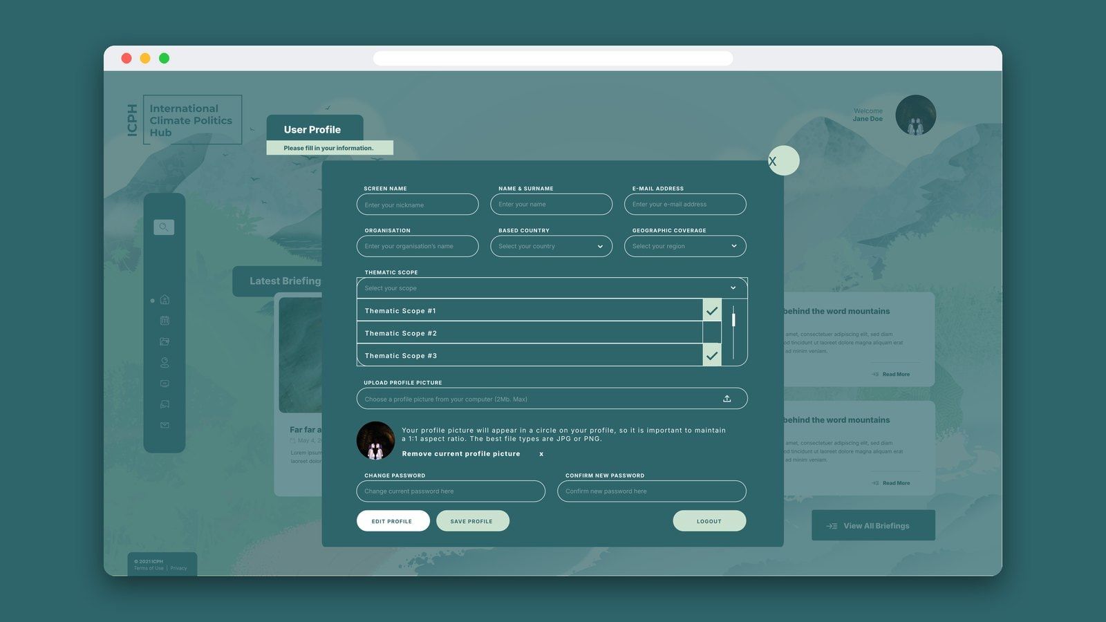
We mapped the platform around the people receiving briefings, the team coordinating the network and the editors publishing its analysis. Their journeys connected tasks that might otherwise have been treated separately: receiving an email, activating an account, opening a briefing, finding a colleague or checking an upcoming call.
This helped define the relationship between the briefing library and the working space for the network. It also brought the less visible parts of the experience into the design, including account activation, password recovery and editorial administration.
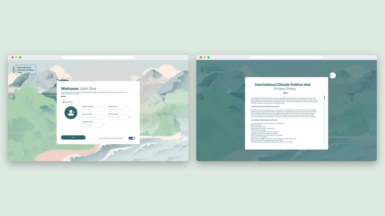
Airtable was already part of ICPH’s day-to-day work. Connecting the platform to it allowed the website to build on that existing network information, with member profiles and access roles carried into the new environment.
Making knowledge easier to explore
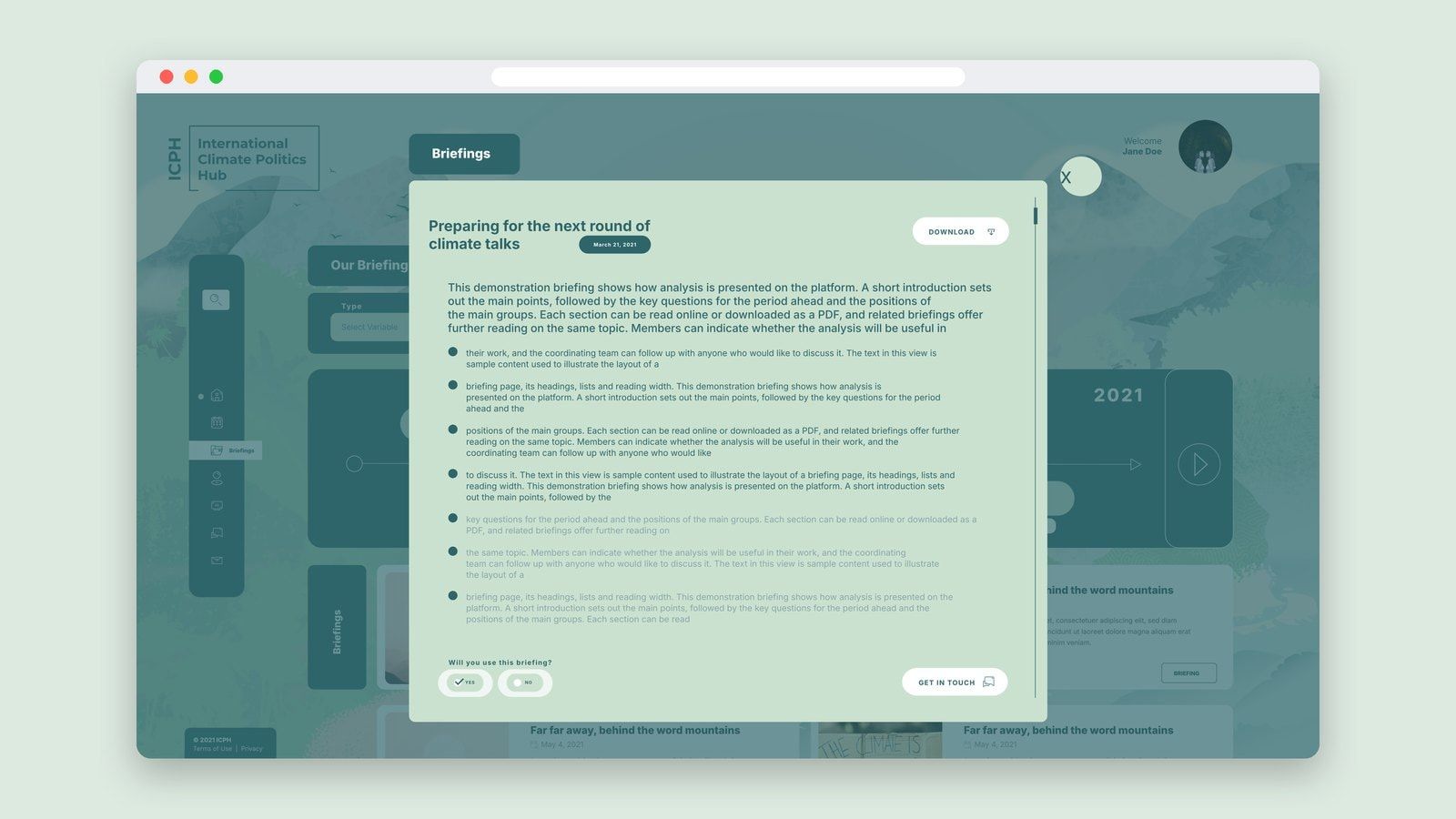
We organised the briefing library around several ways of finding information. Members could search by keyword and narrow the collection by topic, date, geography or event. A timeline offered another route through the material, connecting briefings to moments in the international climate calendar.
The reading experience combined online text with access to the PDF. Topics and related briefings provided routes into further reading, while a simple usefulness response gave members a way to indicate whether they would use a briefing.
The same principle shaped the network directory. Search and filters for topic, location and role helped members find people through the expertise and context relevant to their work.
Giving the workspace a sense of place
The interface paired a landscape of illustrated mountains, forests and water with a restrained palette of teal, pale green and warm neutral tones. It gave the platform a recognisable setting connected to the natural world behind its mission.

White content panels created space for reading within that landscape. Strong headings, rounded controls and consistent tags connected the briefing library, directory, calendar and account screens through one visual language.
The design extended to mobile layouts, adapting navigation, filters and reading views for smaller screens. The aim was a welcoming environment that could support both a quick visit to retrieve a document and a longer session exploring the network’s work.
Connecting the tools behind the network
We developed the platform with a Laravel back end and a Vue.js interface. Airtable integration connected member information and roles to the platform, while editorial tools supported creating, categorising and publishing briefings.
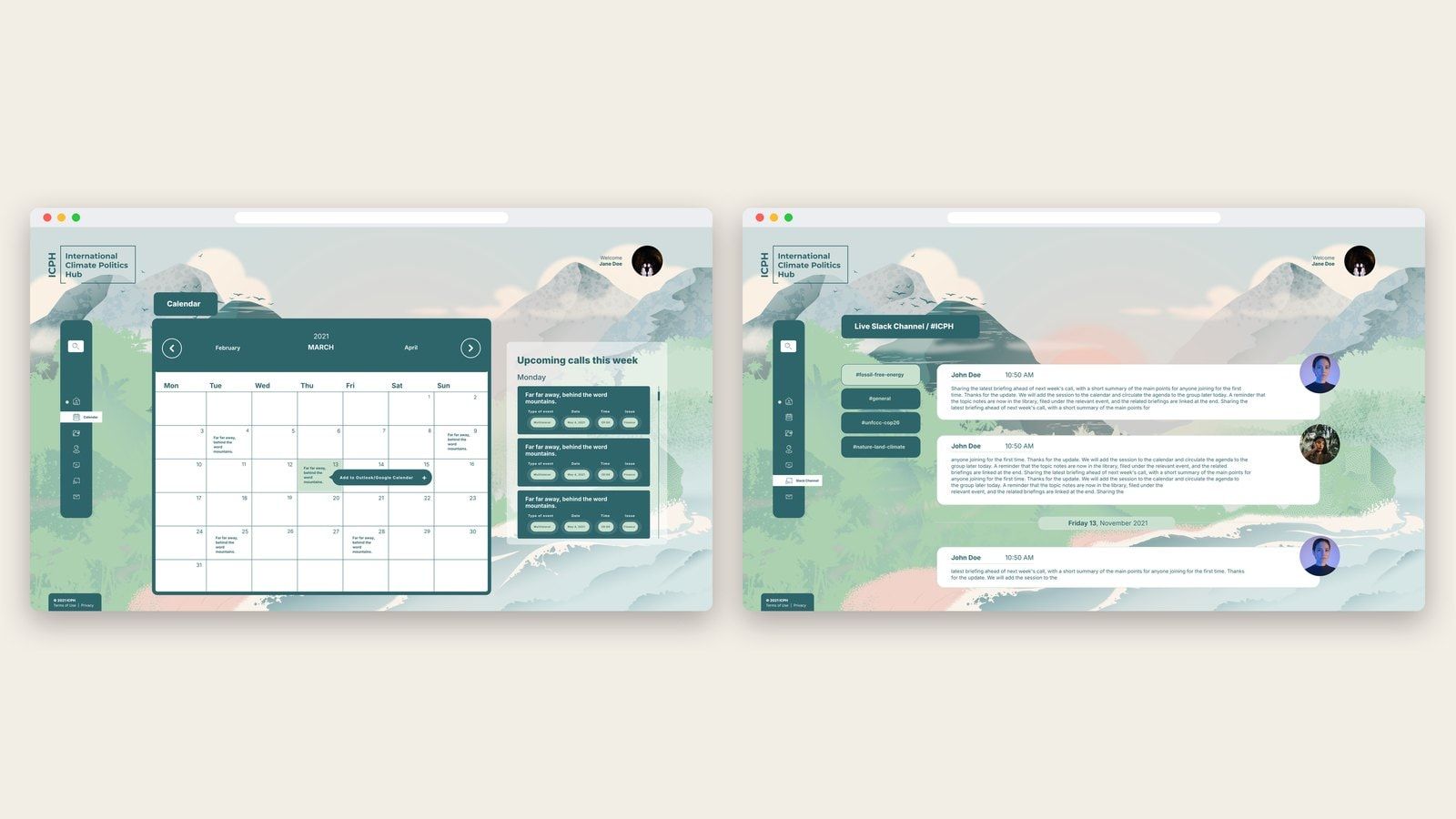
Calendar and Slack views brought upcoming activities and selected conversations into the same workspace. Account activation and password recovery provided routes for members to manage their access, alongside administration tools for the coordinating team.
The work continued through testing and refinement with ICPH. Feedback covered the practical details of using the platform: opening documents, navigating between briefings, synchronising member records and making content comfortable to read.
A platform around the work
The project gave ICPH a custom environment bringing its briefing library, member directory, calendar and conversations together. It supported the relationship between the knowledge the network produced and the people using it.
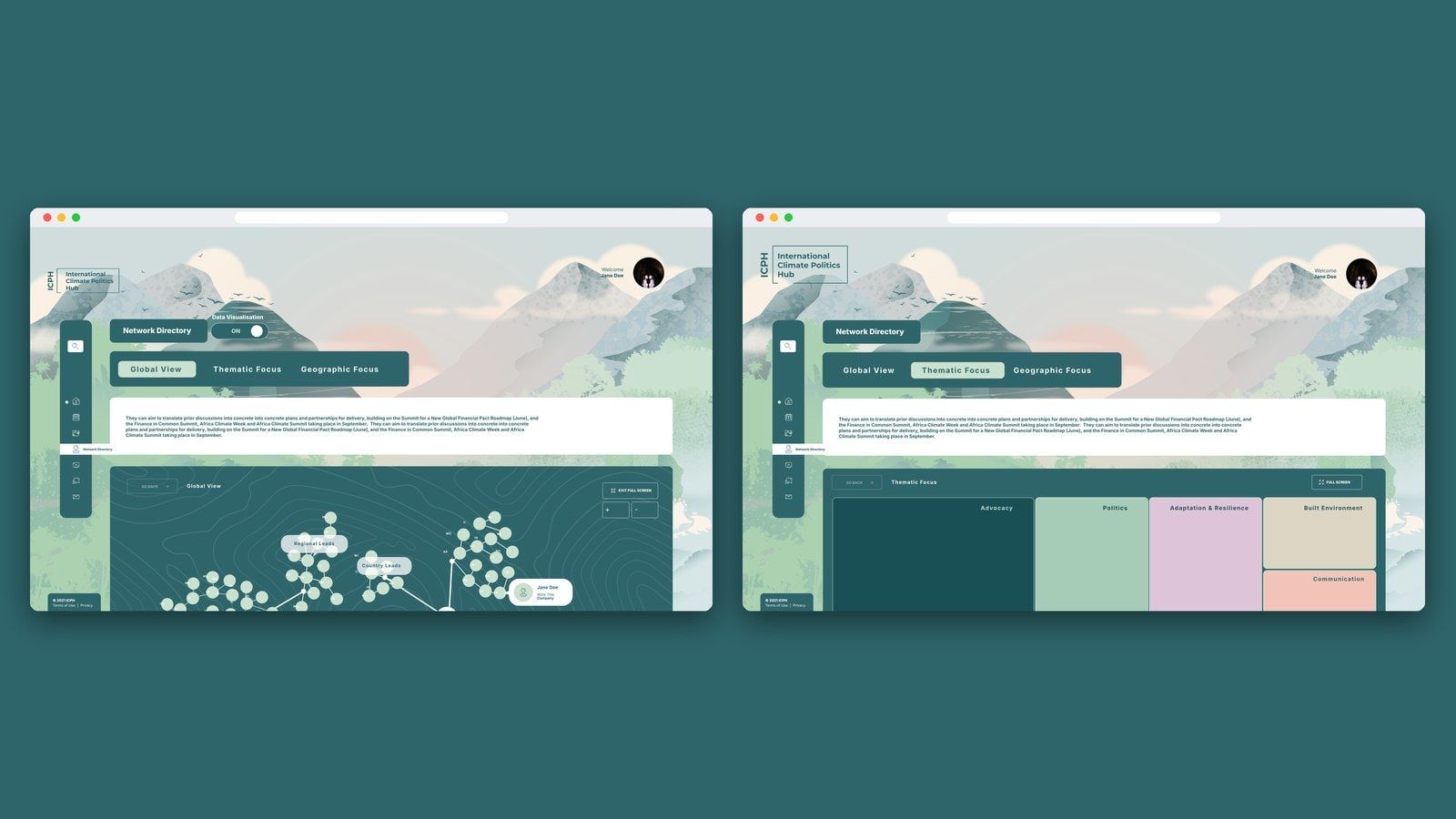
Further design work explored how to make the network itself more legible through global, thematic and geographic visualisations. Building on the directory, these views considered how people could discover expertise and understand the community from different perspectives.
Across the project, the focus remained practical: helping people reach the information and connections they needed to contribute to climate action.
Penrose
 Sorin PavelUX and strategy
 Elena ReghintovschiUI and design
 Cristi LunguDevelopment