
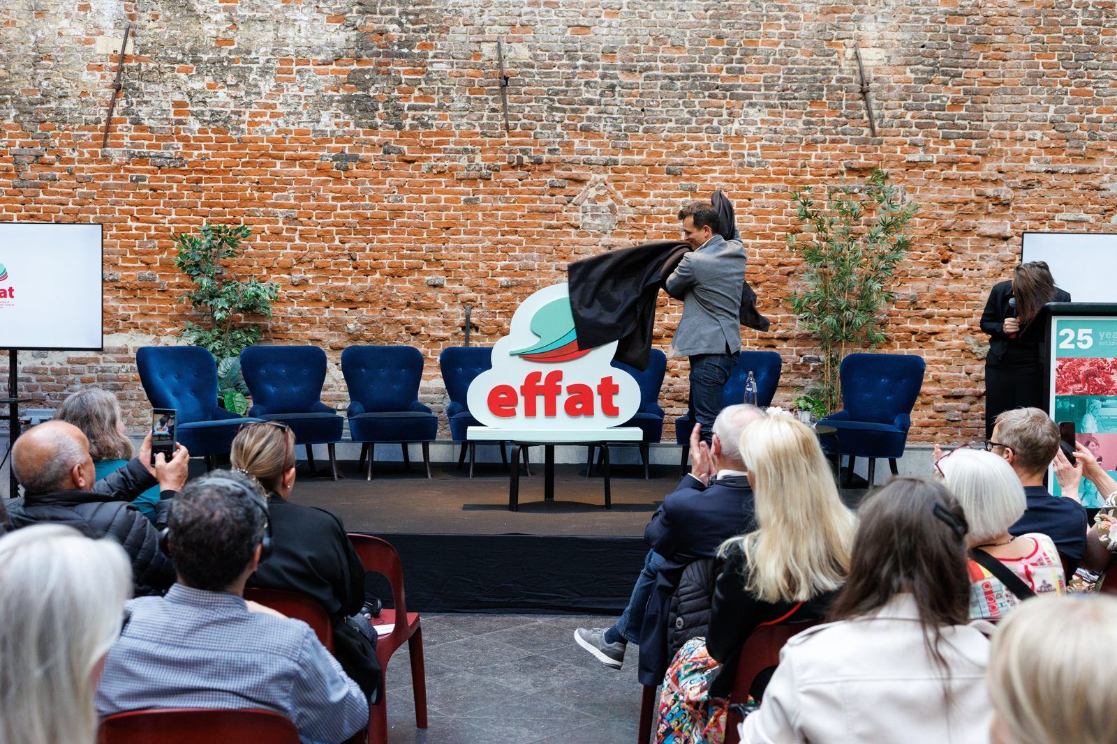
In 2026, as EFFAT celebrated its 25th anniversary and entered a new period of leadership and strategy, we refreshed an identity that had been part of the federation since its early years. The challenge was to give it more movement and a broader visual language, while keeping the history and recognition that mattered to its affiliates.
- ClientEuropean Federation of Food, Agriculture and Tourism Trade Unions
- WorkBrand strategy and visual identity refresh
- TimeframeFour months, completed in June 2026
- StatusIn use
The work
01The new symbol is made from four layered shapes rising together in an arc, one for each of EFFAT’s sectors: food, agriculture, tourism and domestic work.
02Red became the leading colour of the new identity, creating a stronger connection with EFFAT’s trade union roots and giving the federation greater visibility across campaigns and public communications.
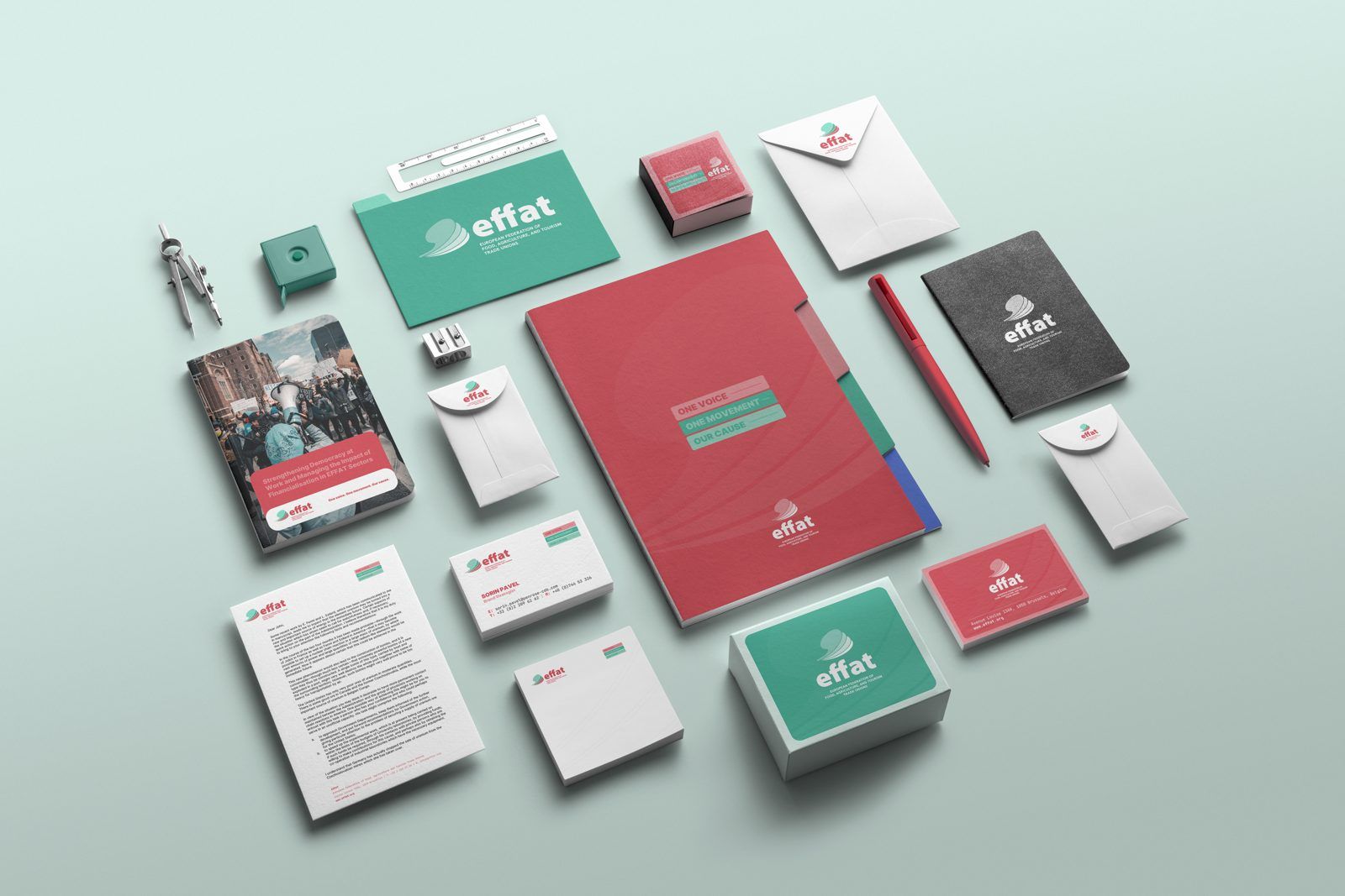
03Alongside the guidelines, we prepared a complete production suite.
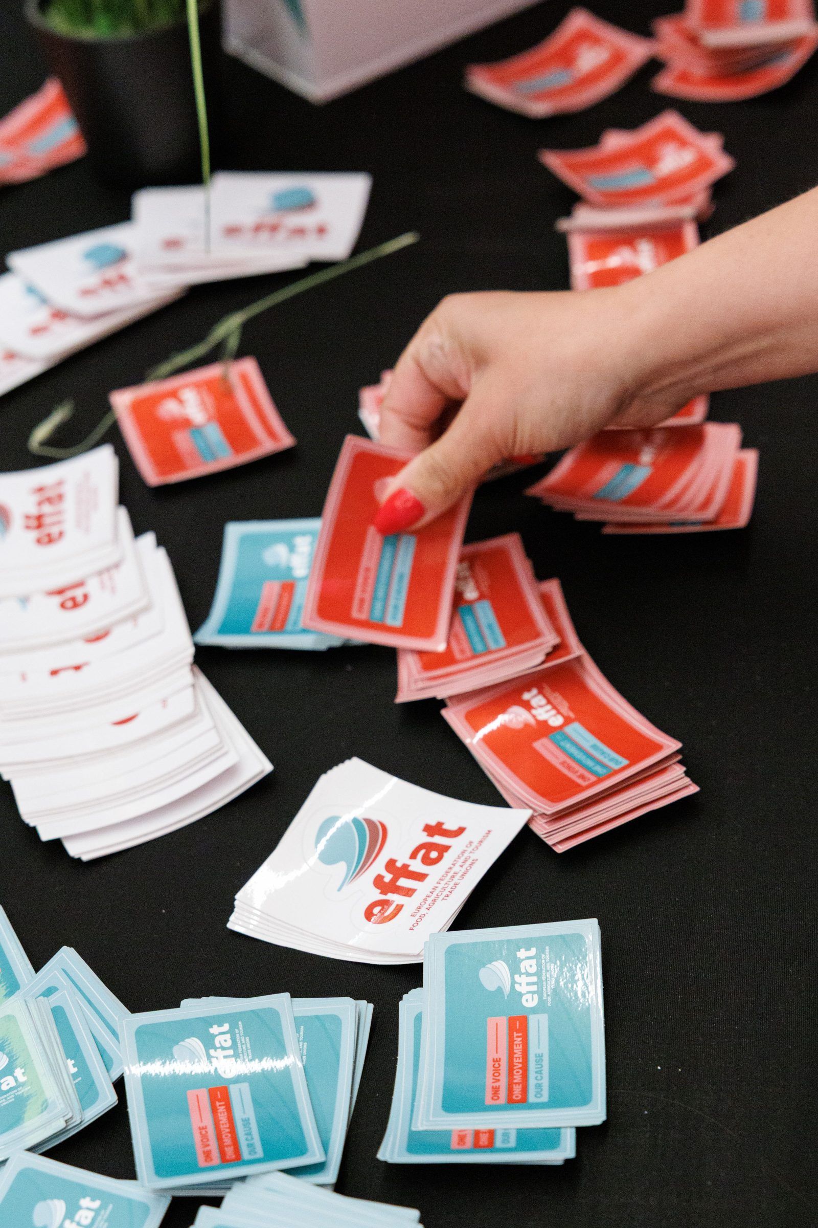
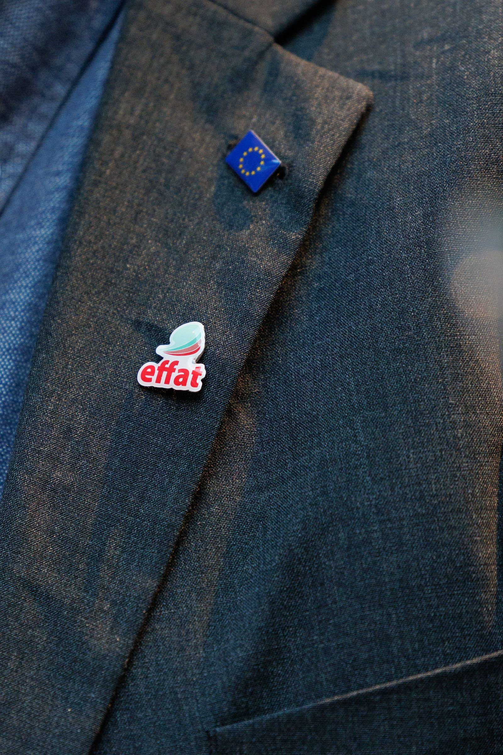
04The wider application set included A4 letterhead and a Word master, business cards, an HTML email signature, flags, beach flags, a three-metre banner, podium graphics, pins, stickers, a PowerPoint template, social media templates and a logo animation.
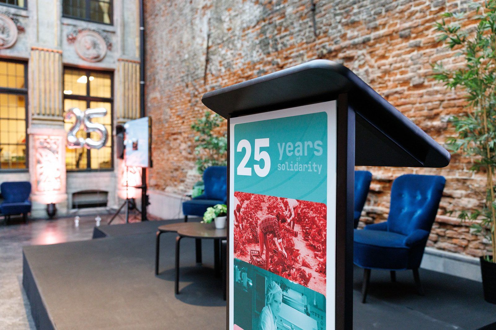
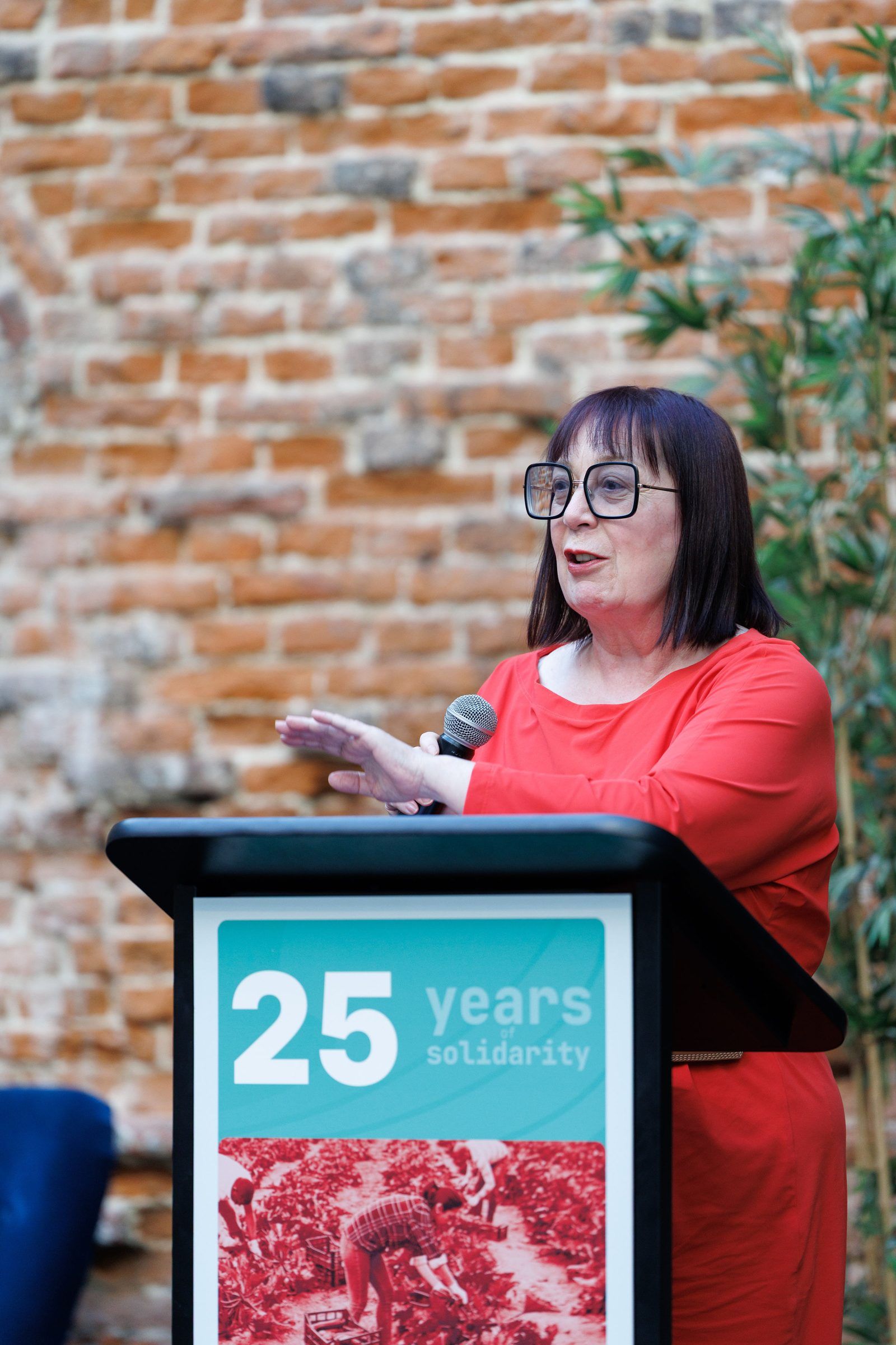
05The lectern, branded with EFFAT’s new visual identity.
The challenge became much clearer: keep the roots, but introduce movement.
How we got there
In this case study
The challenge
EFFAT, the European Federation of Food, Agriculture and Tourism Trade Unions, represents 121 national trade unions across 40 European countries, speaking for 2.6 million members and around 25 million workers in food, agriculture, tourism and domestic work.
EFFAT was created in 2000 and today brings together 121 national trade unions from 40 European countries. It works across four sectors, food, agriculture, tourism and domestic work, representing millions of workers in its discussions with European institutions, employers’ associations and transnational companies.

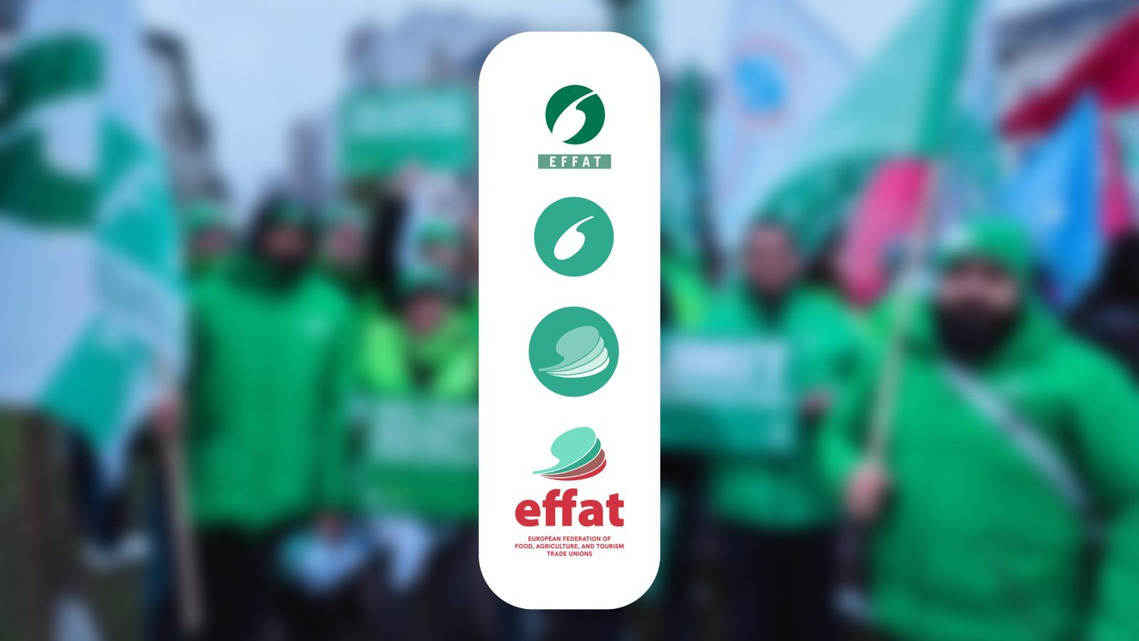
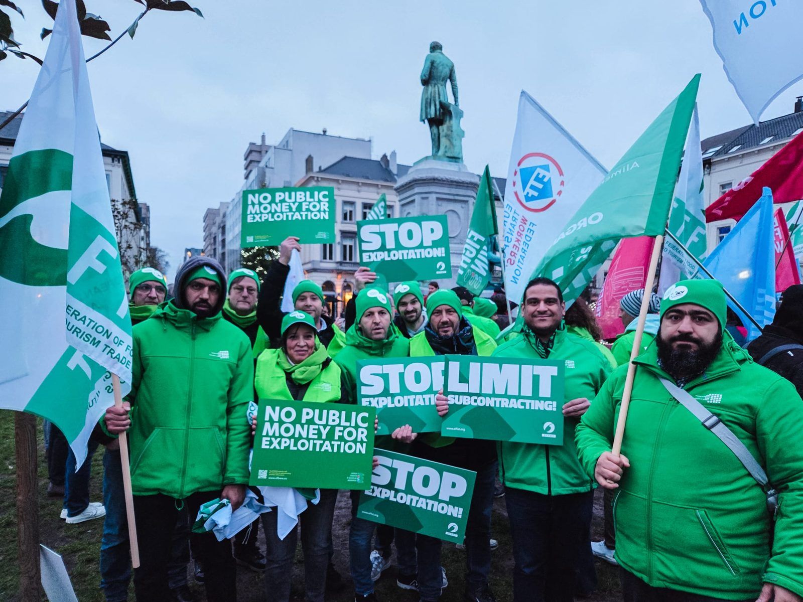
For most of that history, EFFAT had been represented by the same symbol: a dark green circle containing a white seed, or the hand tool traditionally used to plant one, with the federation’s name underneath.
It was a simple idea with a strong connection to EFFAT’s origins. It spoke naturally about agriculture, soil, food processing and the people working with them, and after 25 years affiliates across Europe knew it immediately.
But EFFAT itself had grown beyond what the identity communicated.
Agriculture and food processing remains an important part of the federation, but EFFAT also represents workers across food production, tourism and domestic work. The old identity said much less about these parts of the organisation. Its enclosed circular shape also felt static at a moment when EFFAT wanted to communicate movement and a clearer sense of where the federation was going next.
The timing felt right for a change. EFFAT had new leadership, a new strategy was taking shape, and its 25th anniversary in June 2026 created a natural moment to look both backwards and forwards.
Objective and brief
Our relationship with EFFAT goes back twelve years, to the first public tender Penrose won in Brussels, for the Back 2 our Future campaign coordinated by the federation.
Unplanned events got us back in touch 12 years later, the right time for a renewal. Our idea and initial thinking was liked, EFFAT asked us to develop a proposal, and the work began.
The objective was not to create a completely different EFFAT. It was to give the federation an identity that felt more contemporary and dynamic, could represent all four of its sectors and would work across everything from policy publications to campaigns and events.
There was also a very practical consideration. EFFAT is a federation of 121 autonomous unions, working across different countries and in different languages. The identity could not depend on the Brussels Secretariat or a designer every time someone needed to produce a presentation, document or social media post.
It needed to be recognisable, flexible and easy for affiliates to use themselves.
What the research changed
Our first instinct was to make a bigger change.
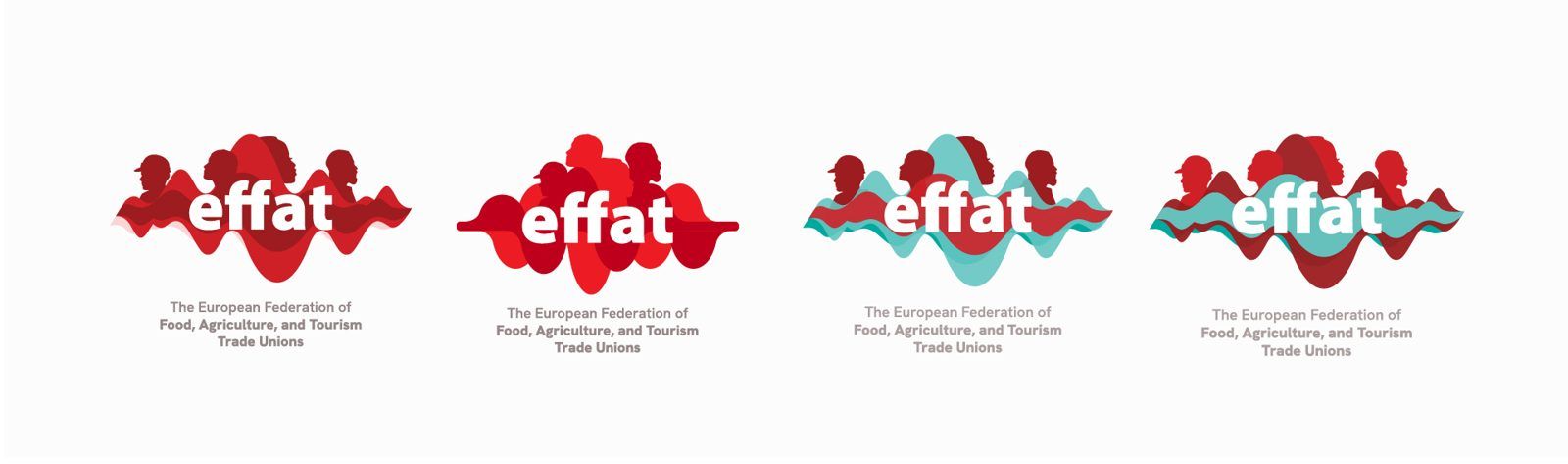
The conversations with EFFAT and its affiliates quickly showed us that this was not what the federation needed. There was a strong attachment to the existing symbol and to the history it represented.
Whatever changed, the new mark still needed to feel like EFFAT.
That became one of the most important findings of the process. The old identity certainly needed to evolve, but recognition was something worth protecting rather than starting again from zero.
It also changed the way we thought about the project. Instead of asking what could replace the existing symbol, we started asking what within it could evolve.
The answer was the seed.
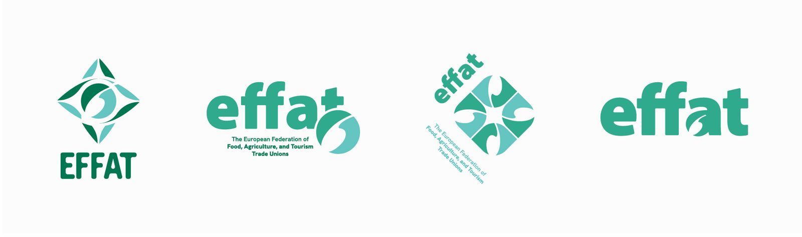
It was the element that carried the strongest connection to EFFAT’s history, but it also gave us something we could reinterpret for an organisation that today represents four different sectors.
The challenge became much clearer: keep the roots, but introduce movement.
The idea
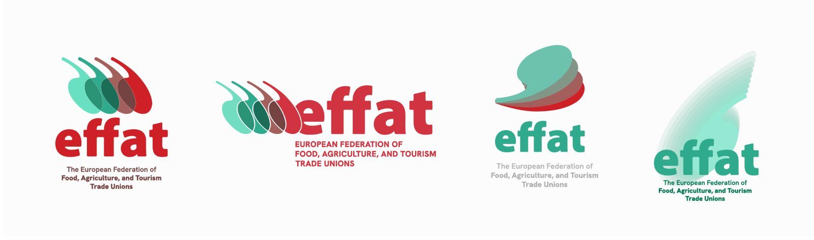
We kept the seed and gave it a new form.
The new symbol is made from four layered shapes rising together in an arc, one for each of EFFAT’s sectors: food, agriculture, tourism and domestic work.
- 01Food
- 02Agriculture
- 03Tourism
- 04Domestic work
Individually, the four forms represent different parts of the federation. Together, they become a single mark.
This gave us a simple way to express what EFFAT is: different sectors and organisations with their own identities, connected through one federation and moving in the same direction.
The overall silhouette remains close enough to the previous symbol to preserve recognition. At the same time, opening the shape and introducing the rising movement makes it feel more dynamic than the enclosed circle it replaced.
During the process, the EFFAT team started calling the new symbol the butterfly. The nickname stayed and eventually found its way into the guidelines.
Constraints
- Continuity was the first constraint, and the most important one. Affiliates had been using and recognising the previous symbol for decades, so the new identity needed to feel like an evolution rather than a replacement.
- The second was usability. With 121 autonomous affiliates, the system had to work in the hands of people with very different levels of design support and on the software they already use.
- The third was EFFAT’s governance. We worked closely with the Secretariat throughout the process, developing and sharing the identity with smaller groups before setting everything ready for the presentation to the Executive Committee.
- And then there was the deadline. The new identity was intended to be introduced as part of EFFAT’s 25th anniversary celebrations in June, giving the project a very clear moment to work towards.
Response
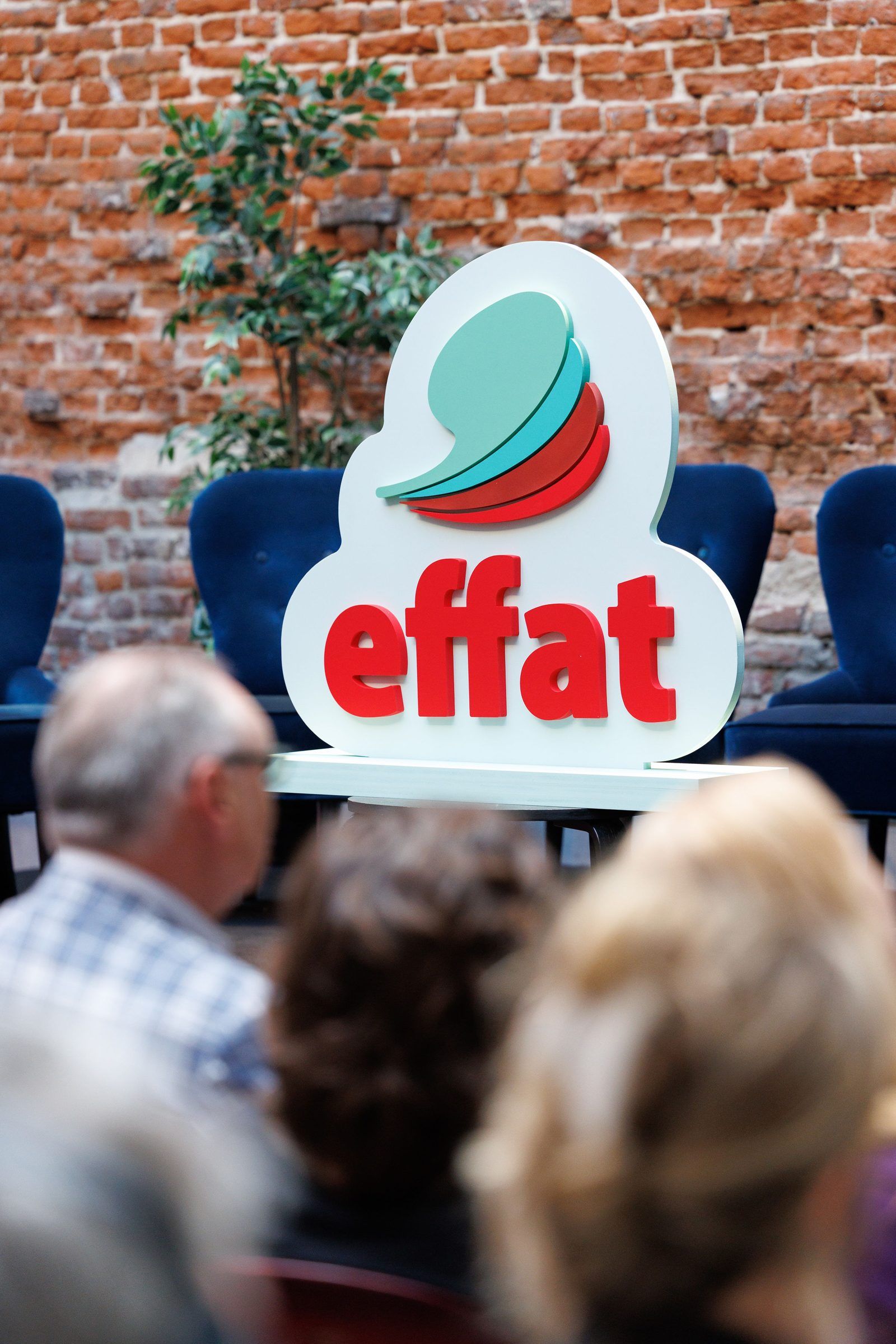
The symbol. The seed was redrawn as four layered forms rising from left to right. Each represents one of EFFAT’s four sectors, but together they read as one shape.
The layering also became a useful way to talk about the federation itself. EFFAT brings together different sectors and autonomous unions, each with its own role and identity, while giving them a shared European voice.
The new mark retains enough of the shape and character of its predecessor to remain familiar, while the open form and upward movement give it a very different energy.
The wordmark. EFFAT is set in a strong lowercase wordmark, with the federation’s full name underneath. The acronym is well established among members and European stakeholders, but not everyone encountering the organisation for the first time will know what it stands for. Keeping the full name visible makes the identity clearer for those wider audiences.
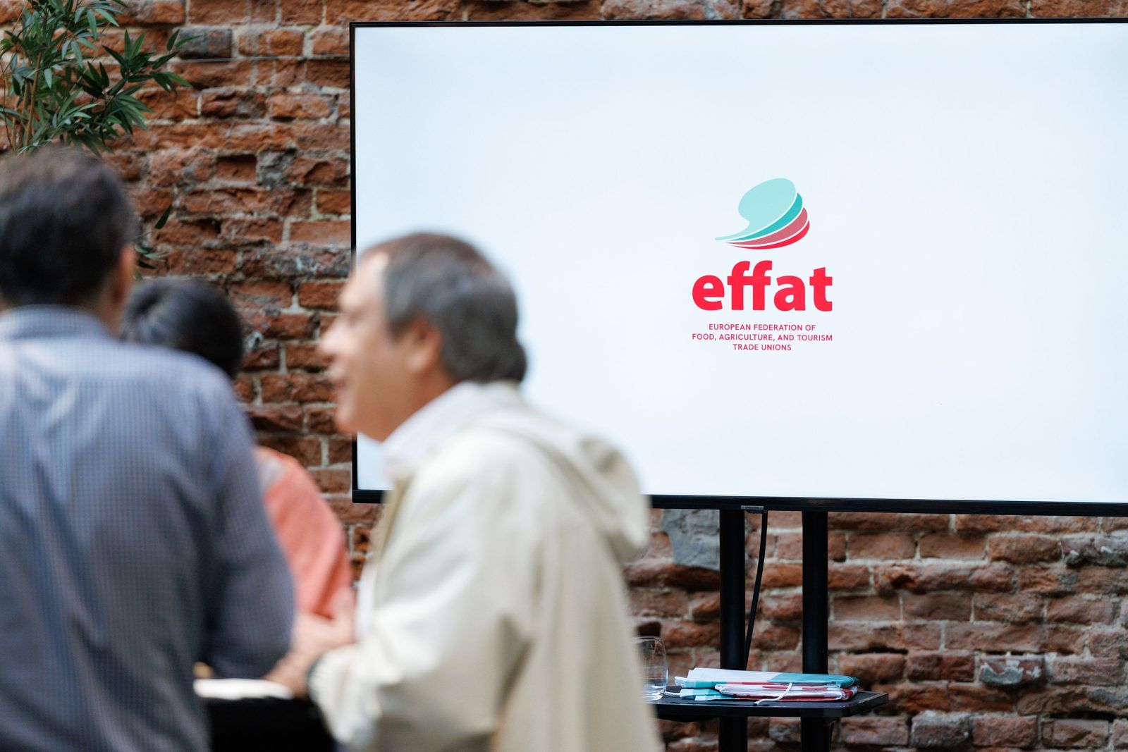
Colour. Red became the leading colour of the new identity, creating a stronger connection with EFFAT’s trade union roots and giving the federation greater visibility across campaigns and public communications.
Green remains part of the system, alongside mint, maintaining a connection with the previous identity and with EFFAT’s agricultural heritage.
The three colours are used in clear proportions, with red taking the lead and green and mint providing continuity and contrast. A small secondary palette is available when additional colours are needed for data visualisation and illustration.
Typography. Inter is used for longer text, while JetBrains Mono introduces a more distinctive voice for labels, figures and supporting information.
Both typefaces are open licence. For a federation with 121 affiliates, this was an important practical choice: anyone working with the identity can install the same fonts without additional licensing or purchasing.
Layout. The layered construction of the symbol also gave us the starting point for the wider visual system.
Content is organised in stacked blocks and cards, carrying the same principle into reports, presentations, campaign materials and social media. This creates consistency even when materials are being produced independently by different teams and affiliates.
Implementation and adoption
We wanted the system to be useful beyond the presentation in which it was approved.
The final guidelines run to 30 pages and bring together the logo, colour, typography, layout principles and practical examples across six chapters. They were designed to give both the Secretariat and affiliates enough guidance to use the identity consistently without needing to come back to us for every application.
Alongside the guidelines, we prepared a complete production suite. The logo was supplied in portrait and landscape versions, together with a symbol-only version and the file formats needed for both print and digital use.
The wider application set included A4 letterhead and a Word master, business cards, an HTML email signature, flags, beach flags, a three-metre banner, podium graphics, pins, stickers, a PowerPoint template, social media templates and a logo animation.
The new identity was introduced during EFFAT’s 25th anniversary celebrations in Brussels in June 2026. The guidelines were shared with affiliates shortly afterwards, giving them the tools to begin applying it themselves, with the wider rollout across the website, internal documents and communication channels beginning in August.
What happened
The identity is now in use, including on EFFAT’s website, and the first phase of the rollout began during summer 2026.
At the anniversary event, EFFAT’s communications team introduced the thinking behind the new mark to its members. The four layers were presented as the four groups of workers represented by the federation, growing together from the seed at the heart of the identity.
EFFAT described the change the following day in a way that captures the balance we were trying to achieve:
“An organisation rooted in tradition, now with a new look. The seed is sprouting. The next chapter is being written.”
What we can see is that the new system has moved from the anniversary launch into EFFAT’s day-to-day communications, while keeping the part of the identity its affiliates told us mattered most.
Penrose
 Sorin PavelBrand Strategy
 Andrei CotruțArt Direction
 Cătălina PuiuGraphic Design
- Cristi DorobantuVideo and Motion Graphics
Launch photography: Sophie Hugon.