
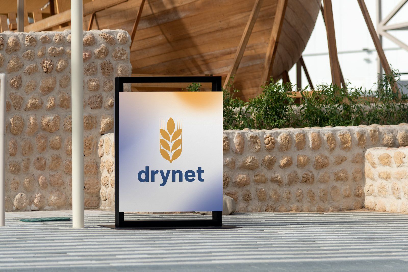
A visual identity refresh for a global civil society network, built around the symbol its members wanted to keep.
- ClientDrynet
- WorkBrand strategy and visual identity refresh
- Timeframe2026
- StatusIn use
The work
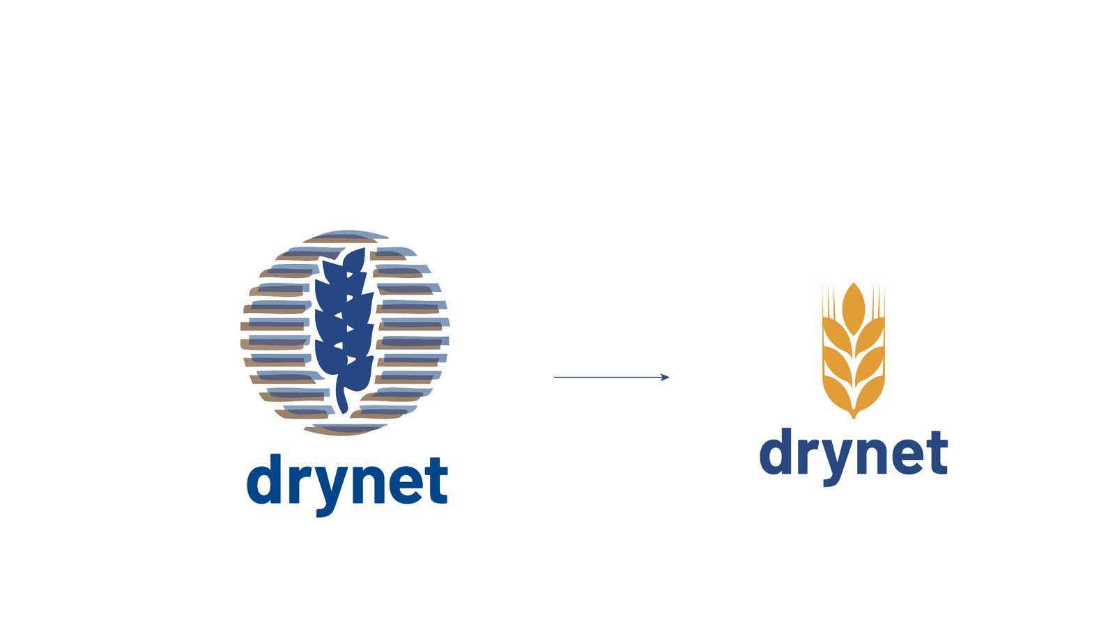
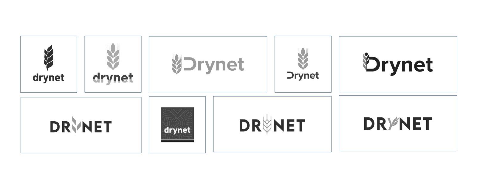
01The wheat is retained; the overlapping circle is removed.
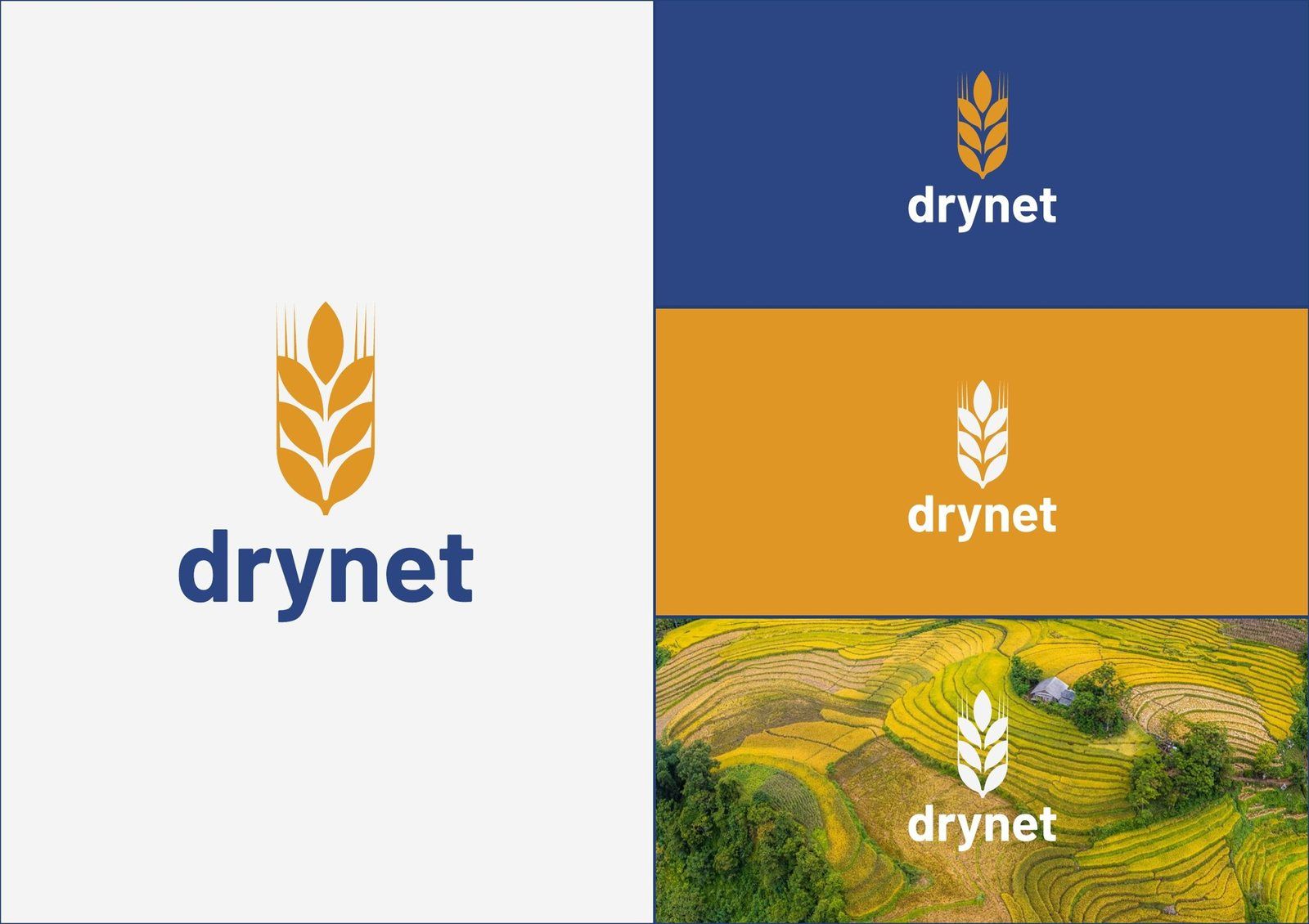
02The final logo in colour and white.

03A pattern drawn from the wheat motif extends the visual language beyond the logo.
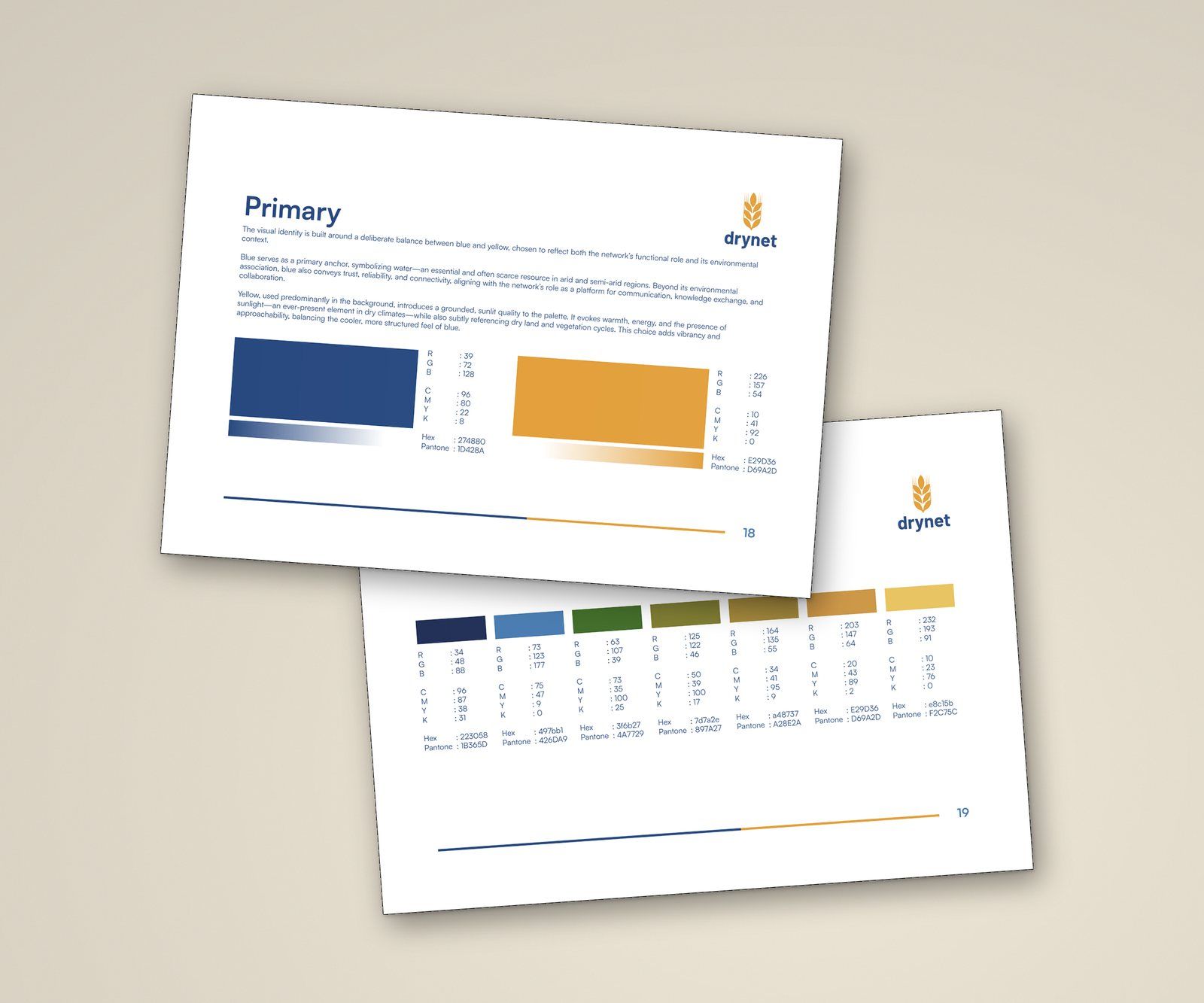
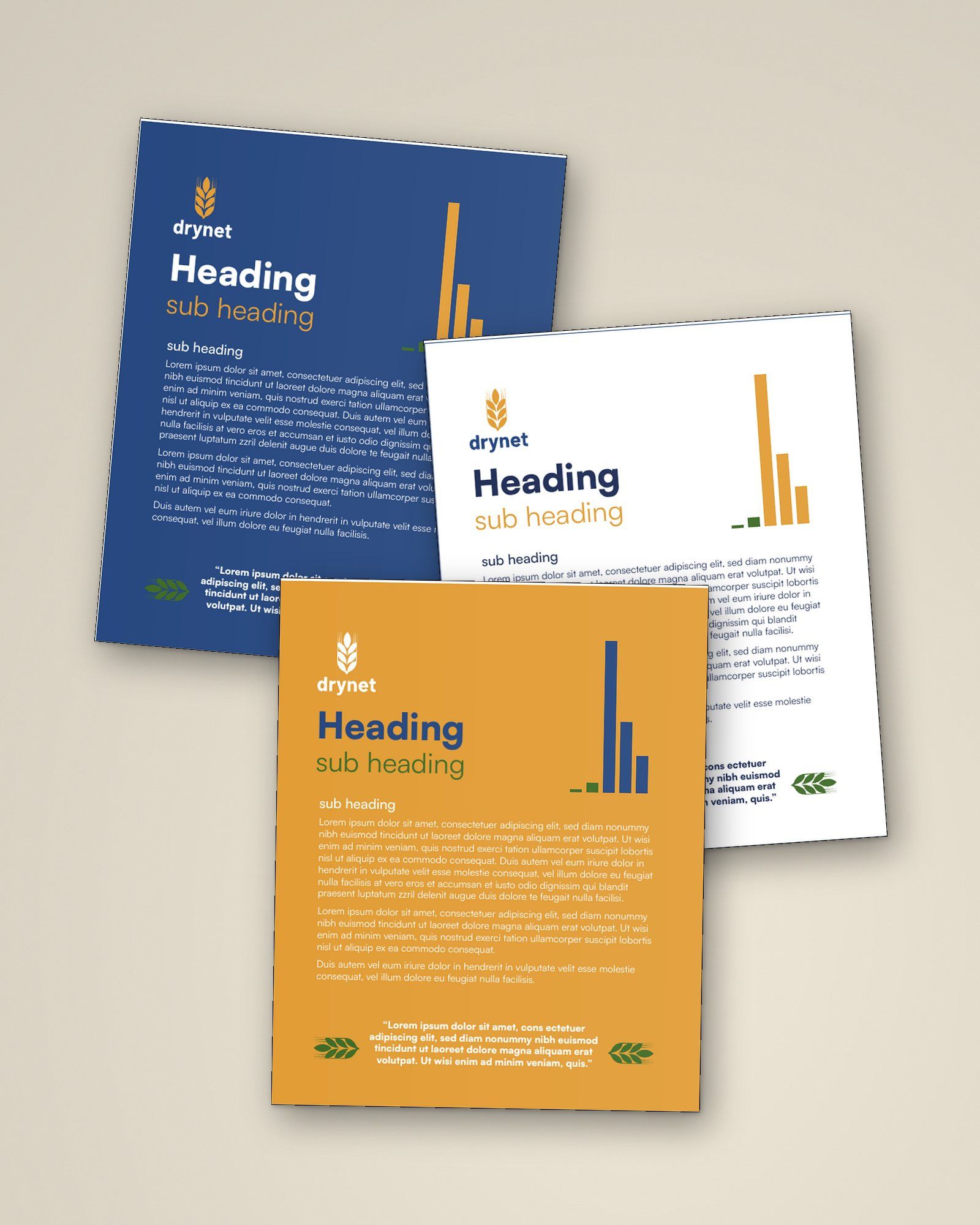
04Blue and gold lead the identity; secondary colours support illustrations and data.
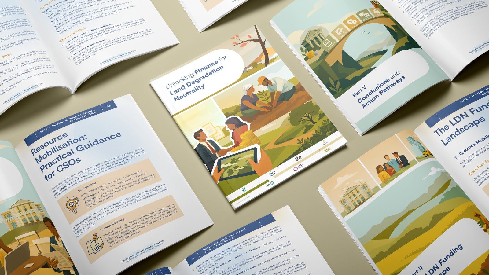
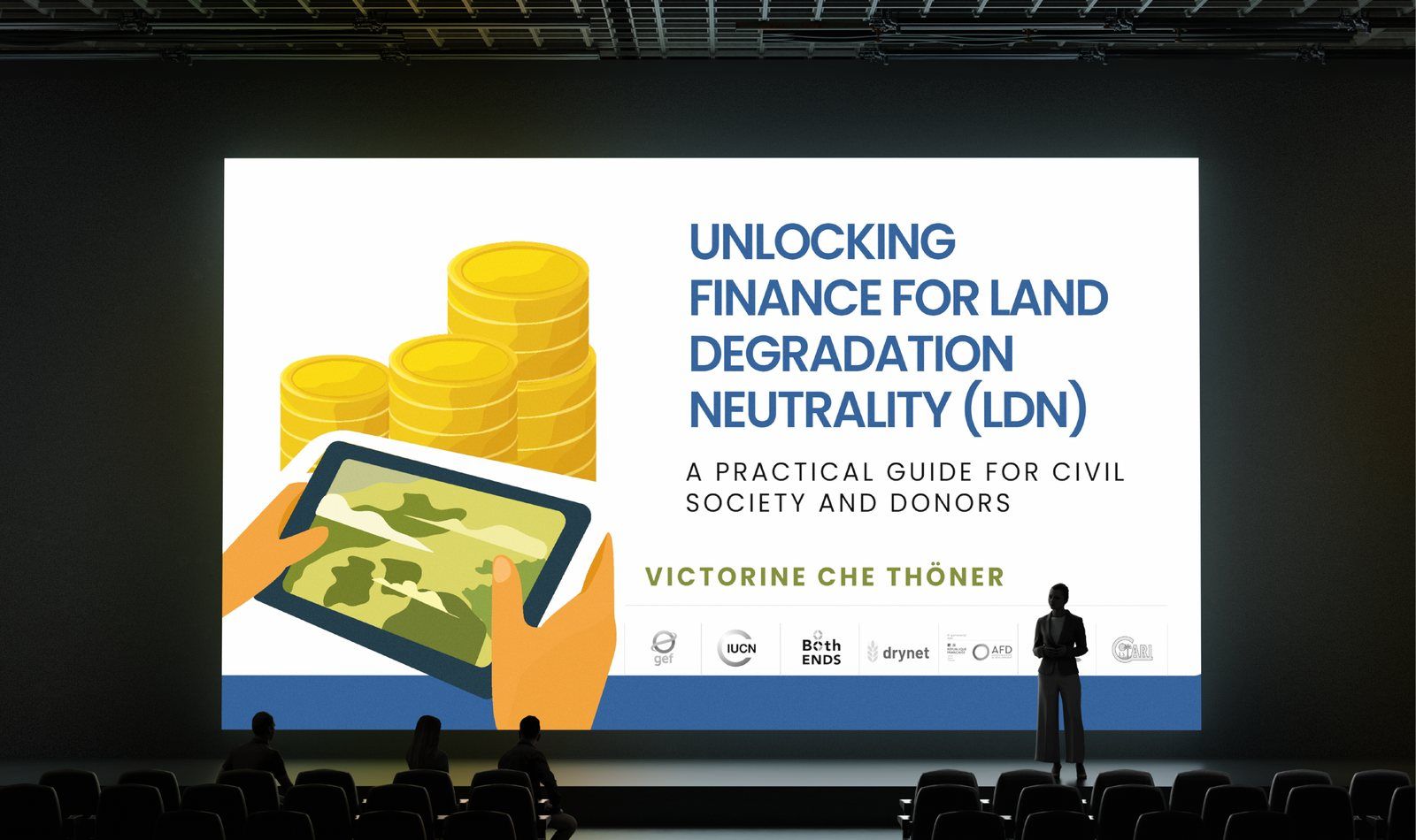
05The refreshed identity applied to Unlocking Finance for Land Degradation Neutrality.
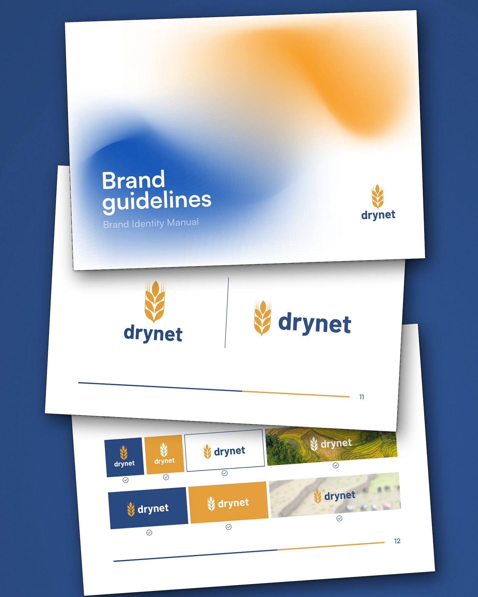
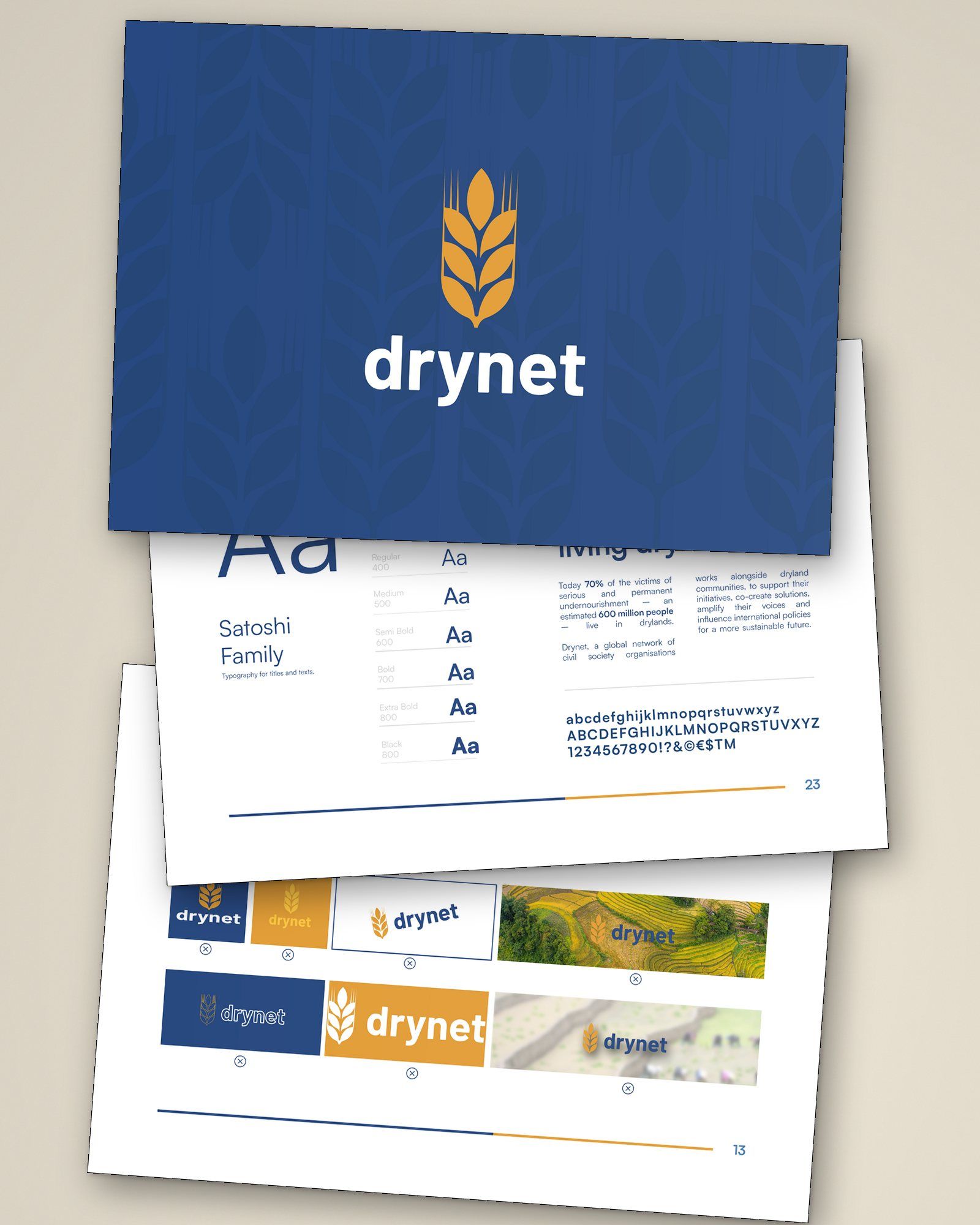
06Practical rules for applying the identity.
07The identity in motion.
Changing the identity meant understanding which parts held that recognition and which parts were getting in the way.
How we got there
In this case study
The Client
Drynet brings together 26 civil society organisations across Africa, Asia and Latin America working on sustainable land management and the future of drylands.
Its members work directly with communities and bring that experience into international policy discussions, particularly through the United Nations Convention to Combat Desertification (UNCCD). The network connects people working in very different places around a shared concern for land and the communities who depend on it.
The Assignment
We worked with Drynet to refresh its visual identity, covering discovery and brand strategy, the logo, colour and typography, brand guidance and motion.
The work began as Drynet reviewed its communications within the CS4LDN project, which supports civil society’s role in achieving Land Degradation Neutrality. A new report was being developed, creating an opportunity to introduce the refreshed identity in a substantial publication.
The challenge
Drynet’s previous logo placed a blue ear of wheat inside a circle of overlapping, striped lines. In discovery, members described it as dated, blurred and difficult to use on screen. The circle made the mark visually busy, particularly at small sizes.
The wheat carried a different meaning. Members associated it with Drynet’s history and wanted to keep it. Changing the identity meant understanding which parts held that recognition and which parts were getting in the way.
There was also a question of how the network should present itself. Drynet needed to feel warm and approachable to the communities it works with, while looking credible to government representatives and donors. Both audiences mattered to the brief.
What the research changed
We began with a discovery questionnaire that brought together views from within the network, followed by an interview with one of Drynet’s board co-chairs. The discussion helped us look more closely at what members valued in the existing identity and what they wanted it to communicate.
The first finding gave us a clear starting point: attachment to the wheat did not extend to the striped circle around it. Preserving recognition gave us room to simplify the mark and change its treatment.
The second finding concerned the meaning of the symbol. A wheat ear could suggest agriculture and food production, while Drynet’s work also encompasses forests, grasslands, biodiversity and the health of whole landscapes. We needed to keep the familiar symbol while opening its meaning towards growth, regeneration and the network itself.
The interview also clarified the balance between local work and global advocacy. Drynet’s knowledge comes from its members’ experience on the ground; its ambition is to bring that knowledge into the decisions that shape land policy. The network was described to us as “connected with a common purpose and agenda”. The identity needed to express the care behind that shared work and the confidence to take part in policy discussions.
Three qualities shaped the direction: warmth, human connection and hope. These gave us a way to evaluate the options alongside recognition, clarity and relevance to the network’s future.
The constraints
The identity had to work across a network whose members have different resources and communications needs. The brief called for practical guidelines and a system that would be straightforward to use in everyday materials.
The visual direction also needed warmth and energy. Discovery pointed towards colours associated with soil and sunlight, and imagery showing people’s relationship with land and the possibilities for regeneration. These ideas helped us explore a wider range of treatments for the wheat.
The response
We redrew the wheat as seven grains growing from a single stem and removed the striped circle around it. The simpler shape keeps the point of recognition and gives the symbol a clearer outline.
The grains also offered a way to express the network: individual parts growing together, connected through a common purpose. This became the idea behind the refreshed identity.
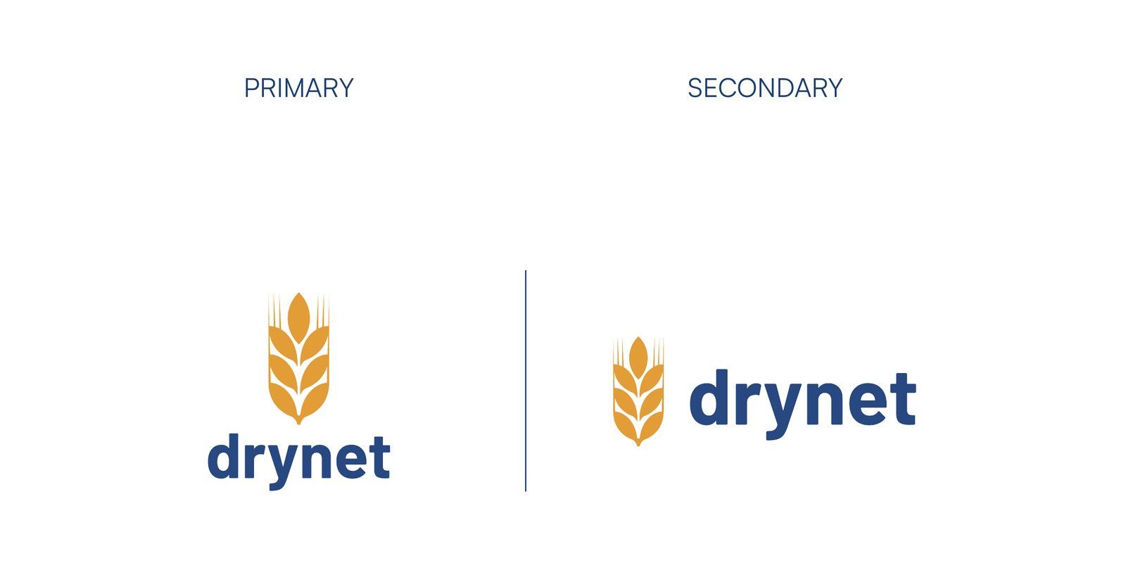
The core palette pairs deep blue with warm gold. Blue connects the identity to water, an essential and often scarce resource in drylands, and to Drynet’s role in communication and knowledge exchange. Gold brings in the warmth of soil and sunlight. In the logo, the gold wheat and blue name give each element a clear role.
A clear, bold lowercase wordmark keeps the name direct and approachable. The symbol can also appear on its own, while colour and white versions allow the identity to work on light and dark backgrounds.
A pattern drawn from the wheat motif extends the visual language beyond the logo. The wider palette also gives the identity room to work with more complex content. Secondary earth tones support illustrations, diagrams and data visualisations, while green is used as a limited accent.
Implementation
The 27-page brand guidelines bring the system together: logo versions and usage rules, application examples, the primary and secondary palettes, and a clear typography hierarchy.
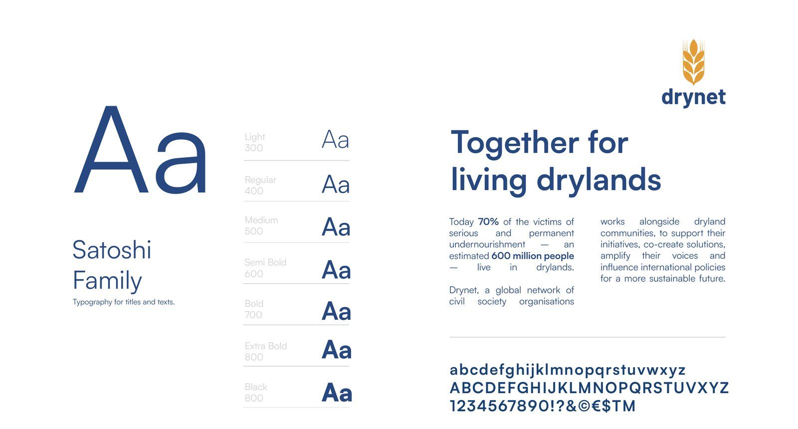
A single, legible typeface serves headings and body copy. It is freely available, so members can download it without an additional font purchase. Examples show how blue, white and gold can lead a layout, with secondary colours supporting more detailed content. These choices give the network a practical starting point for producing consistent materials.
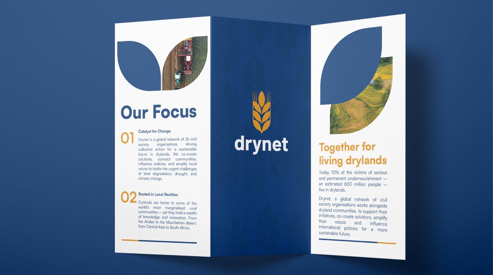
Unlocking Finance for Land Degradation Neutrality became the first major publication created in the refreshed identity. It applied the new logo and visual language to a report intended for civil society organisations, donors and policy audiences.
We also developed animated versions of the identity in landscape and square formats. These extended the logo into motion for digital communications.
The wheat that members recognised remains the starting point. The refreshed identity gives Drynet clearer forms, a more deliberate use of colour and practical guidance for presenting its work.
Penrose
 Sorin PavelFounder
 Andrei CotruțArt Director
 Cătălina PuiuGraphic Designer
- Victor JanteaMotion Graphics