
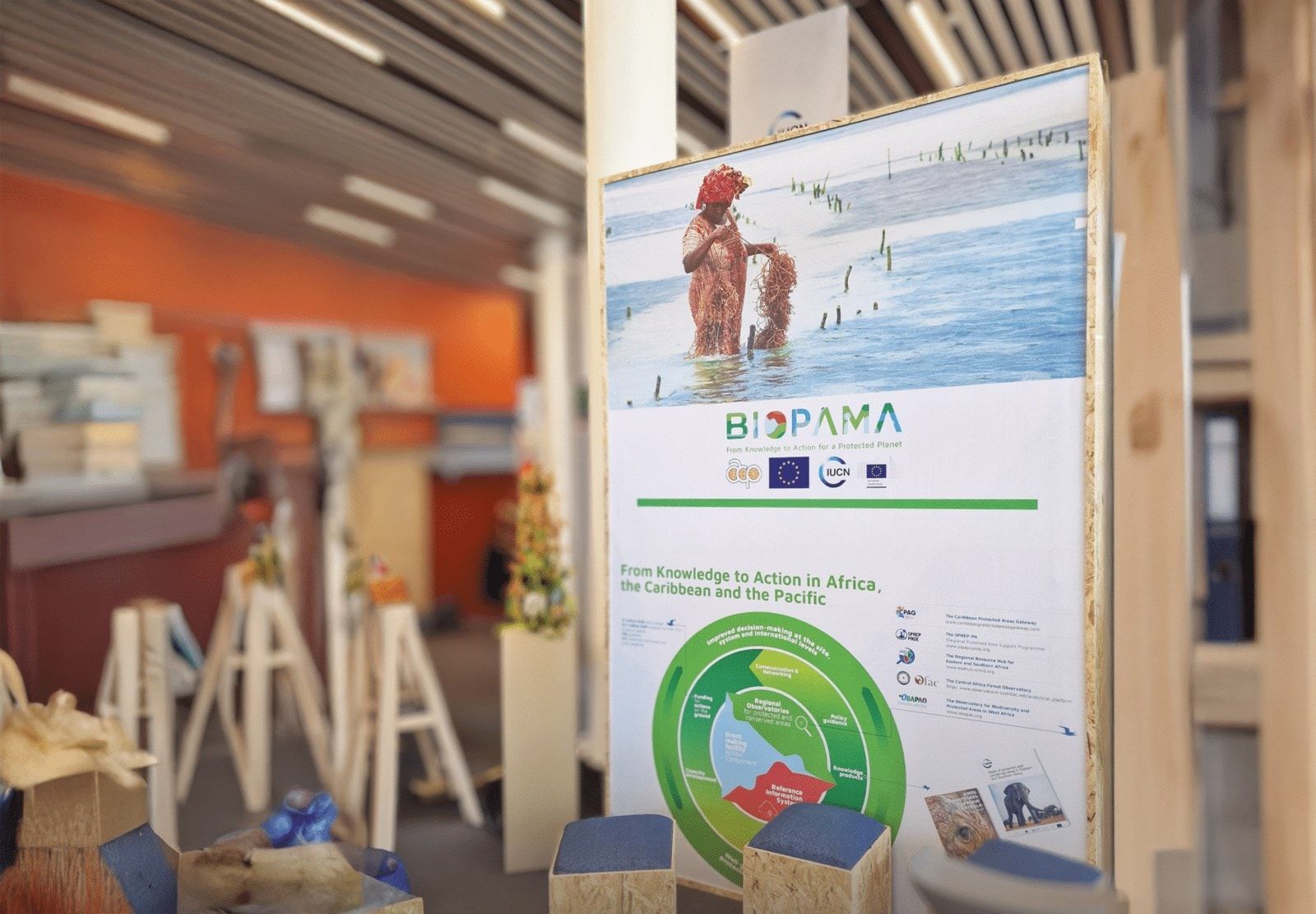
BIOPAMA brought together conservation knowledge, funding and local action across Africa, the Caribbean and the Pacific. From 2017 to 2025, we worked with IUCN and the European Commission’s Joint Research Centre on the identity, websites and digital tools that helped people take part in the programme.
Visit the website (opens in a new tab)biopama.org
- ClientInternational Union for Conservation of Nature (IUCN) and the European Commission’s Joint Research Centre (JRC), for BIOPAMA
- WorkVisual identity, communications, websites, Reference Information System UX/UI and data visualisation
- Timeframe2017–2025
- StatusProgramme completed in 2025. Identity also used in the BIOPAMA II Impact Report published in 2026.
The work
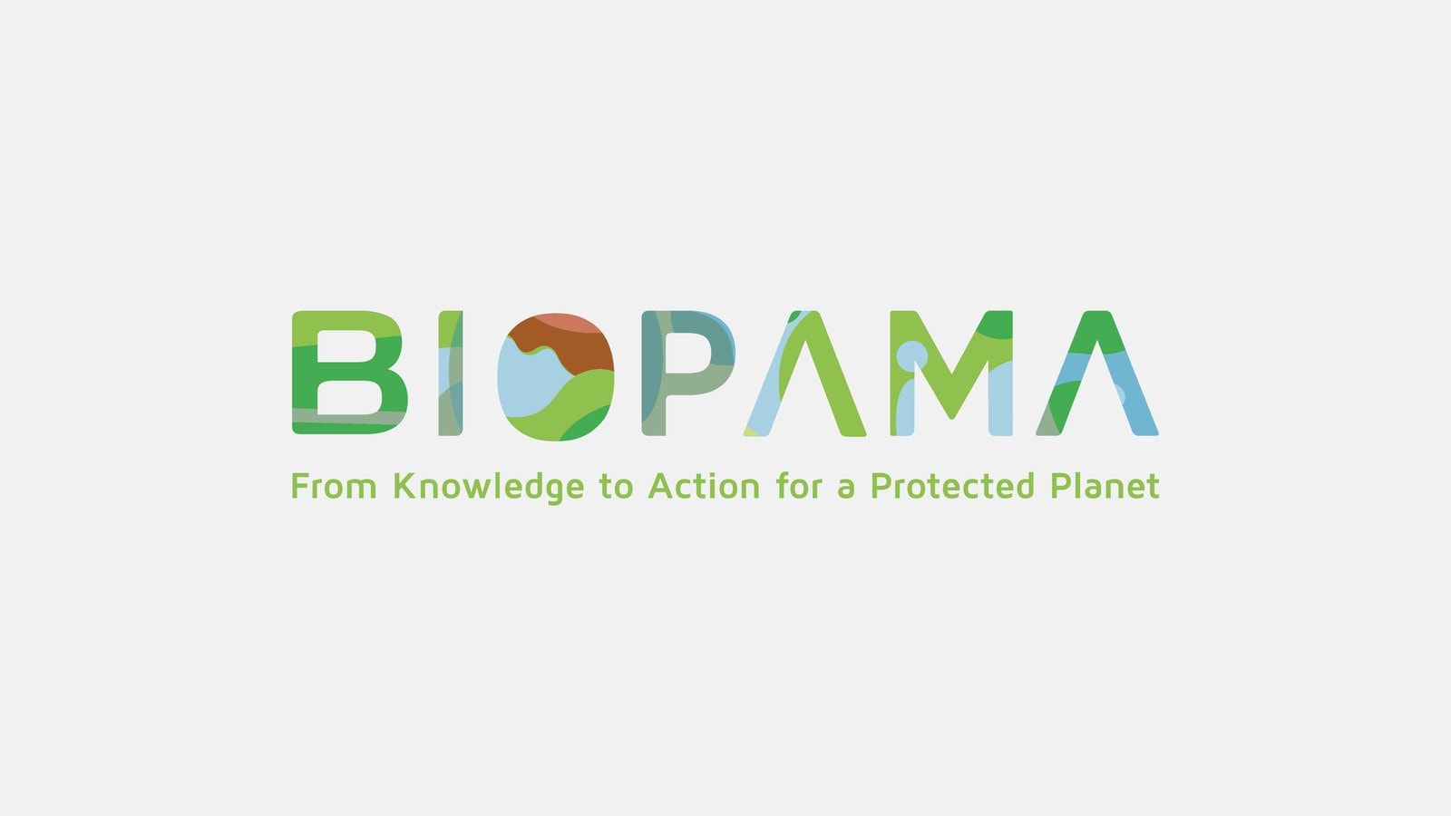
01Land and water carried through the BIOPAMA name.
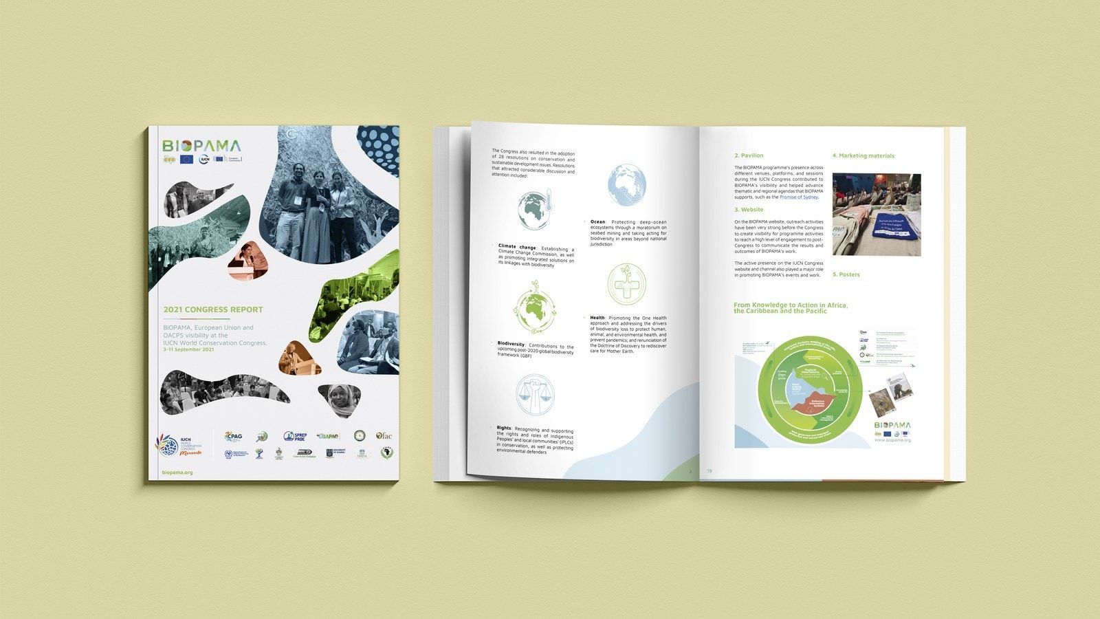
02One visual language, with room for regional photography and content.
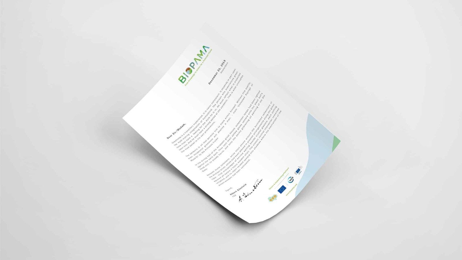
03Guidelines and practical materials for teams across the programme.
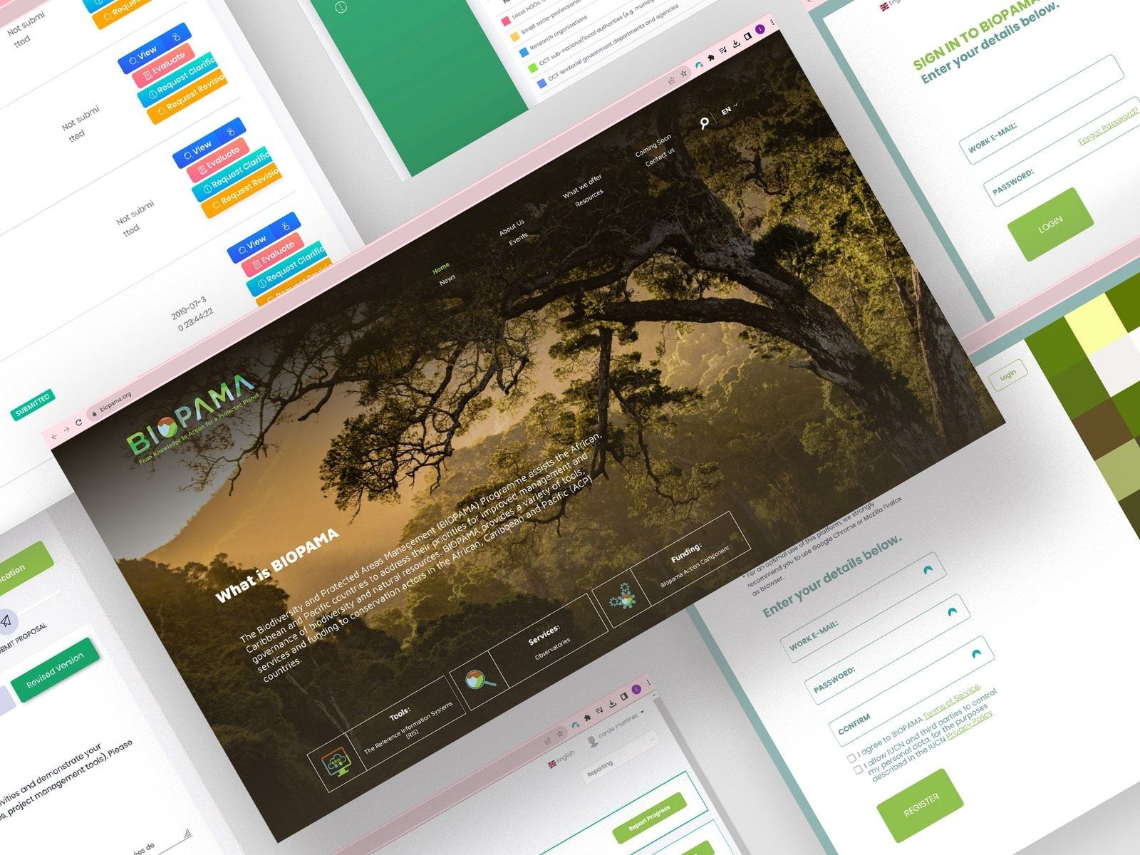
04Information about the programme, its funding opportunities and how to take part.
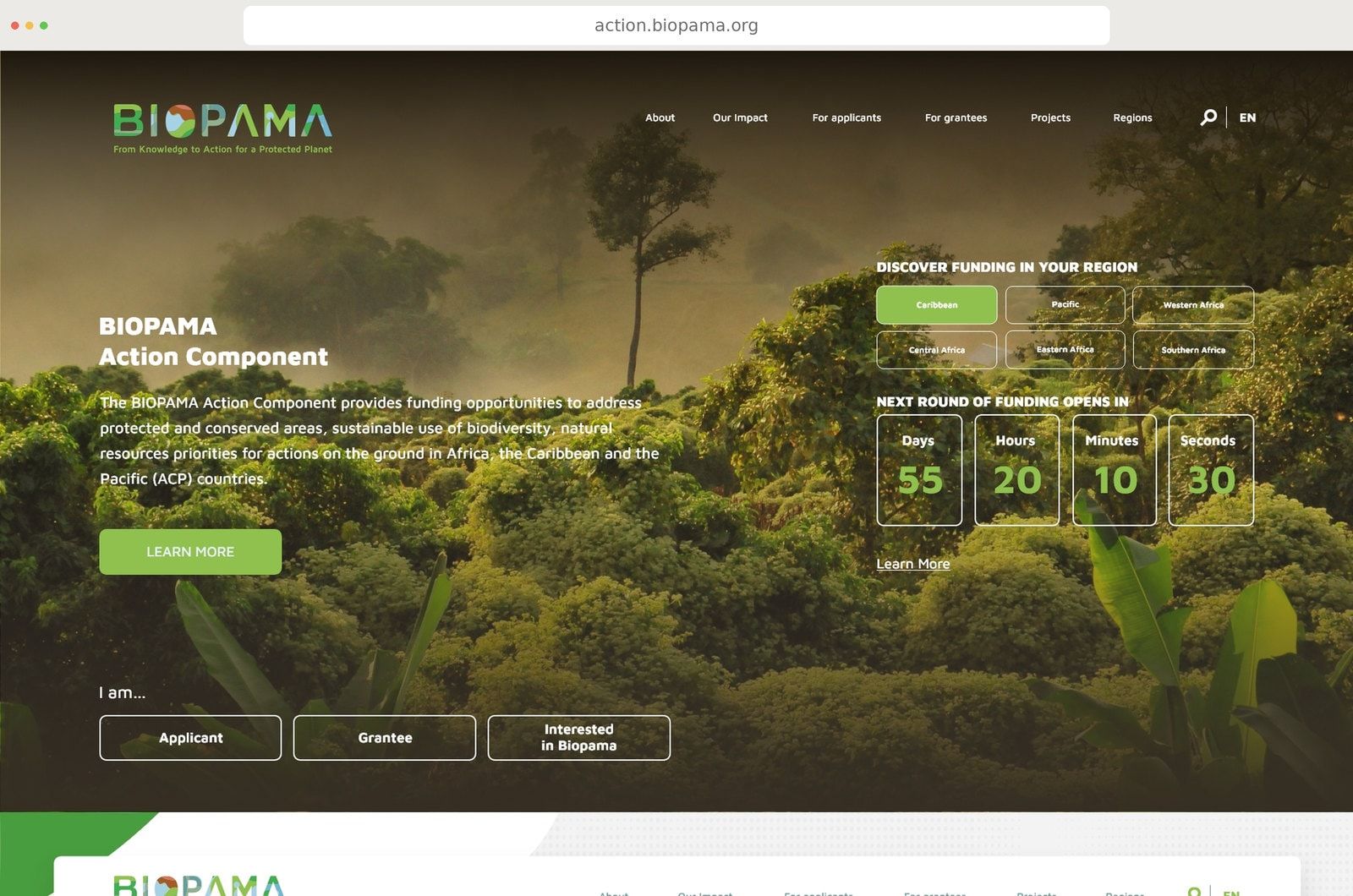
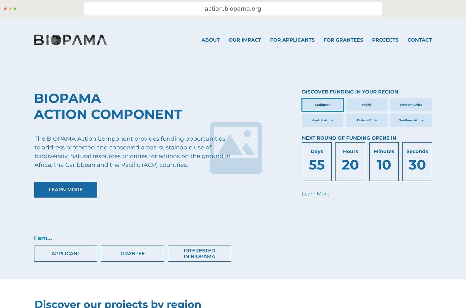
05The Action Component website, from wireframe to design.
A shared visual language and a set of public websites helped people recognise BIOPAMA and find their way into its work. Our interface design for JRC addressed how they accessed and understood its conservation data.
How we got there
In this case study
The challenge
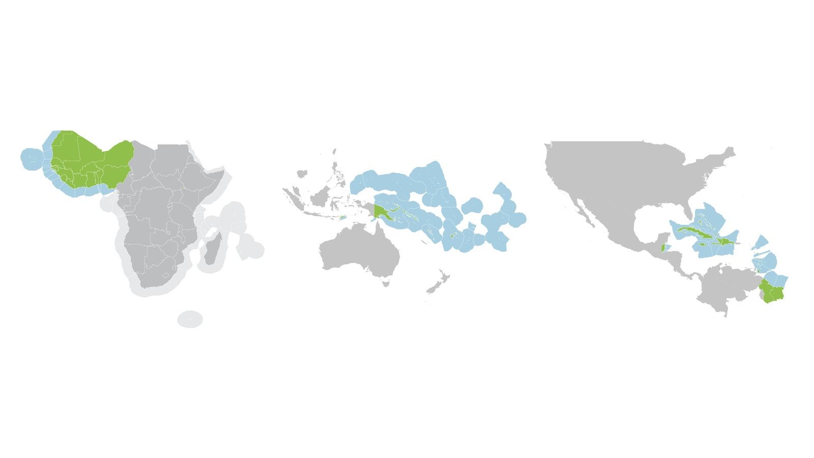
The Biodiversity and Protected Areas Management Programme, or BIOPAMA, supported the management and governance of protected and conserved areas in 79 countries. An initiative of the African, Caribbean and Pacific Group of States, it was financed by the European Union and implemented by IUCN and JRC.
Its work brought together two things that need each other: reliable information about conservation priorities and the resources to act on them. Regional observatories and information systems helped people understand those priorities. The Action Component provided grants for work on the ground.
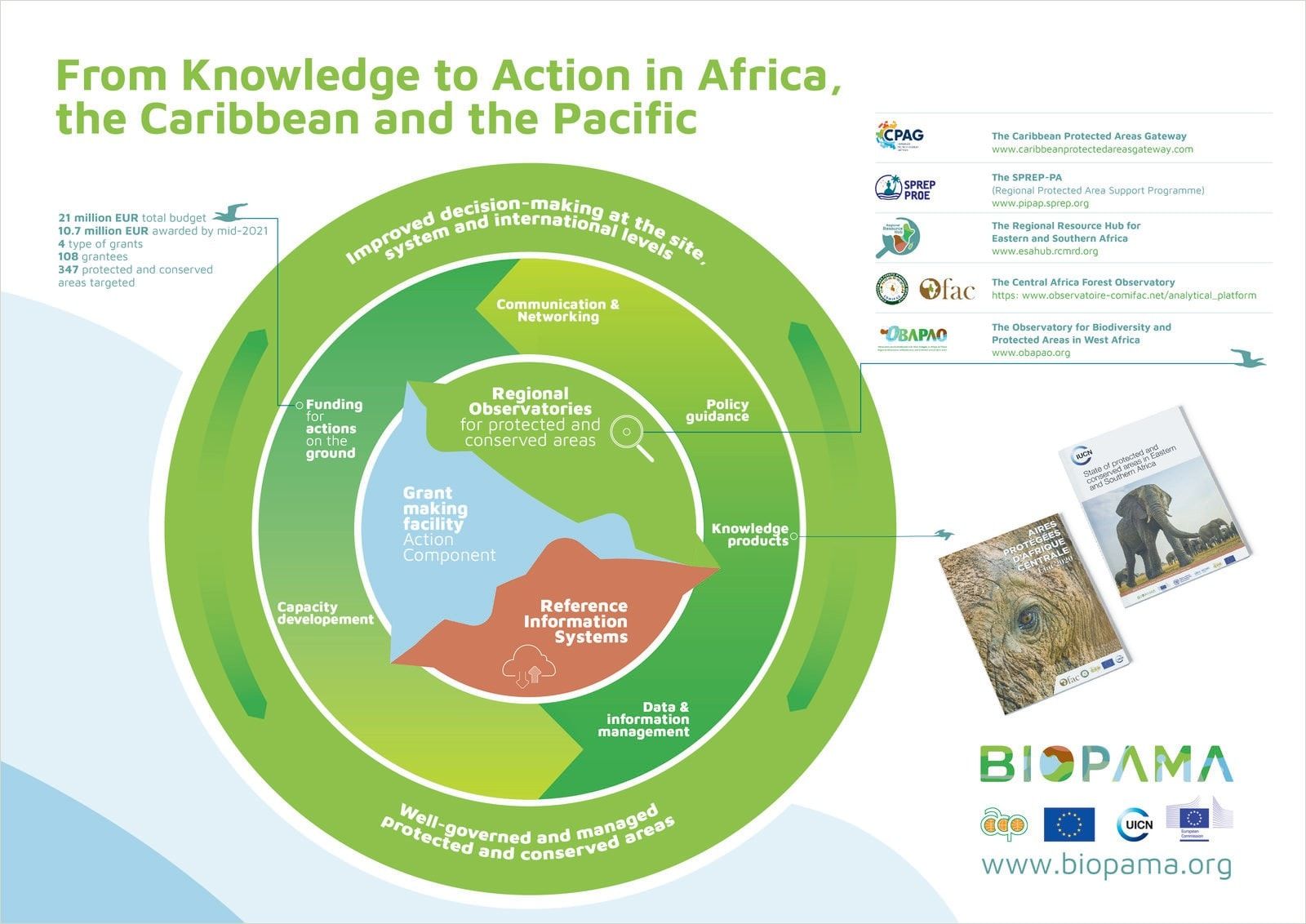
That meant serving people with very different responsibilities. A protected-area manager might need to interpret biodiversity data. A local organisation might be looking for support for its work. A regional communications team needed to share information relevant to its own part of the programme.
The identity and digital tools needed to make sense across those situations, languages and regions. They also needed to work for people whose internet connection could not be taken for granted.
Objective and brief
Our work began in 2017, at the start of BIOPAMA’s second phase, with the visual identity and website. Over the following years, the relationship grew through separate commissions from IUCN and JRC.
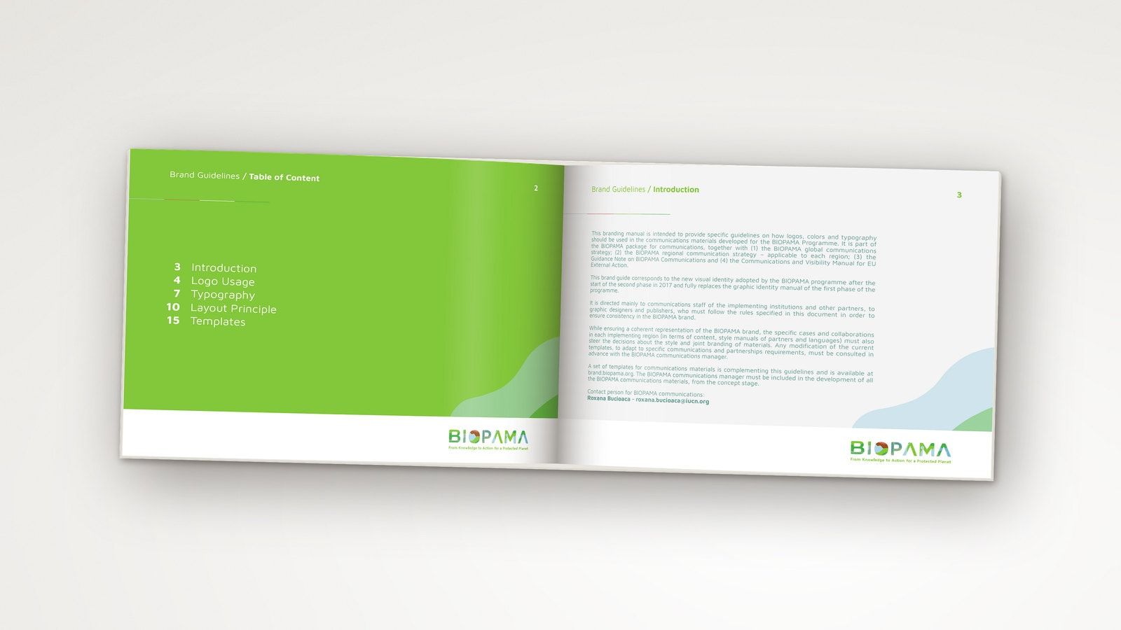
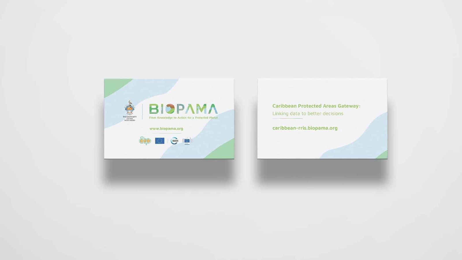
The identity needed to give a distributed programme a recognisable visual language, with guidelines and templates that regional teams and partners could use in their own communications.
The public websites needed to explain the programme and give its audiences clear routes to information, resources and funding opportunities. They also needed to remain manageable for the communications teams responsible for keeping that content useful.
For JRC, the brief concerned the second iteration of BIOPAMA’s Reference Information System: rethinking the user journey and designing an interface and data-visualisation system that would help people work with its conservation evidence.
What the research changed
The UX work included user interviews, regional validation workshops and iterative testing. We considered the needs of people communicating the programme and those using its conservation information, alongside the conditions in which they worked.
The public websites and the Reference Information System served different purposes. The websites introduced the programme and helped visitors find relevant news, resources and opportunities. The information system supported people working with maps, indicators and biodiversity evidence. Each needed a structure suited to those tasks, within a recognisable BIOPAMA experience.
The work also needed to be sensitive to regional contexts. Teams had different content, languages and audiences, and some users worked with limited or unstable internet connections. Multilingual content, responsive interfaces and usability in low-bandwidth settings were part of the design brief.
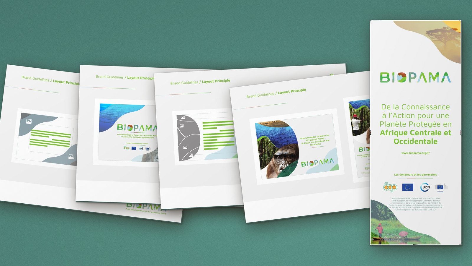
For the identity, regional variation needed room within a shared system. Guidelines and templates gave teams a consistent starting point while allowing them to use photography and material relevant to their own work.
The constraints
BIOPAMA was one programme working through multiple institutions and regional partners. The visual system needed to accommodate different languages, local photography and joint branding while meeting donor and implementing-partner visibility requirements.
There were also different technical needs within the same programme. Public websites needed to be straightforward for communications teams to maintain. The information system depended on the scientific data and services developed by JRC, with an interface that could make that material approachable for users with different levels of technical experience.
Working across countries, continents and time zones made coordination part of the design process. Decisions had to accommodate regional needs while keeping a coherent structure across the programme.
The response
An identity that could travel
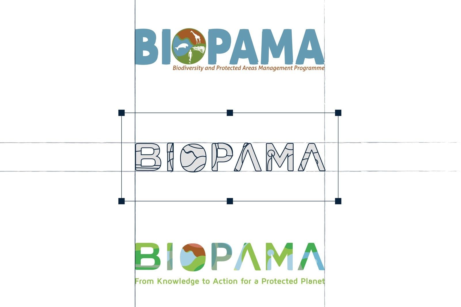
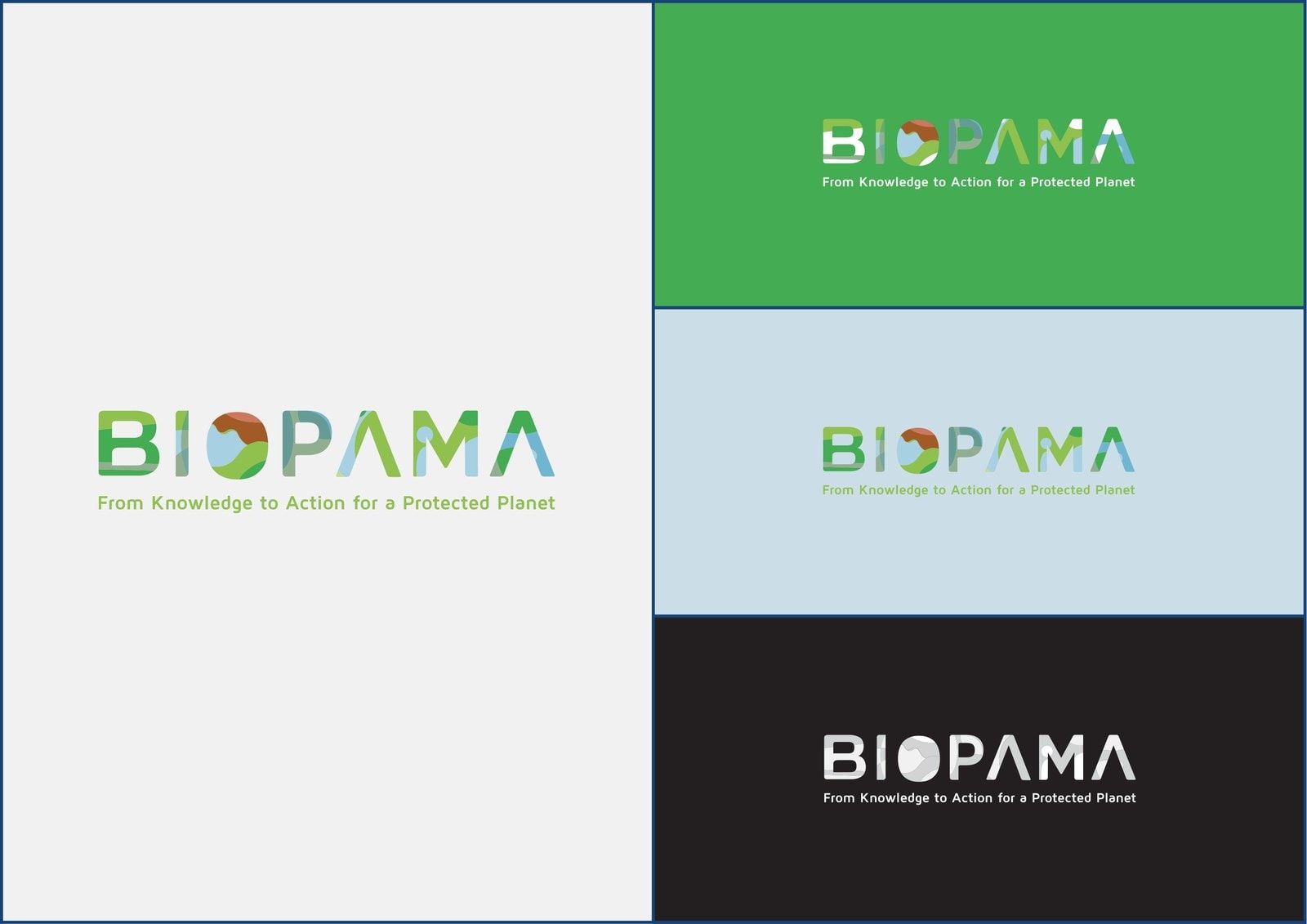
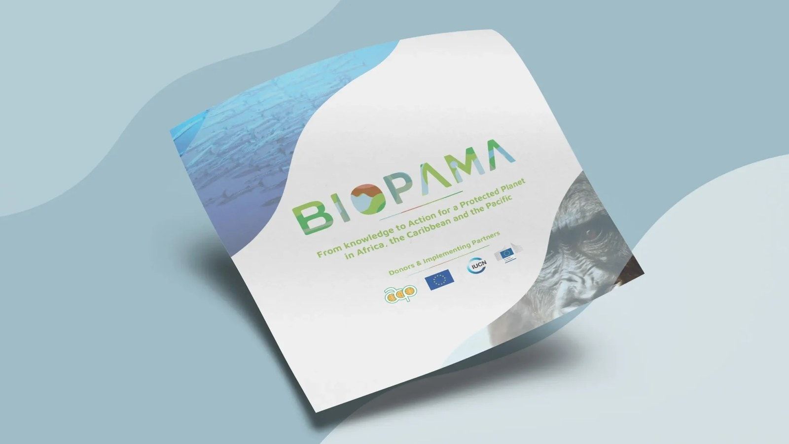
The BIOPAMA wordmark brings land and water into the lettering. Patches of green, teal, blue and earth tones form an abstract landscape across the name, with the circular O also providing a compact symbol for digital applications.
The same flowing forms extend into layouts, framing photography and giving reports, banners and presentations a recognisable shape. Regional teams could use images relevant to their own work while retaining a shared visual language.
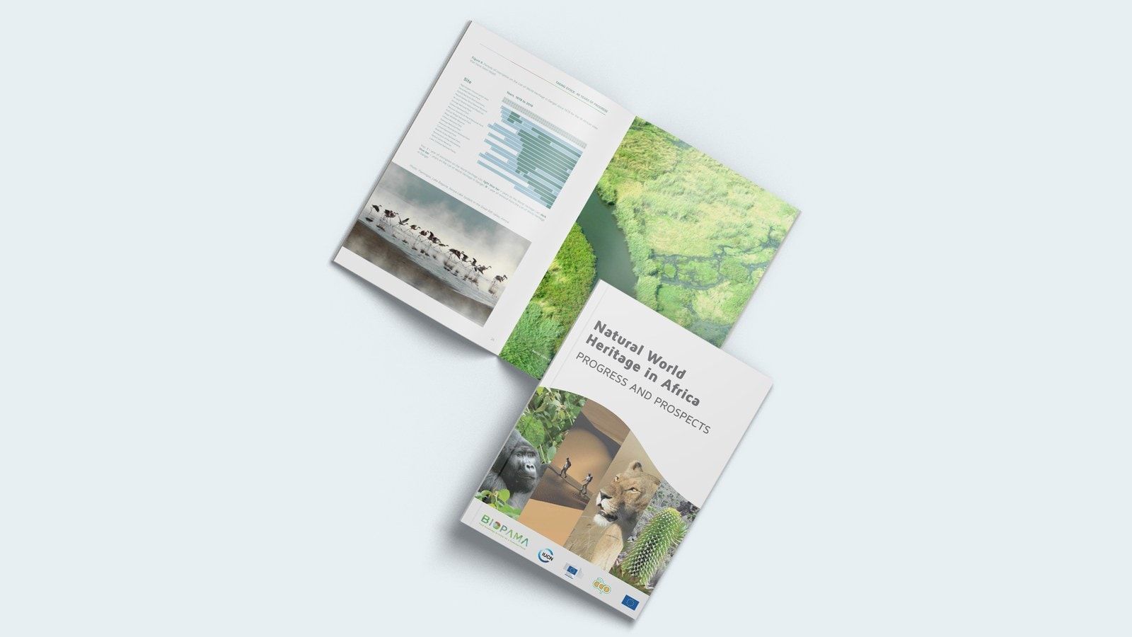
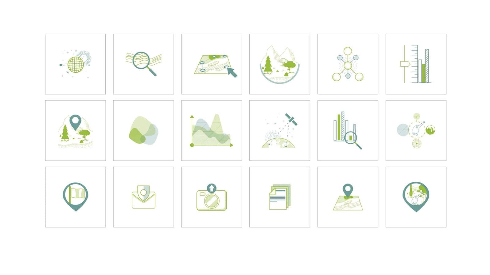
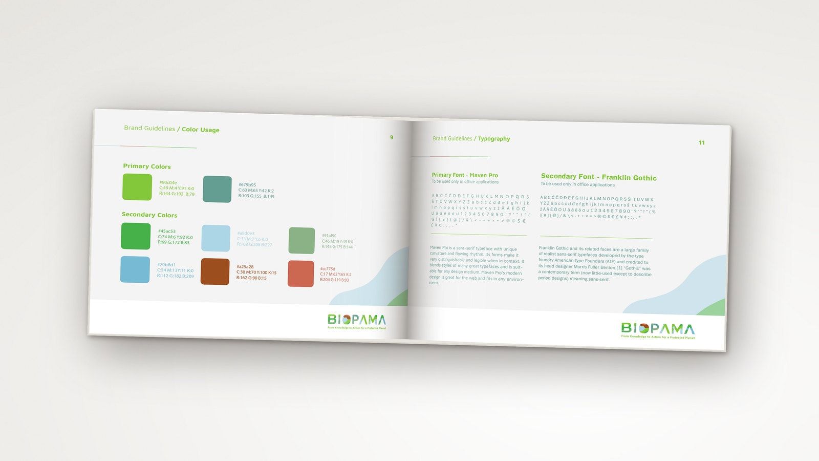
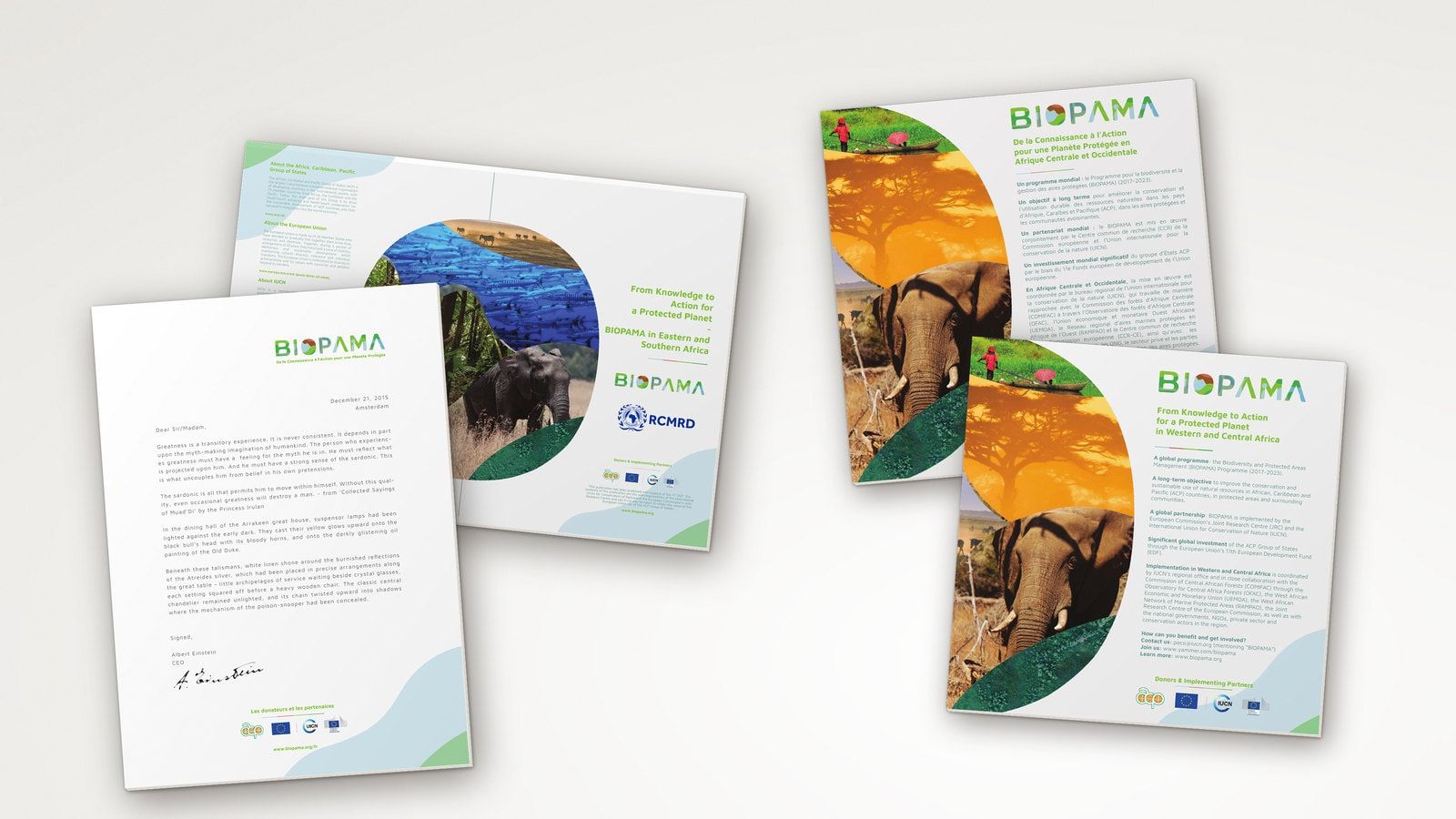
The guidelines, issued in December 2017, set out logo variants, colours, typography, layout principles, photography and partner branding. Templates translated those rules into materials people needed to produce: publications, leaflets, letterheads, folders and presentations. Custom iconography extended the system into communications and digital interfaces.
A clear route into the programme
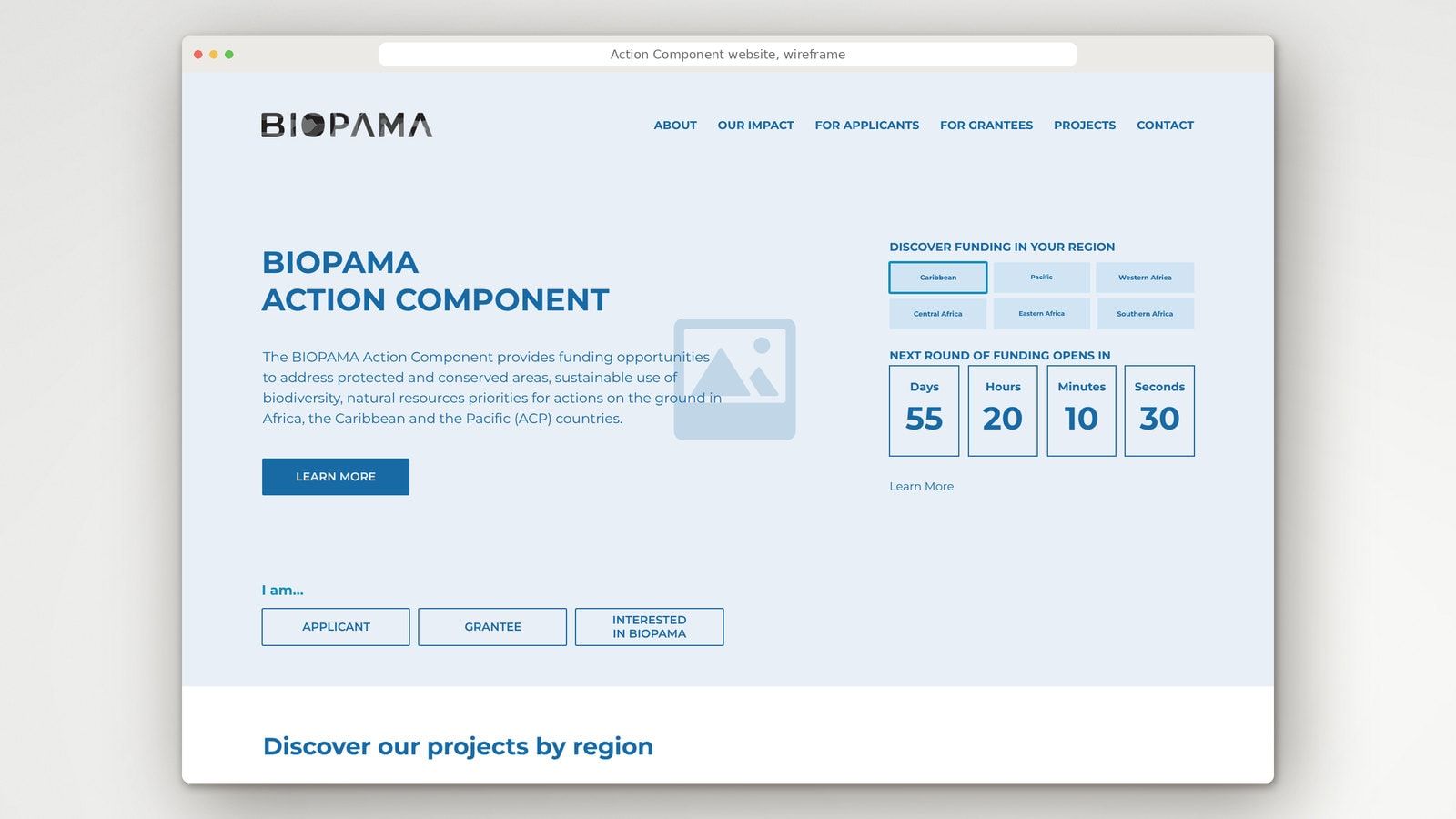
We designed and developed the main BIOPAMA website and the public Action Component website. The latter explained the funding opportunities, requirements and application process, with a route into the application itself.
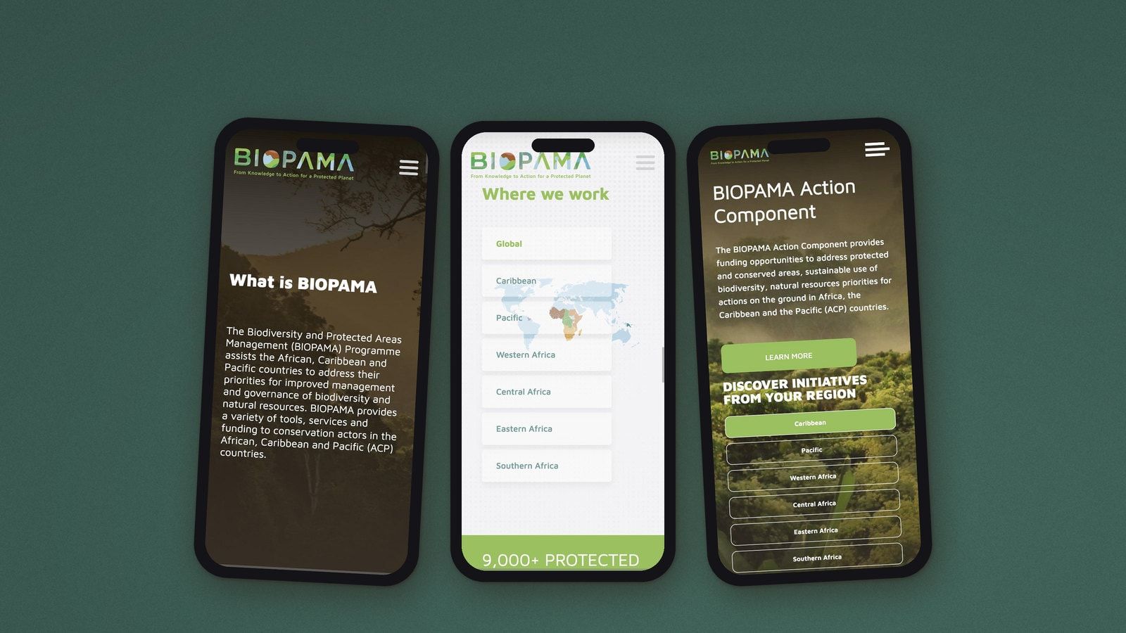
The main website initially used Drupal. As the programme’s needs developed, we redesigned it and migrated it to WordPress, carrying over and adapting the existing content. The Action Component website also evolved from a presentation landing page into a fuller resource for applicants and grantees.
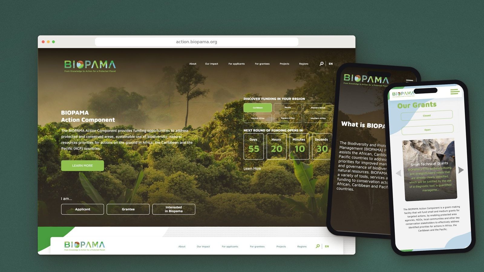
Our wider work for IUCN also included a separate grant-management platform, supporting applications, assessment and grant follow-up.
Making conservation data easier to use
Our work for JRC addressed another part of the programme: how people found and understood the evidence available through the Reference Information System.
We worked on its concept, user journeys, interface and data visualisation, connecting navigation with the maps, indicators and conservation information people needed to interpret. The aim was to make the system more approachable for users with different levels of technical experience.
JRC remained responsible for the scientific platform, its data and its underlying development. Our contribution concerned the experience through which people accessed that work.
Implementation
The work developed over the life of the programme, with the identity, communications materials and public websites evolving alongside its needs. We supported the websites through ongoing development and maintenance, as well as the hosting infrastructure under our management.
The public websites used established open-source technologies, first Drupal and later WordPress. These provided foundations that could be maintained and handed over as the programme’s needs changed.
For the infrastructure we managed, we used Leafcloud VPS hosting in the Netherlands. Leafcloud uses renewable electricity and recovers server heat for use in buildings. Hosting was one way to bring the environmental purpose of the programme into the decisions behind its digital services.
The brand guidelines and templates gave communications staff and regional partners practical tools for producing materials themselves, across publications, presentations, events and digital communications.
What happened
Our work with BIOPAMA continued from 2017 through the end of its second phase in 2025. The identity remained part of the programme’s communications and appears in the BIOPAMA II Impact Report published in 2026.
The main website moved from Drupal to WordPress as the programme developed, carrying its existing content into the new structure. The public Action Component website grew from a landing page into a fuller resource for applicants and grantees. Alongside these, our work for JRC addressed the user journeys and presentation of conservation evidence in the Reference Information System.
The lasting result is visible across the programme’s communications: a recognisable identity applied to regional materials, websites, publications and its final impact report.
Penrose
 Sorin PavelLogo design, UX leadership, solution architecture and project coordination
 Andrei CotruțLogo design, illustration and custom iconography
 Viorel UngureanuPublications, templates and print materials
 Cătălina PuiuGraphic design
 Elena ReghintovschiUI design for the websites and the Reference Information System
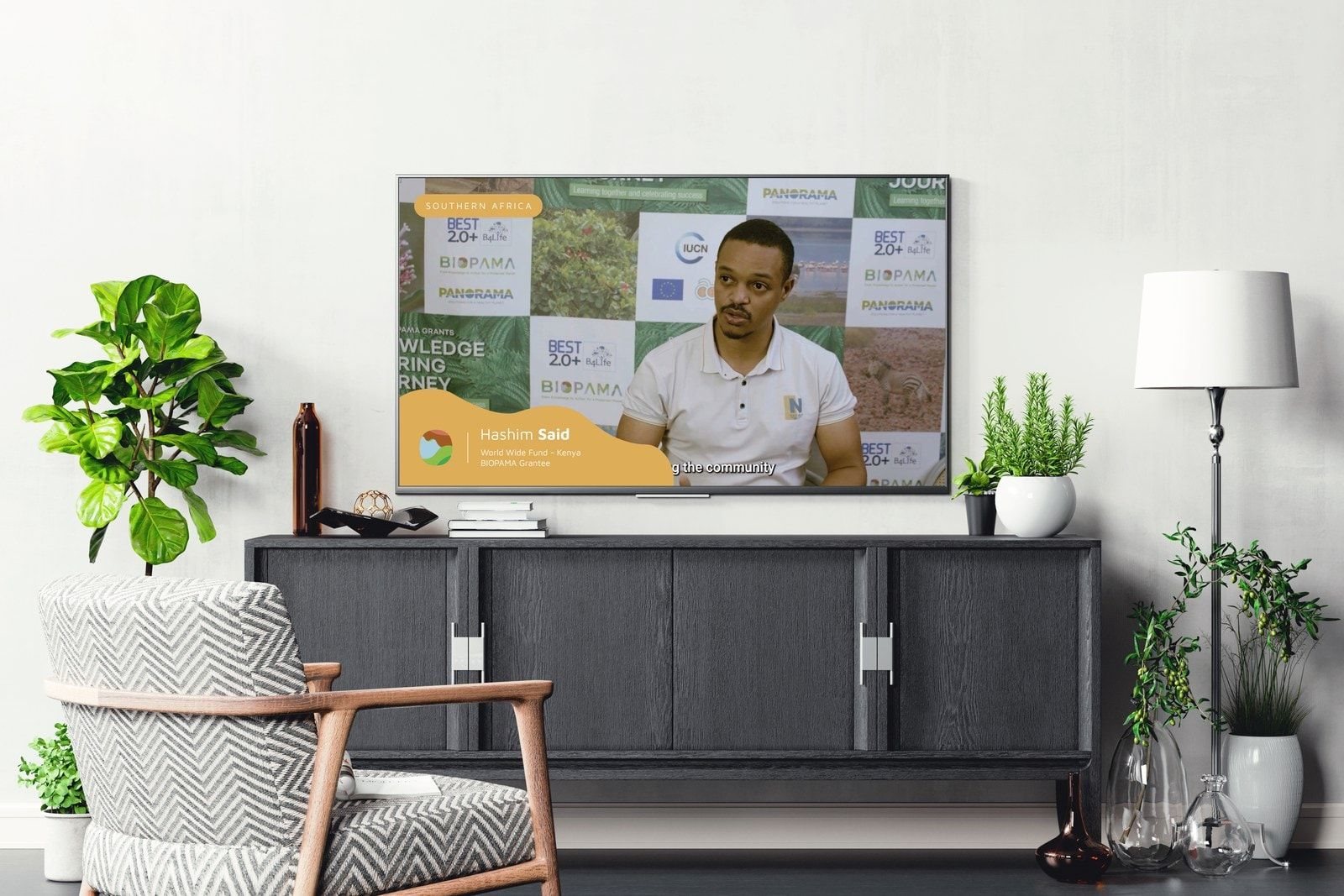
- Victor JanteaMotion graphics and video
 Bogdan PârvulescuWebsite development
 Cristi LunguWebsite development
With: IUCN’s BIOPAMA communications team, regional colleagues and the European Commission’s Joint Research Centre.