
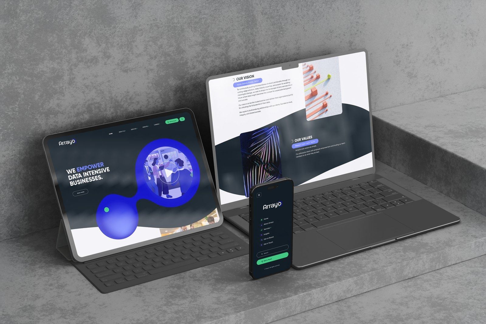
Arrayo helps financial services and life sciences organisations make better use of their data. Based in Boston and New York, its teams work on challenges ranging from risk and regulatory compliance to biomedical research and drug development. We worked with Arrayo to bring those specialisms into a shared visual identity, website and animation. Keeping its existing logo and symbol, we developed a wider design system that gave each side of the business its own expression while keeping the company recognisable as a whole.
Visit the website (opens in a new tab)teamarrayo.com
- ClientArrayo, Boston and New York
- WorkResearch, visual identity refresh, brand guidelines, stationery, website design and development, animation
- Project2023–2024
The work
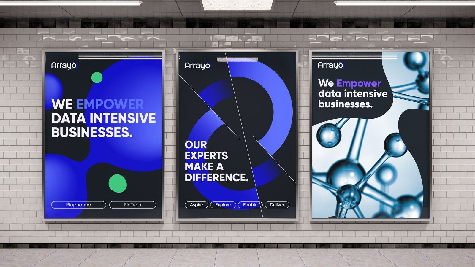
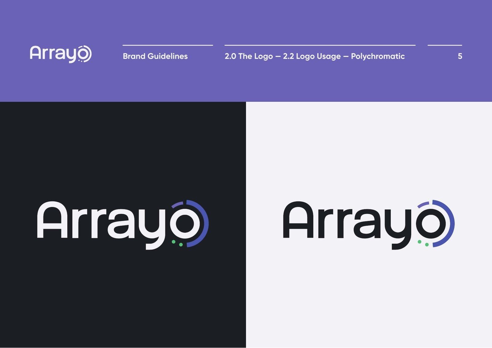
01We retained the logo and symbol, then developed a bolder colour palette, expressive typography and custom visuals around them.
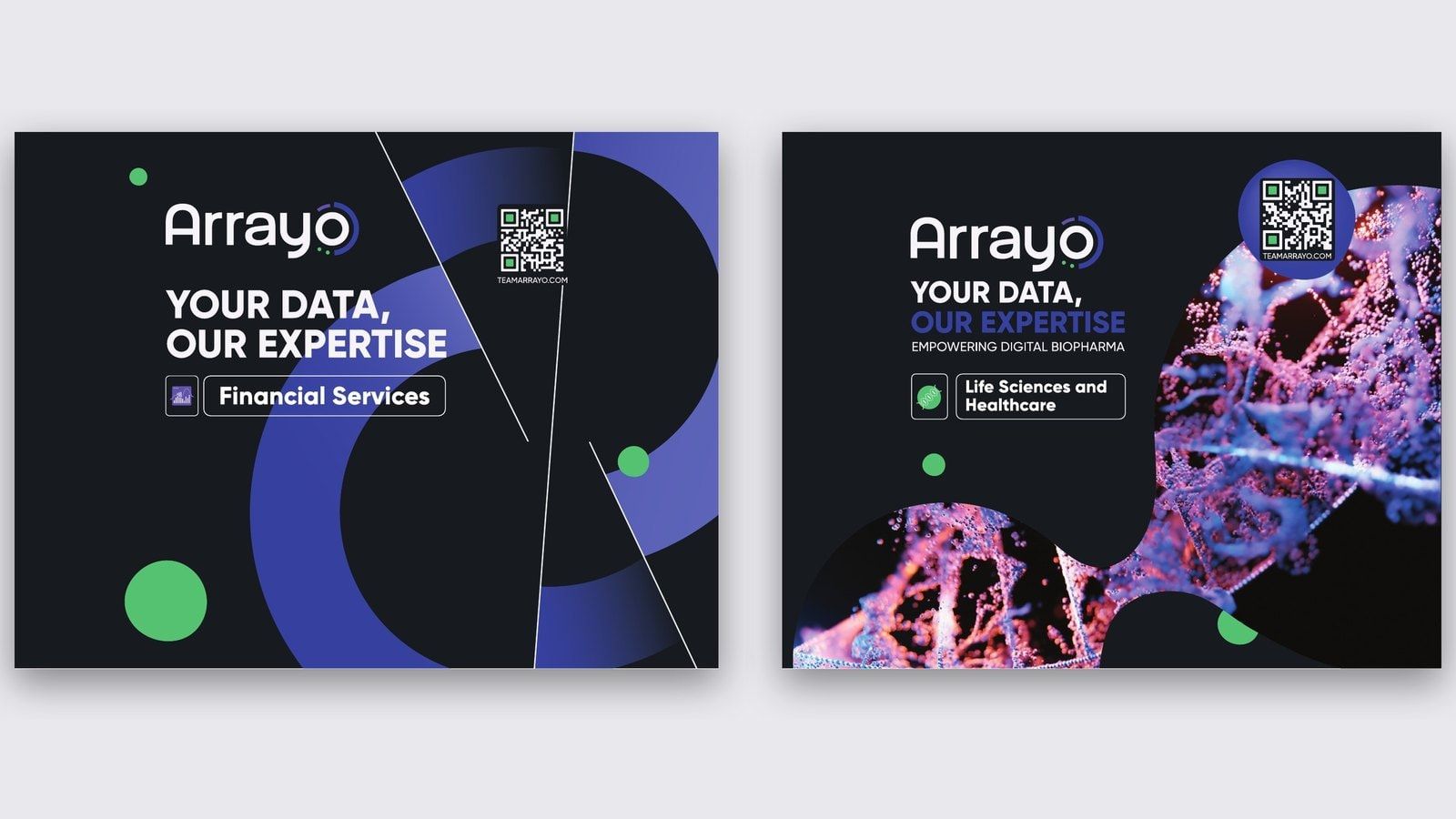
02Within this shared language, we developed different visual expressions for the two divisions.
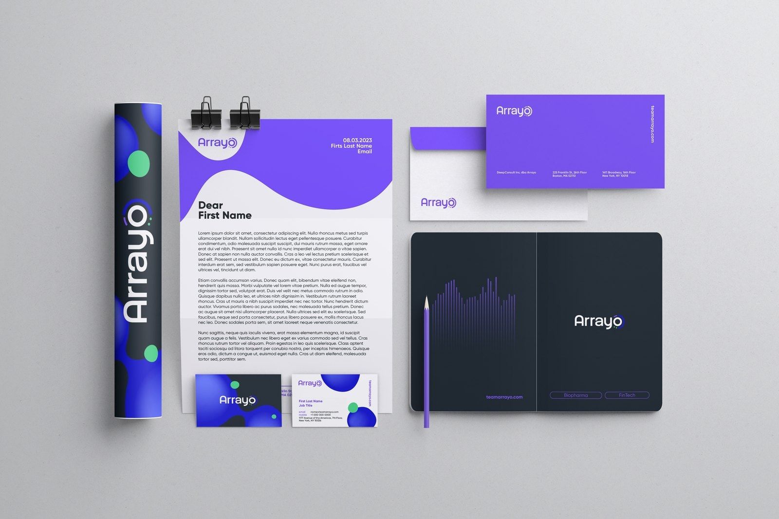
03We documented the refreshed identity in a brand book and applied it to stationery and communications materials, giving Arrayo a reference for using the system consistently.
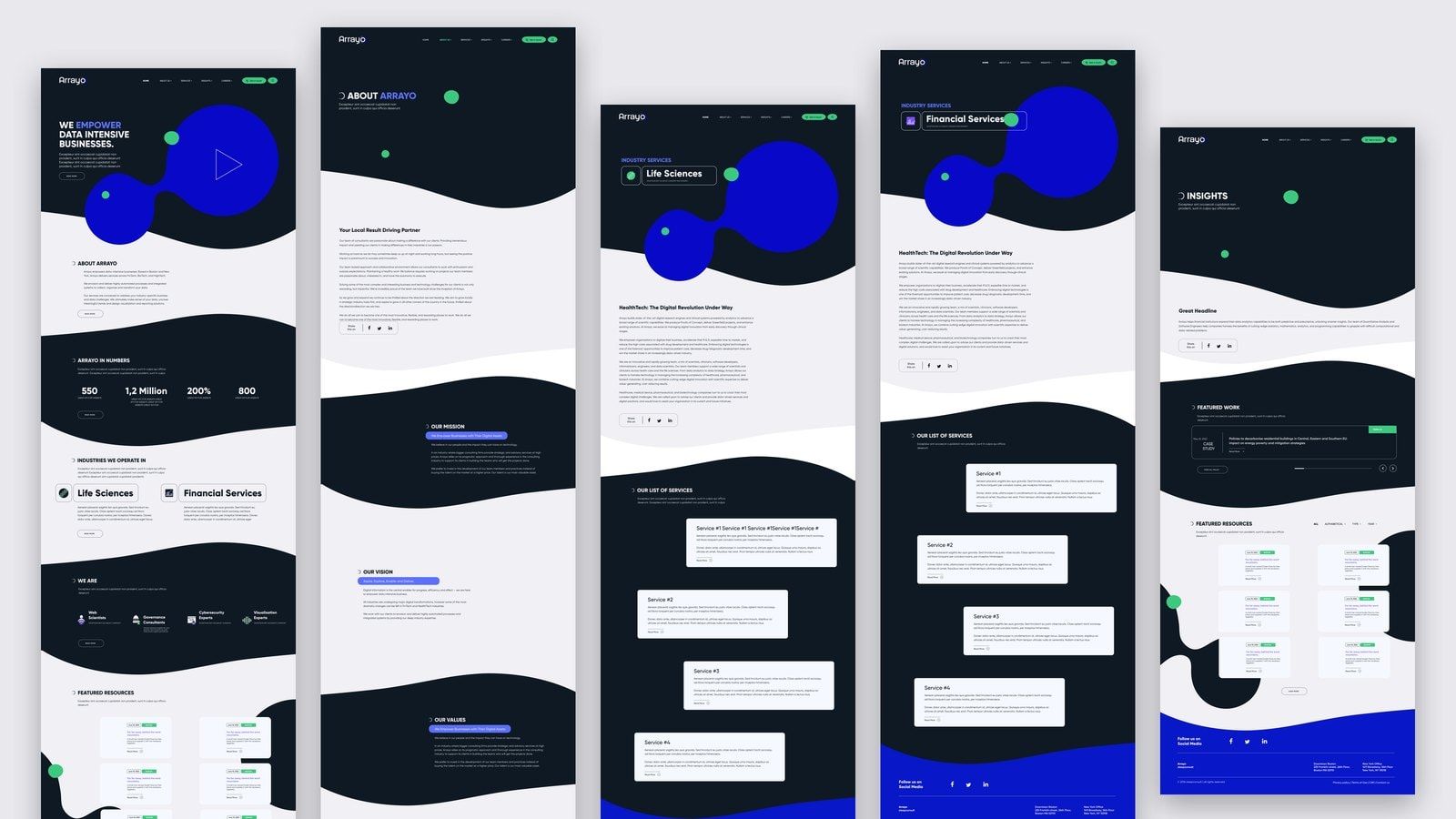
04The redesigned website brought the visual system into the way Arrayo introduced its business and services.
05Animation extended the project into another format.
Both belonged to the same company and needed to feel connected.
How we got there
In this case study
The brief
Arrayo wanted its brand and digital presence to reflect the expertise behind its work. Its existing logo and symbol were to remain, with the transformation taking place across the visual language around them.
The identity also needed to accommodate two divisions with different audiences. Financial services communications had to speak to technology, data management and compliance. Life sciences communications needed to convey scientific precision and an understanding of research. Both belonged to the same company and needed to feel connected.
Understanding the business
We began with interviews and focus groups involving Arrayo’s staff and clients. These conversations informed the identity and the way the company presented its work across the website and communications materials.
The shared starting point was Arrayo’s expertise in data. The applications varied between sectors, but the broader purpose connected them: helping organisations collect, manage and use information to support their work.

That gave us a basis for developing an identity with room for both specialisms, and for explaining what brought them together.
Building the visual language
We retained the logo and symbol, then developed a bolder colour palette, expressive typography and custom visuals around them.
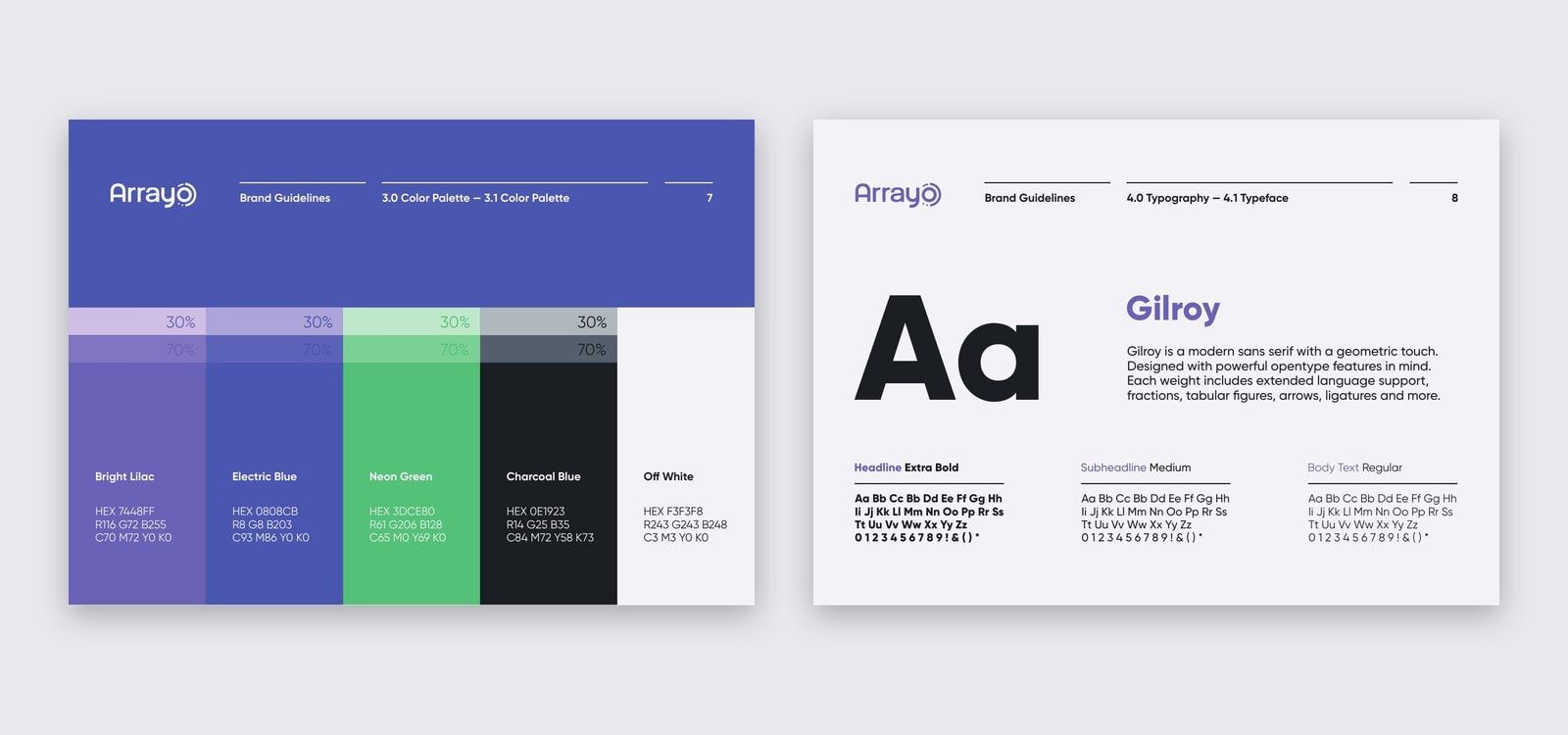
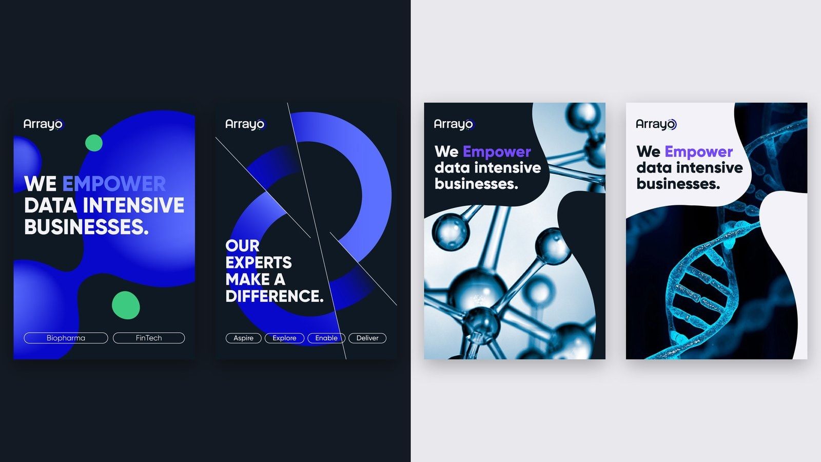
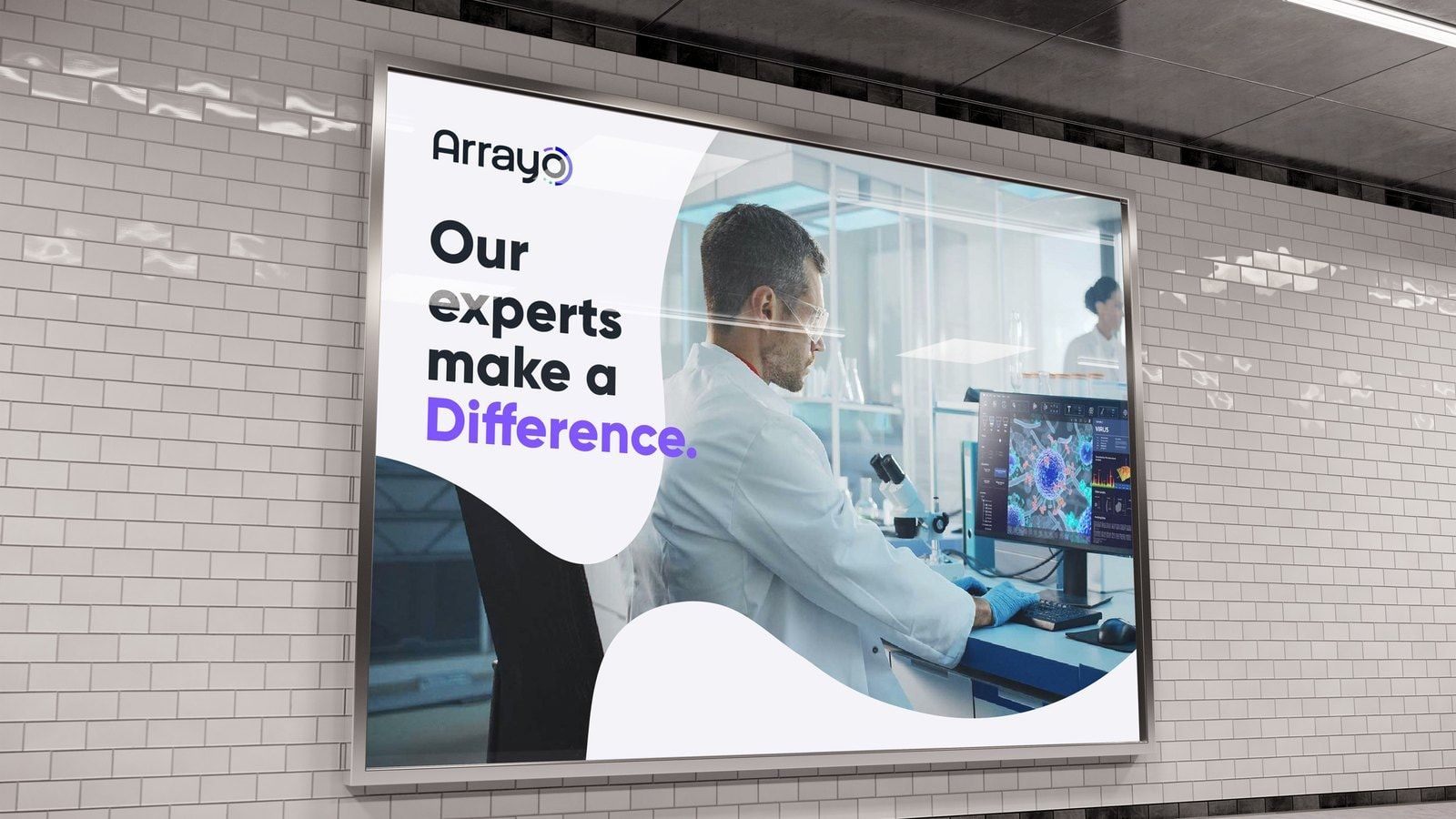
Deep charcoal backgrounds, purple and green accents, and large areas of white gave the website a distinctive rhythm. Rounded, connected graphic forms introduced a more fluid element, carrying illustration and imagery through the layouts.
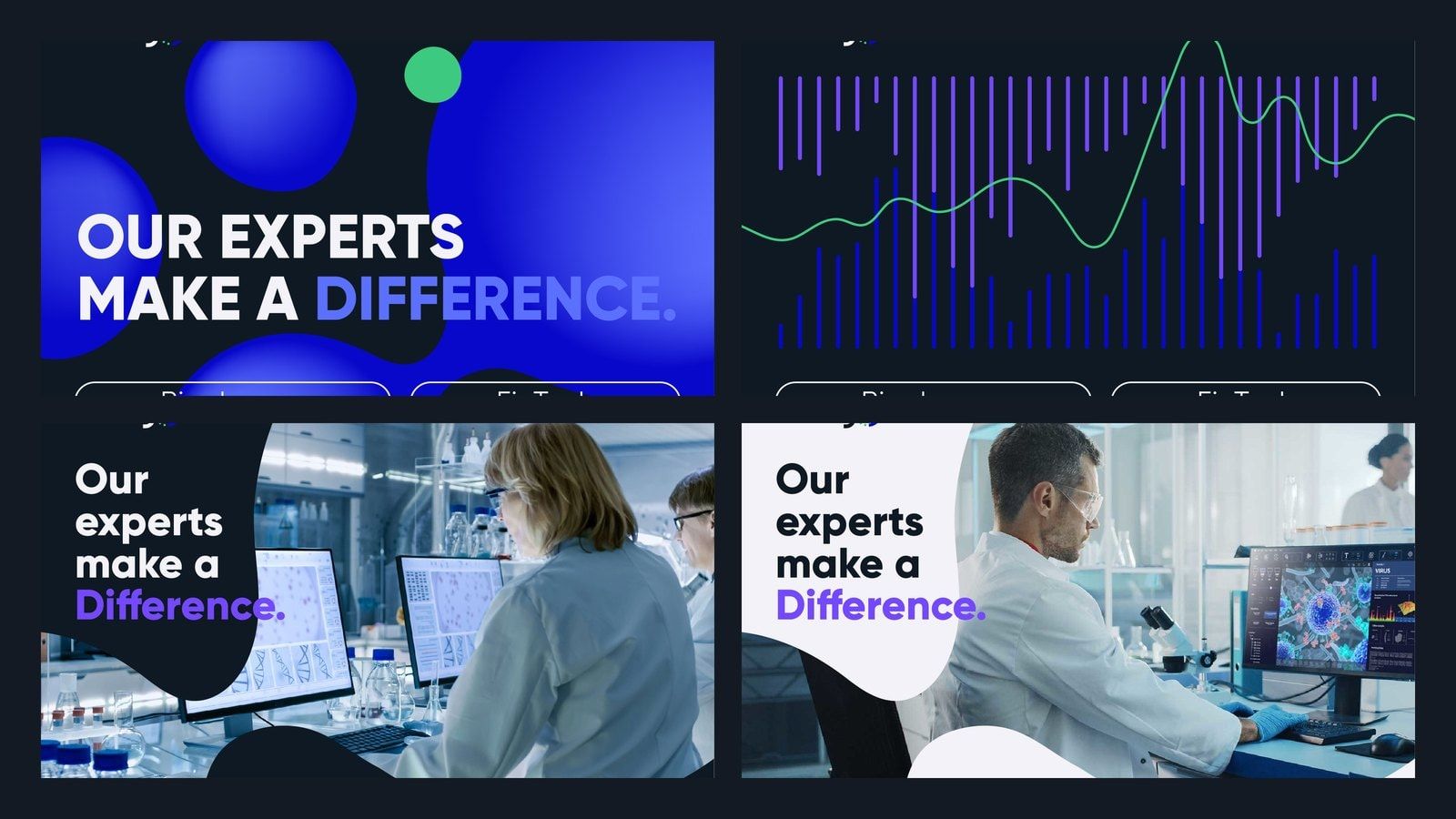
Within this shared language, we developed different visual expressions for the two divisions. The financial services direction used vivid graphics to convey its technology focus. Life sciences took a cleaner, more precise approach to imagery. The common typography, palette and graphic treatment held them together.
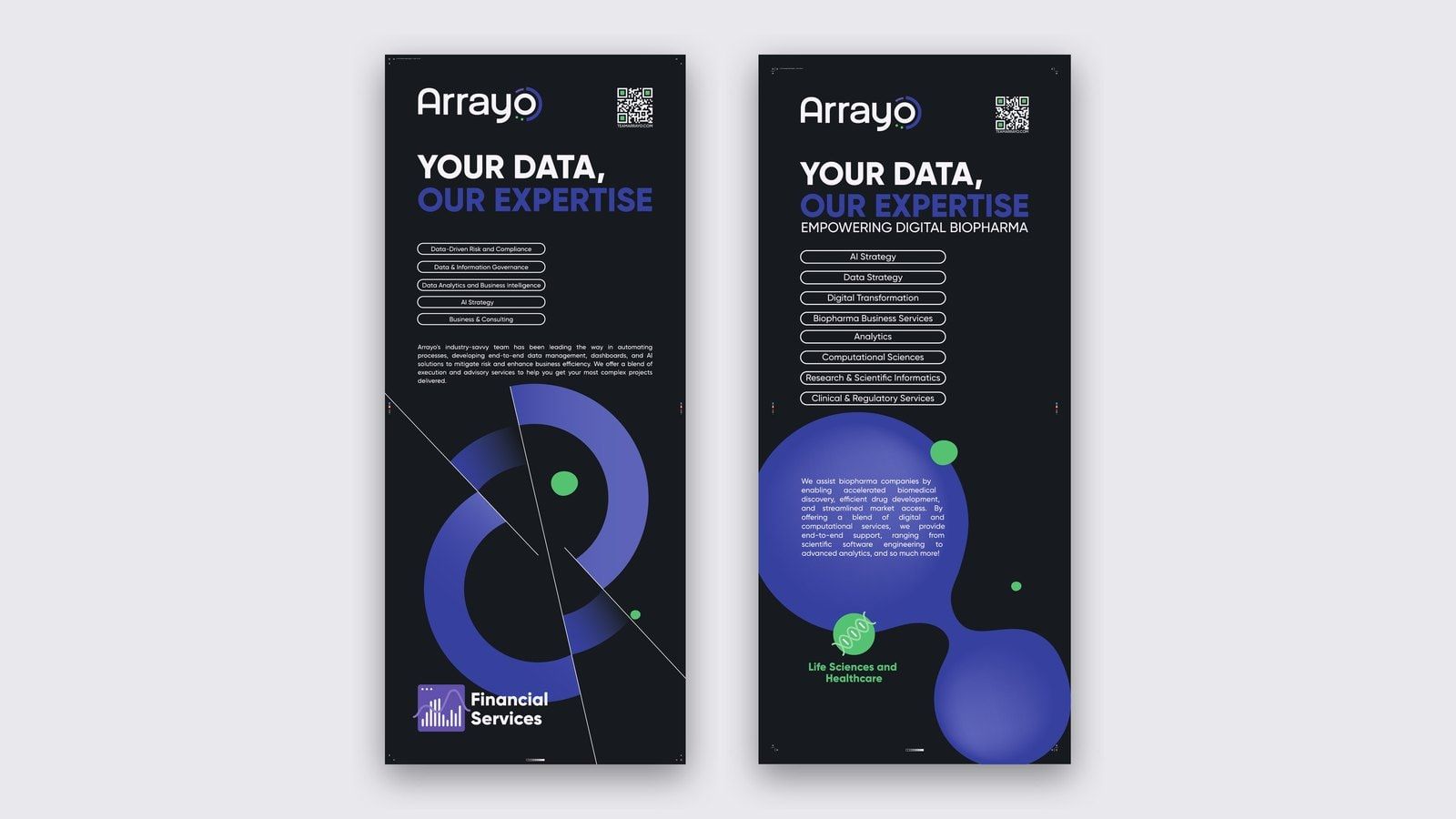
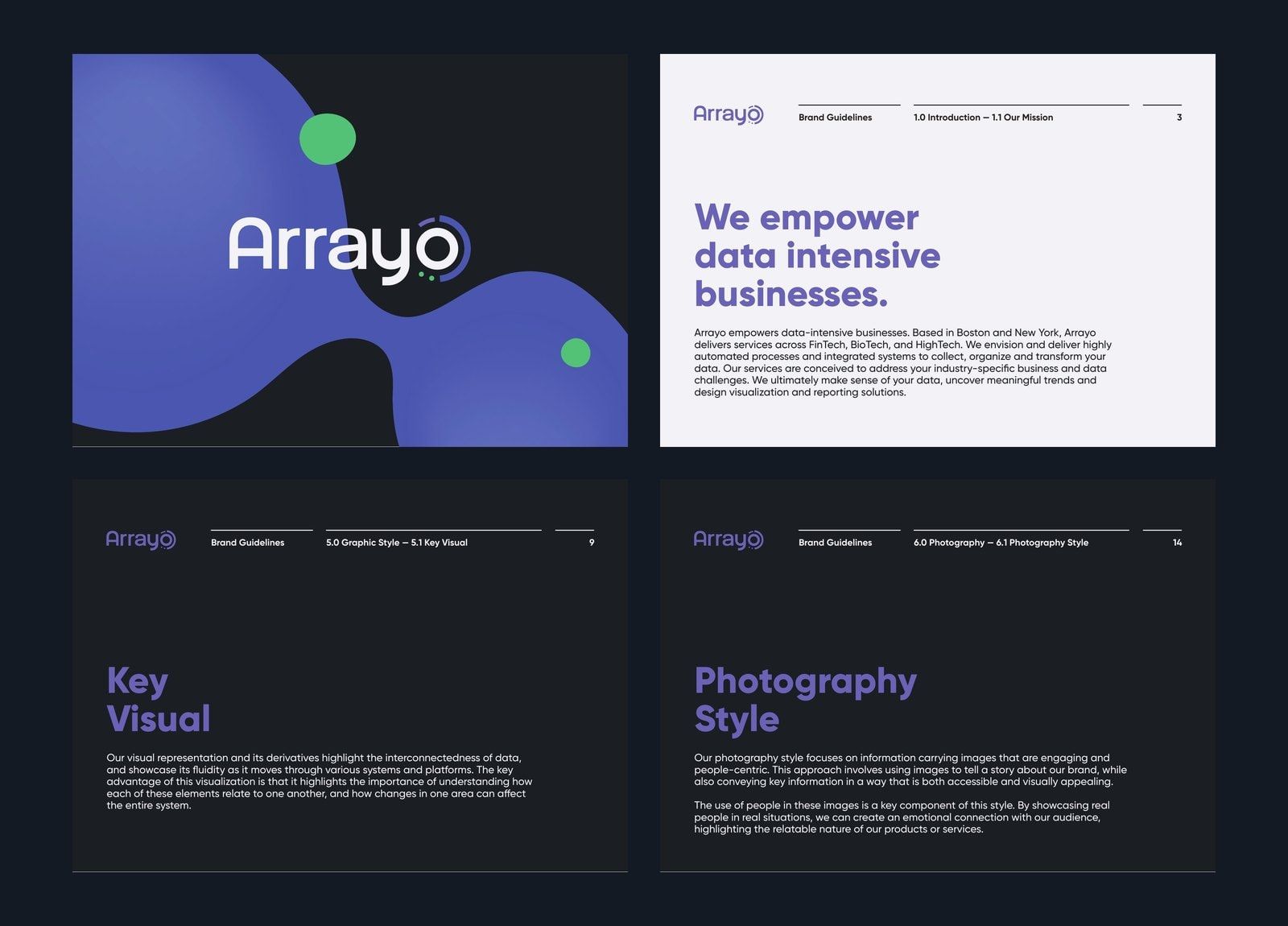
We documented the refreshed identity in a brand book and applied it to stationery and communications materials, giving Arrayo a reference for using the system consistently.
Bringing the identity to life
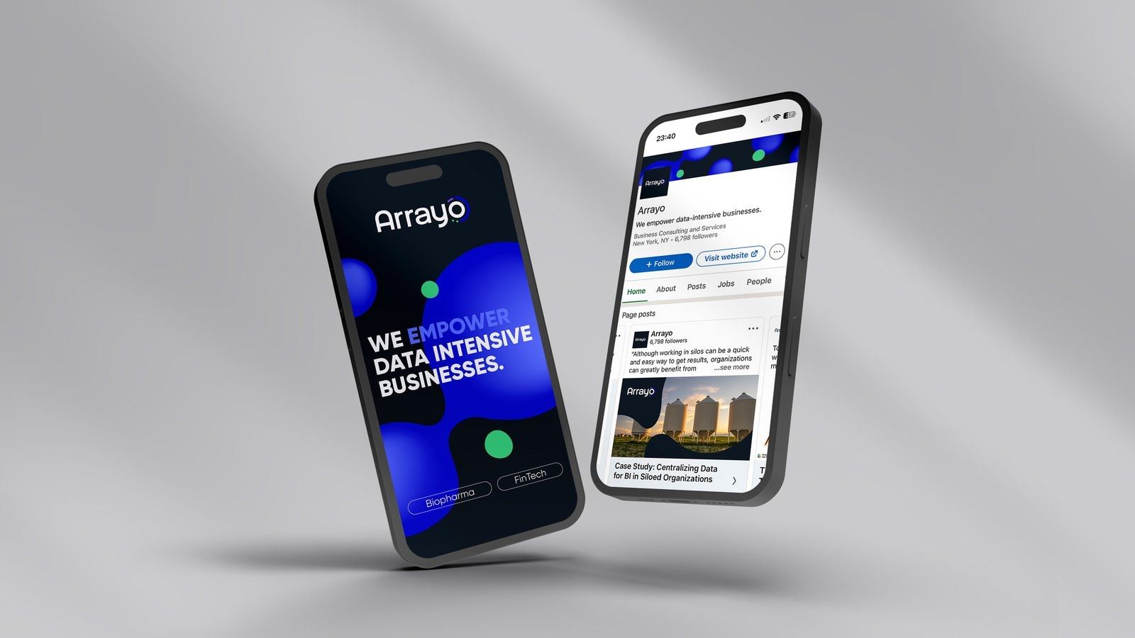
The redesigned website brought the visual system into the way Arrayo introduced its business and services. It gave the two specialisms a place within the same experience, alongside the company’s people, values and expertise.
The layouts combined bold opening statements with space for more detailed explanations. Custom illustration helped introduce the work, while the identity’s graphic forms connected the pages visually across desktop and mobile.
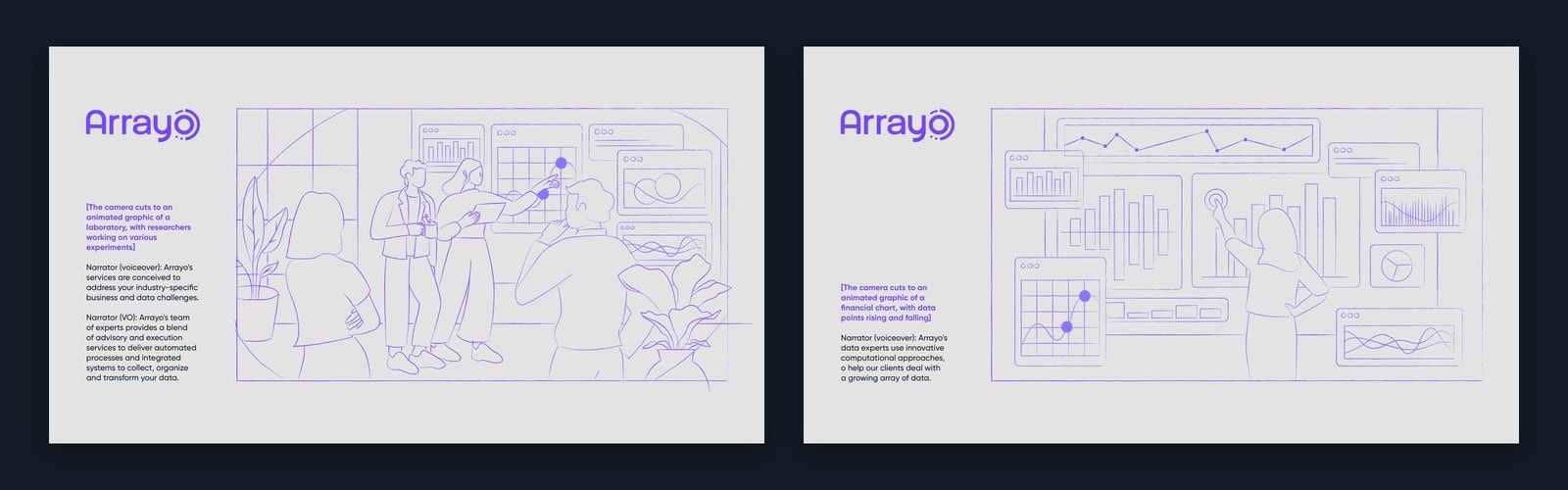
Animation extended the project into another format. The film, Empowering Data-Intensive Businesses, presented Arrayo’s expertise through an illustrated story, complementing the website and wider identity.
The outcome
Arrayo gained a shared design system spanning its brand guidelines, stationery, website and motion work. Its financial services and life sciences divisions could communicate in ways suited to their audiences while remaining part of a recognisable company identity.
The refreshed identity received positive feedback from staff and clients. The project brought Arrayo’s two areas of expertise into a more coherent public presence, building on the logo people already knew.
Penrose
- Research: interviews and focus groups
- Visual identity refresh and key visuals
- Brand book
- Stationery and communications materials
- Website design and development
- Animation