
OFoundation was a Dutch charitable foundation, set up in 2011, that worked through social enterprise. It helped local entrepreneurs in developing countries build their own businesses, with coaching, training, equipment and financial support. In return, the entrepreneurs committed to healthy working conditions and fair wages for their employees. Its main project at the time was a waste-recycling enterprise in Mumbai, India.
- ClientOFoundation
- WorkBrand strategy, visual identity, brand guidelines, stationery, website design
- TimeframeAutumn 2012
- StatusLaunched January 2013
The work
01The symbol keeps the foundation's O and surrounds it with loose, overlapping circles drawn by hand.
02"Foundation" sits beside the symbol, with "sharing is everything" kept as the tagline.
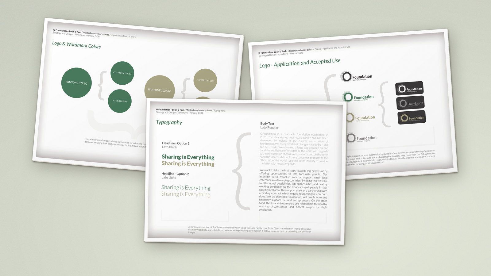
03The guidelines set out the logo, colour, type and imagery, with rules for each.
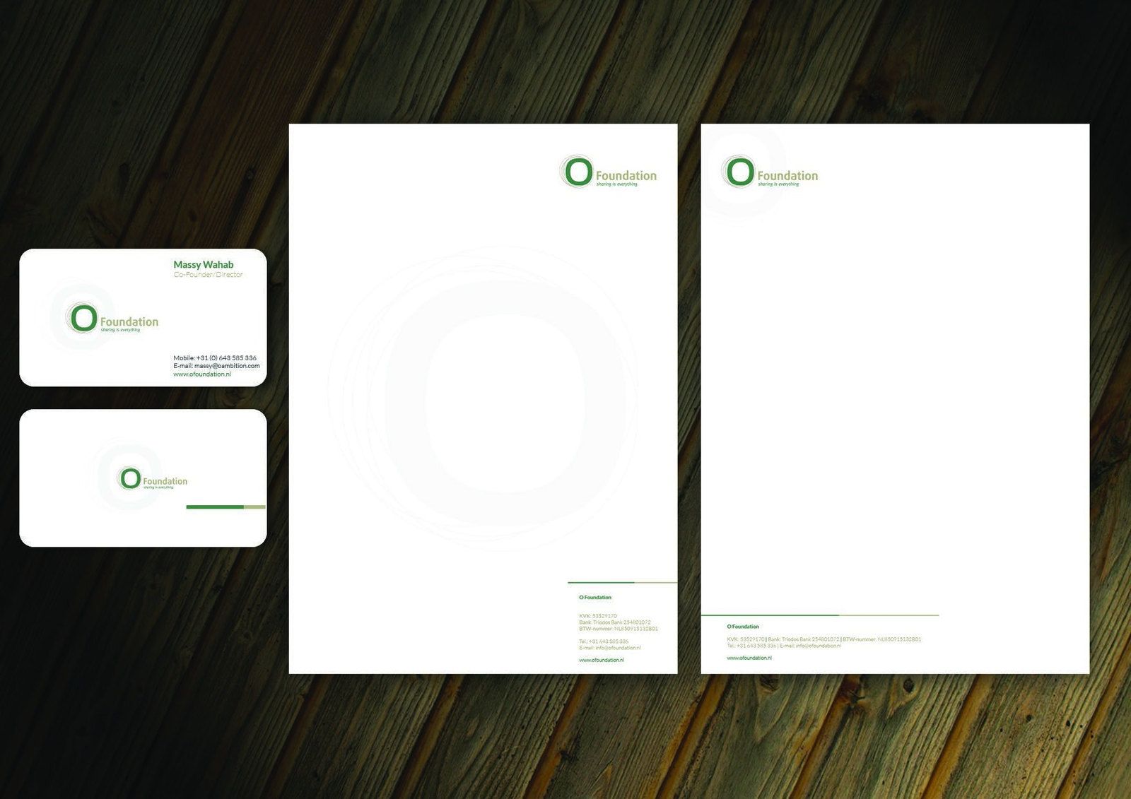
04Letterheads, continuation sheets and business cards put the identity into daily use.
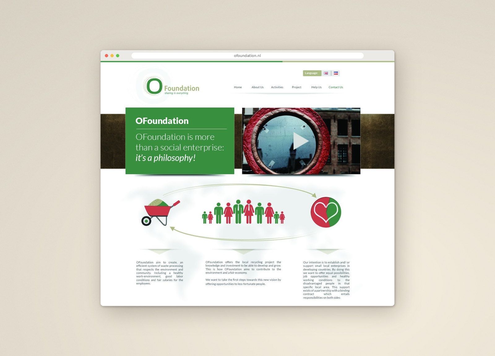
05The new website applied the same system.
For an organisation in that position, uncertainty quickly becomes a question of trust.
How we got there
In this case study
Situation
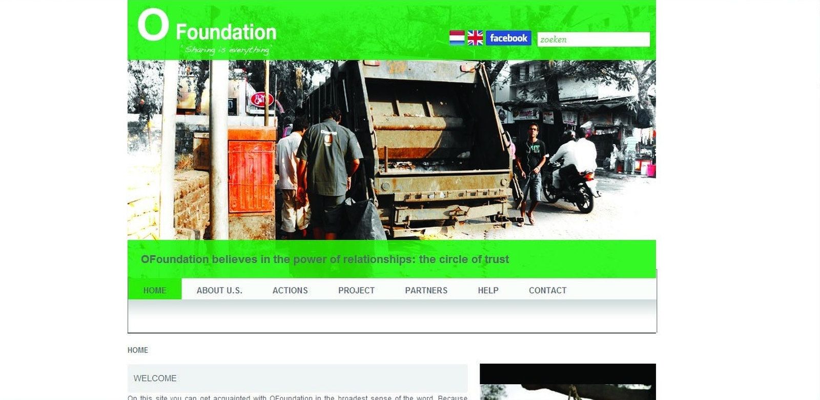
The foundation already had a name built around a single letter and a line that summed up its belief: "Sharing is everything." Its website spoke of the same idea: "OFoundation believes in the power of relationships: the circle of trust."
The ideas were in place. The visual identity, a bright green logo with a handwritten tagline, did not yet carry them, and it said little about a model that was new to most of the people the foundation worked with.
What we learned
There was a gap between the foundation's strategy, its identity and its visual communication. OFoundation depended on volunteers, donors, NGOs and public institutions, and the gap left them unsure what the foundation stood for. For an organisation in that position, uncertainty quickly becomes a question of trust.
The identity had to make the foundation credible to donors and institutions. It also had to stay true to its central belief: that people's lives improve through new ideas and shared effort, rather than through change handed down by a few.
The idea
The solution grew from the idea of oneness: each person distinct, each part of one whole.
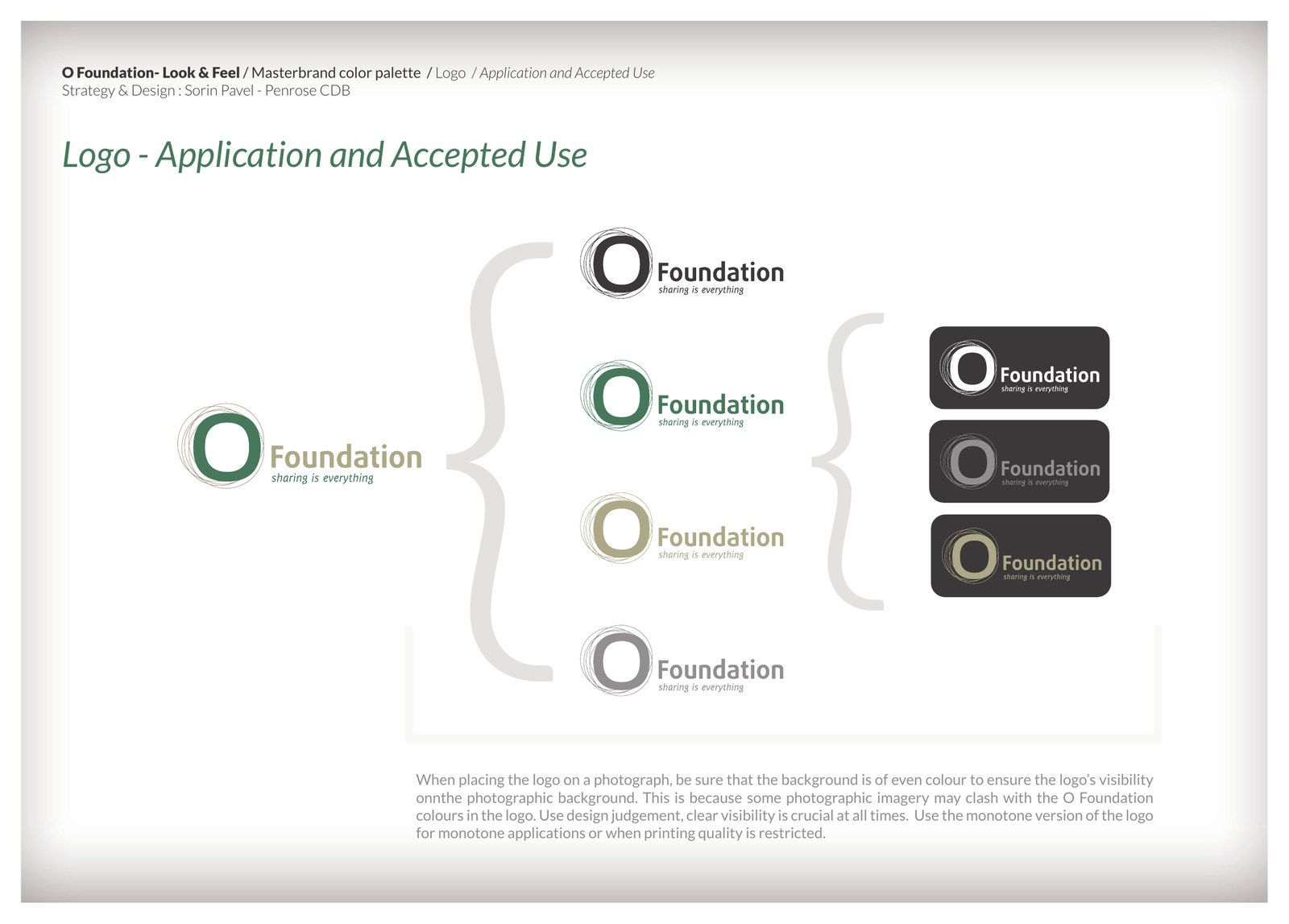
The symbol keeps the foundation's O and surrounds it with loose, overlapping circles drawn by hand. They suggest people linked in a network, and the circle of trust the foundation already spoke about. "Foundation" sits beside the symbol, with "sharing is everything" kept as the tagline.
The system
Two colours carry the identity. Green refers to the environment. A light earth brown stands for practical, hands-on work. Body text is set in shades of grey instead of black.
Lato was chosen for its modern yet elegant feel, and because it is open source, which suits a foundation whose line is about sharing.
A textured brown background and a circular bead texture carry the circle into the wider visual language. The photography guidance asks for images that tell a story, of learning, hard work and people developing their own lives.
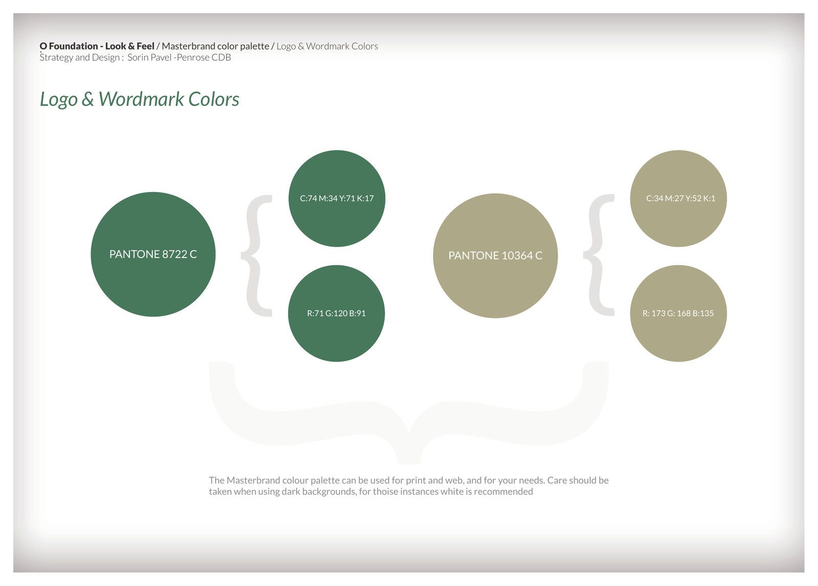
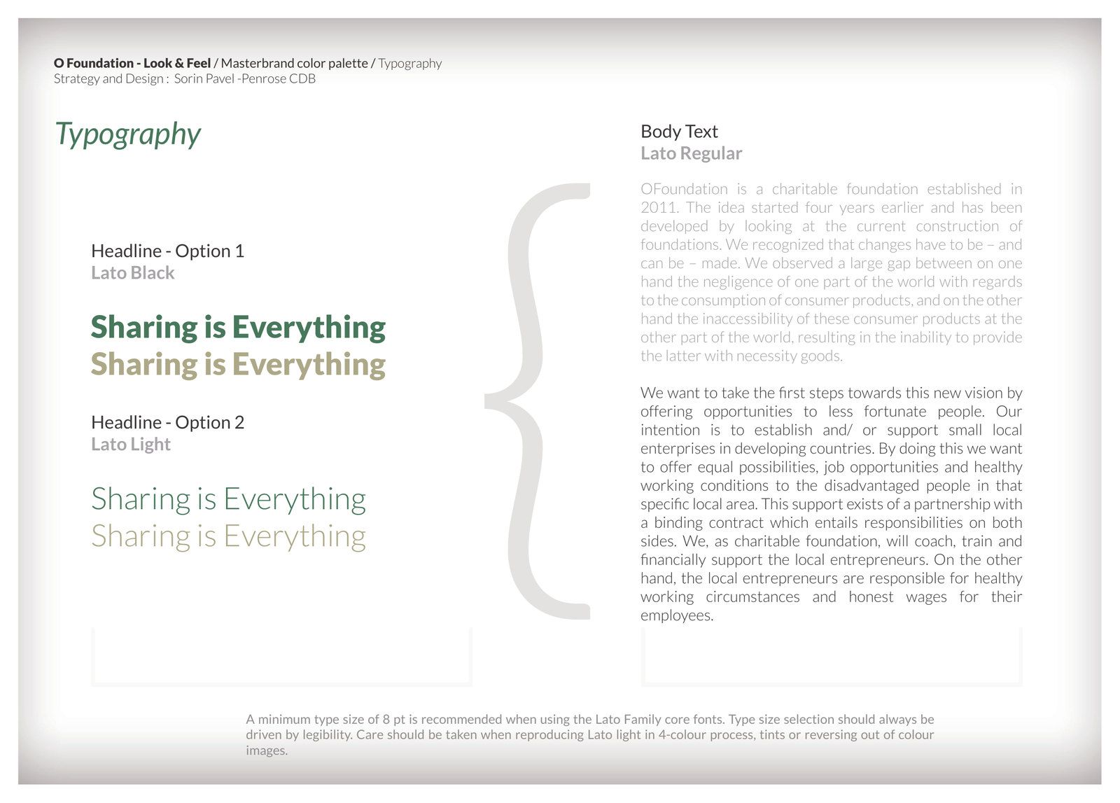
The guidelines set out the logo, colour, type and imagery, with rules for each. Letterheads, continuation sheets and business cards put the identity into daily use.
Online
The new website applied the same system. Its homepage explains the model as a simple loop, from waste collection to the people it employs to the benefit that returns to the community. Redrum made an animated infographic for the foundation, based on our guidelines. The site was live at ofoundation.nl by January 2013.
OFoundation was the first project Penrose took on. In the foundation's own words: "We see that greed does not result in happiness, but sharing leads to the amplification of happiness and satisfaction."
Penrose
 Sorin PavelStrategy and design
Animated infographic: Redrum.