
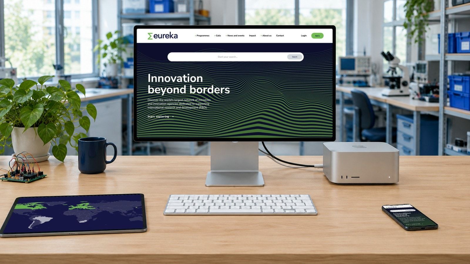
Eureka brings ministries and innovation agencies together across 47 countries to support international research and development. Its website needs to work for a company exploring funding for the first time, as well as the public institutions that make those opportunities possible. We worked with Eureka to rethink that experience, from stakeholder research and information architecture to design, WordPress development and hosting. The result brings programmes, funding calls and guidance into a shared structure, while giving the network behind them a clearer presence. The new website launched in August 2025, extending a relationship that began in 2013.
Visit the website (opens in a new tab)eurekanetwork.org
- ClientEureka Network AISBL, Brussels
- WorkResearch, information architecture, UX and UI design, WordPress development and ongoing support
- TimeframeJanuary–August 2025, following selection in 2024
- StatusLive, with ongoing maintenance and development
The work
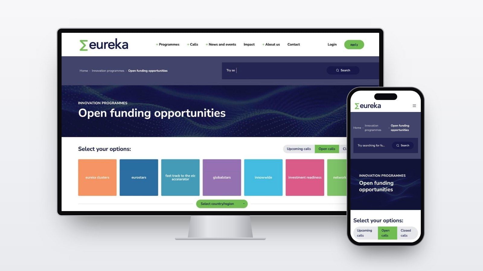
01The funding opportunities area brings calls together with routes by programme, country or region, and status.
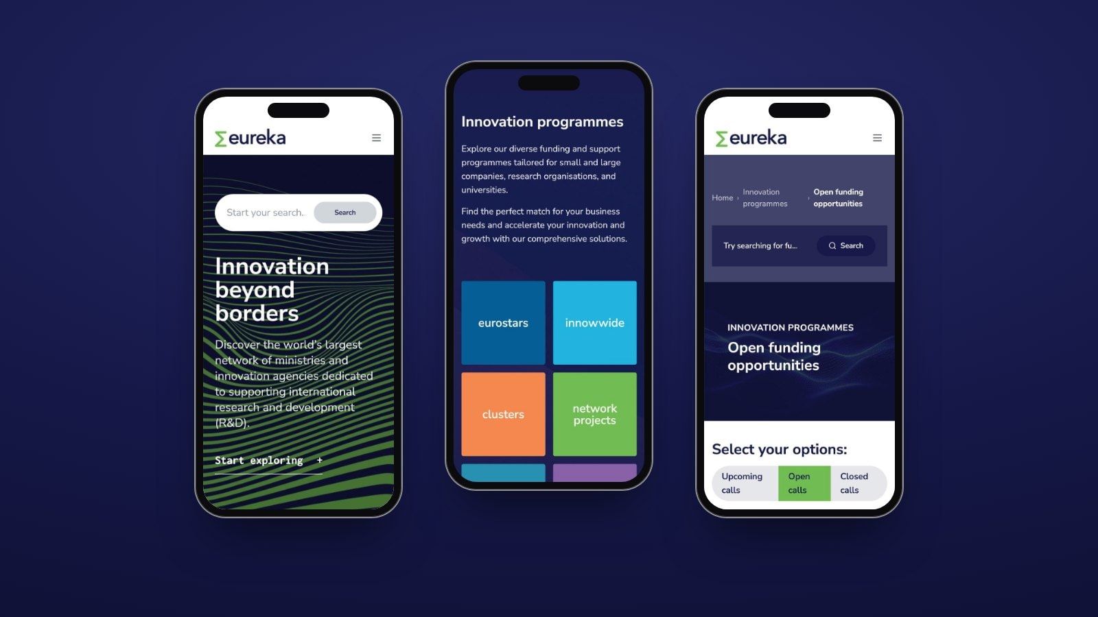
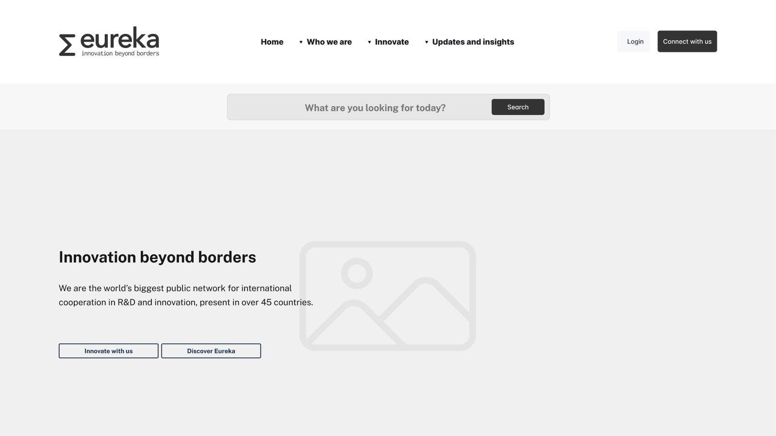
02Search has a prominent place in the opening screen, giving visitors a direct route into the content alongside the main navigation.
03We worked from that starting point to develop the information architecture and user journeys, then made them tangible through a fully interactive Figma prototype.
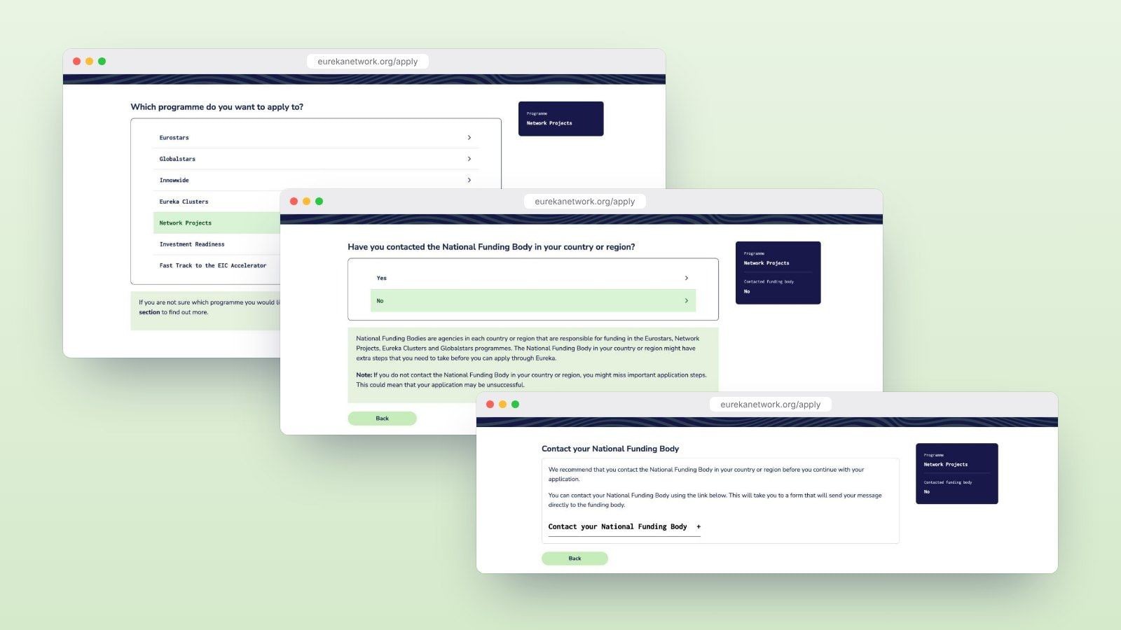
04The interface makes an important part of Eureka’s funding process visible at the point where someone needs it.
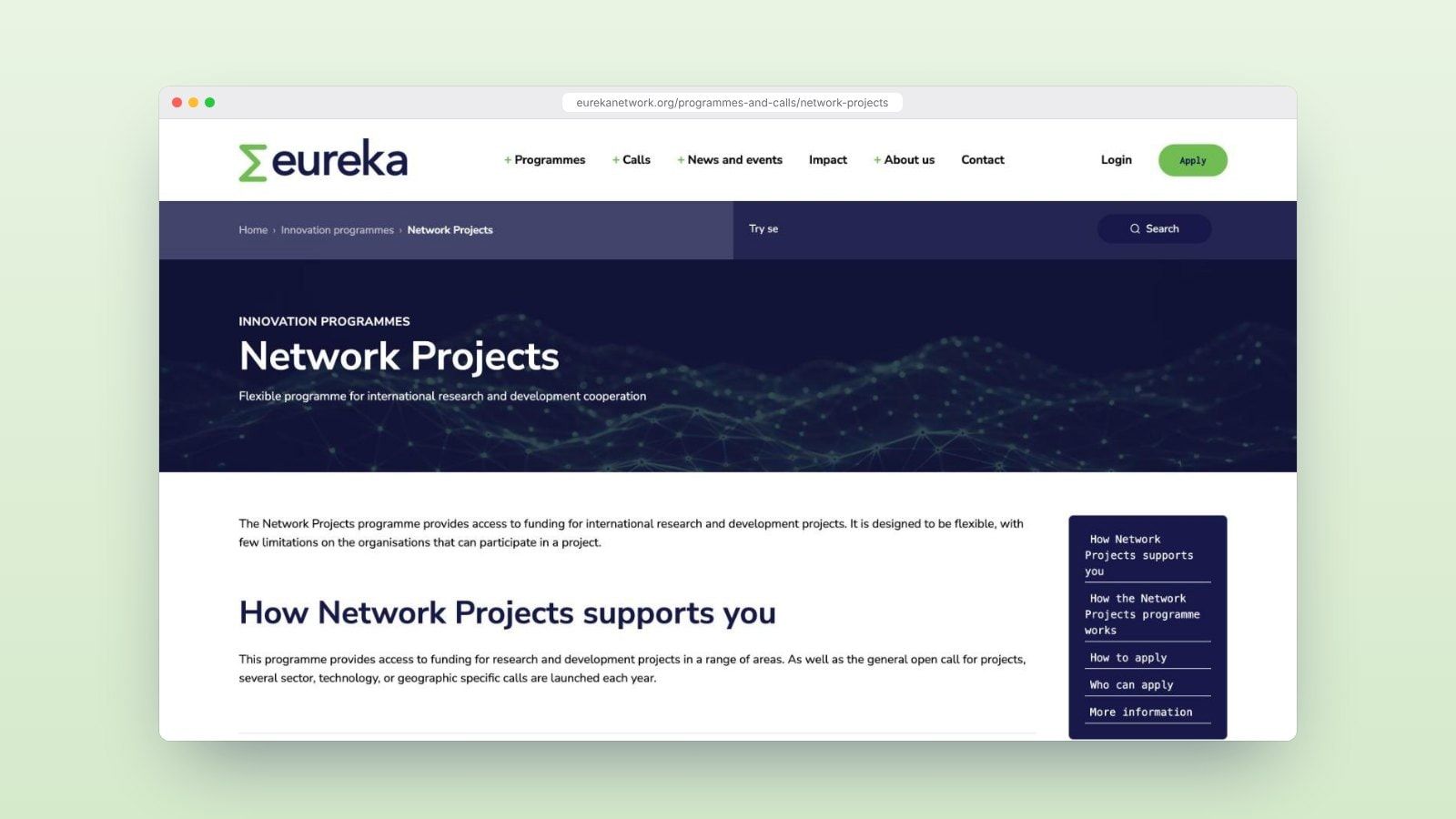
05Programme pages bring an introduction together with information about participation, applications and supporting resources.
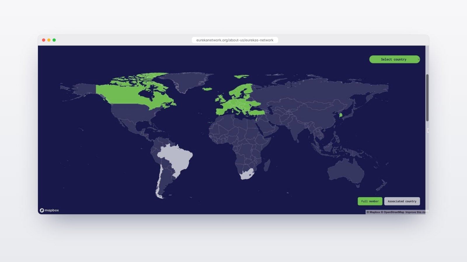
06The network area introduces its ministries and funding agencies, membership, meetings and relationship with the European Commission.
Its website needs to work for a company exploring funding for the first time, as well as the public institutions that make those opportunities possible.
How we got there
In this case study
following selection in 2024
Gutenberg blocks
managed by Penrose
and development
The brief
Eureka supports collaboration between companies, universities and research organisations across national borders. Behind its programmes is a network of ministries and funding agencies, each working within its own national context.
The previous website focused primarily on the beneficiaries of that support. Eureka wanted the new website to serve its wider audiences more effectively, including national funding bodies, policymakers and prospective member countries.
This meant addressing different questions within the same website. A company might need to understand which programme suits its project and whether funding is available in its country. A ministry might be interested in the network’s governance, international partnerships or the value of participating.
The brief also identified difficult navigation and a cumbersome publishing system. Alongside a more contemporary digital presence, Eureka needed a structure people could understand and a platform its team could continue to develop.
Understanding the network
We began with interviews involving the Eureka Secretariat and network stakeholders. Although we had worked with the organisation on communications and digital projects since 2013, the redesign required a fresh look at how its audiences used the website.
Eureka brought an initial sitemap and navigation proposal to the project. We worked from that starting point to develop the information architecture and user journeys, then made them tangible through a fully interactive Figma prototype.
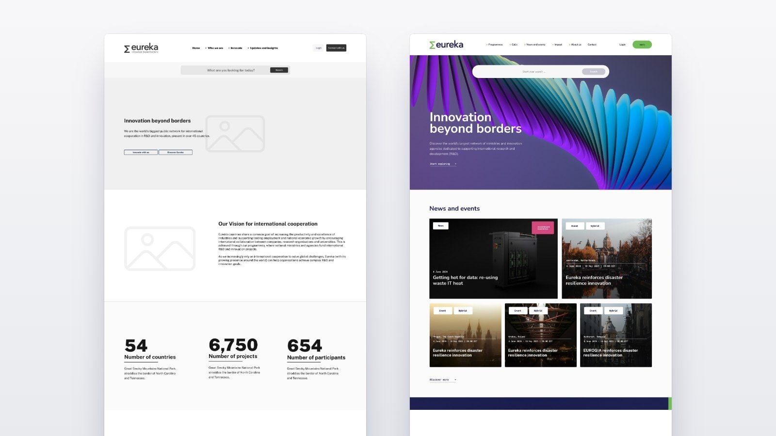
A full-day UX workshop brought the leadership team, including the Director General, into the process. Working through the prototype gave the group a shared reference for reviewing the experience before implementation.
We then refined the UX and interface design with the Eureka team. The prototype connected the discussion about audiences and organisational priorities with the pages and interactions people would actually use.
Connecting programmes with the next step
The central task was to make the relationships between programmes, countries, funding opportunities and guidance easier to follow. Each carries information that affects what someone can do next.
Finding a relevant opportunity
The funding opportunities area brings calls together with routes by programme, country or region, and status. Visitors can look at open opportunities, see what is coming next or return to a closed call.
That gives people different ways to begin. Someone who already knows Eurostars can approach the information through the programme. Someone starting with a country can narrow the opportunities from that perspective.
Understanding how a programme works
Programme pages bring an introduction together with information about participation, applications and supporting resources.
The Network Projects page, for example, explains how the programme works, who can apply and where to find detailed guidance. Relevant calls are presented alongside that information, connecting the explanation with an opportunity to act.
The application journey also reflects the role of national funding bodies. For Network Projects, it asks whether the visitor has contacted the body in their country or region and explains why that step matters. The interface makes an important part of Eureka’s funding process visible at the point where someone needs it.
Giving the network a clearer presence
Alongside those practical journeys, the website explains the institutions and relationships behind Eureka’s work.
The network area introduces its ministries and funding agencies, membership, meetings and relationship with the European Commission. Visitors can understand both how to access support and how the international cooperation behind it works.
Bringing the identity into the interface
We developed the website’s visual system around Eureka’s existing identity, using its green and dark blue palette across navigation, page layouts and reusable components.
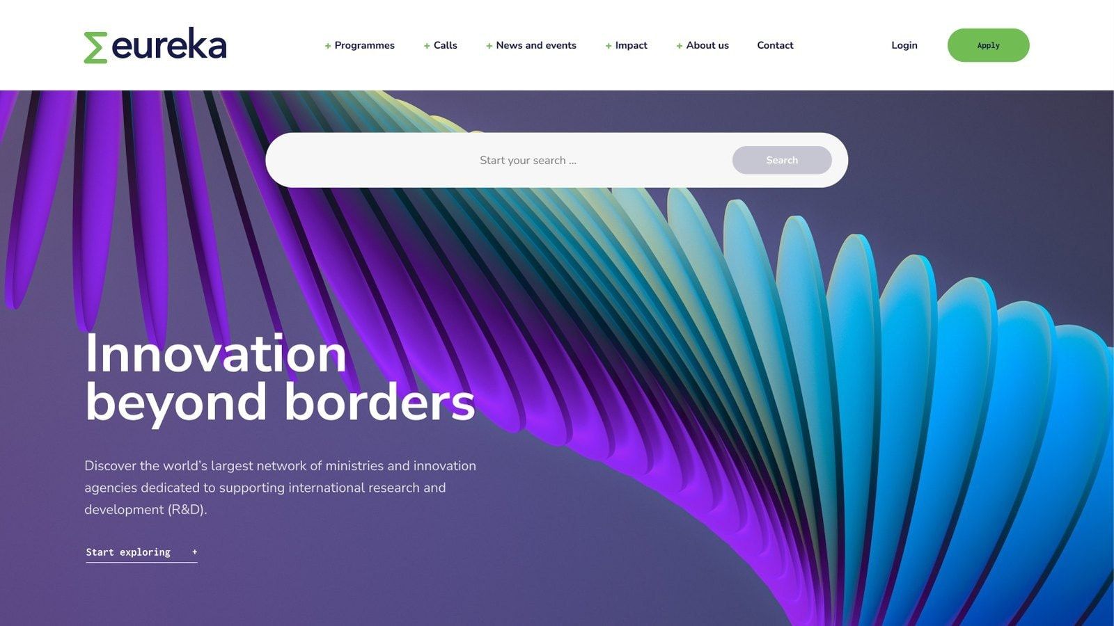
The homepage pairs a large statement of purpose with flowing line graphics. Search has a prominent place in the opening screen, giving visitors a direct route into the content alongside the main navigation.
Across the website, programme identities, call deadlines and content labels help distinguish different kinds of information. A funding call needs to communicate its programme and closing date quickly; a programme page needs room to explain how participation works.
The design system carries those differences through a consistent set of components, connecting the public interface with the publishing tools used by Eureka’s team.
Building a platform the team could use
We built the website in WordPress with custom Gutenberg blocks. Editors can manage content and assemble page layouts within the design system, giving them flexibility while keeping the website visually consistent.
The front end uses Tailwind CSS, with Algolia integrated for search. These support a platform that needs to accommodate detailed guidance, regular updates and changing funding opportunities.
We also manage the hosting, using containerised Kubernetes infrastructure at Leafcloud. This provides a European hosting environment that can scale as the platform’s needs grow.
Sustainability informed the hosting choice from the original proposal. Leafcloud’s approach combines renewable electricity with the reuse of server heat in buildings. It connects the infrastructure behind the website with a practical use for energy that computing would otherwise release as waste heat.
Our work covered the full delivery process, from research and design through front- and back-end development, testing and launch. Hosting and maintenance continued beyond delivery, keeping responsibility for the platform connected with the team that built it.
The outcome
The new website launched on 11 August 2025 and received positive feedback from Eureka’s leadership and wider network.
Eureka gained a shared structure for presenting its programmes, opportunities and institutional role, supported by a publishing system its internal team can manage. Visitors can approach the information through a programme, a funding call or the network itself, with guidance connecting those routes to the next step.
Following launch, Eureka asked us to continue providing maintenance, optimisation and development support. That relationship has continued into the platform’s next phase, including work on data visualisation, dashboards, SEO and further UX improvements.
Penrose
 Sorin PavelStrategy and UX design
 Mircea ȘerdinProject management
 Elena ReghintovschiUI design
 Bogdan PârvulescuWeb development
 Cristi LunguDevOps
The Eureka Secretariat, network stakeholders and leadership team contributed organisational knowledge and feedback throughout the project.