The Client
CONCORD is the European confederation of non-governmental organisations working on sustainable development and international cooperation, and the main interlocutor with the European Union institutions in that field. It has 58 member organisations: 26 national platforms, 25 networks and 7 associate members, together representing more than 2,600 NGOs.
The Assignment
A visual identity refresh, developed alongside the redesign of the CONCORD website.
Scope: brand strategy and stakeholder research, wordmark, colour and typography system, pattern, imagery principles, brand guidelines and document templates.
Timeline: discovery in March 2026, board consultation on 22 April, launch at the General Assembly on 16 June 2026.
Status: in use. The 2027 strategy, Rising to the Occasion Together, published in June 2026, is the first major publication created in the new identity.
Roles: Penrose led strategy, art direction, design and motion. CONCORD contributed through discovery, interviews and decision-making, with director sign-off, board consultation, and the communications team as project owners.
The Challenge
CONCORD describes itself as “the main interlocutor with the EU institutions on sustainable development policy and international cooperation”. Its visual identity no longer fully reflected that role.
The previous logo had been in use since 2003. Its colourful lettering and illustration-led style still expressed the openness and diversity of CONCORD’s membership, but less so its position as an established and credible voice in conversations with EU institutions, Member States and potential funding partners.
This was also the communications team’s assessment during discovery. The organisation had evolved while the identity had stayed largely unchanged. The issue was not that the logo was more than twenty years old. It was that it no longer represented CONCORD as it is today.
2026 also offered a clear opportunity to make the change. A new strategy was due to be adopted at the General Assembly on 16 June, with an ambition for CONCORD to become “bolder and reliable experts and conveners”. Penrose was already redesigning the CONCORD website. Refreshing the identity alongside those two projects meant the organisation could introduce a consistent visual language across its main communications at once.
Objective and Brief
The objective was broader than a new logo. CONCORD needed an identity that would help external audiences recognise it as an expert, impartial and credible organisation speaking on behalf of a large and diverse network.
At the same time, the identity had to feel relevant to its 58 member organisations. It had to represent a collective without losing the openness and collaboration that members already associated with CONCORD.
The brief covered a new wordmark, a colour and typography system, a visual pattern, imagery principles, brand guidelines and practical templates that the secretariat could use independently.
What the Research Changed
Opinions differed on individual elements such as colour, photography and the strapline, but there was much more agreement about the audiences the identity needed to reach. One question from the interviews proved useful throughout: how would a Commission official or a foundation officer read this identity?
That perspective let us judge the options from the point of view of the people CONCORD needs to influence and work with, rather than what felt familiar inside the NGO sector.
The identity also had to hold two sides of CONCORD’s role together. It needed to feel credible and confident enough for a policy organisation, while reflecting its work as a convener and facilitator for a large membership.
That led us towards a wordmark-led identity with no separate symbol and no reliance on photography: a system that reads as established and institutional without becoming distant or overly formal.
The Constraints
Some colours had to be avoided because of their political associations in Brussels. Red and blue were not considered as primary brand colours, and pastels were excluded. Purple was checked against its use by feminist movements and by Volt, and green risked positioning CONCORD as a climate organisation.
Photography of people raised ethical, copyright and practical questions for an organisation representing 58 members across different countries and contexts. The team also wanted to avoid familiar charity imagery and visual clichés such as globes, hands, doves, leaves and religious symbols.
Accessibility was a requirement throughout the system. The typefaces also had to be free to install, easy to use and legible at small sizes on screen.
Some elements were worth keeping. Members already associated CONCORD strongly with its hot pink, and the existing strapline, “Collective Power. European Action. Global Equality.”, remained relevant to the organisation.
Our Approach
The identity centres on the CONCORD name itself.
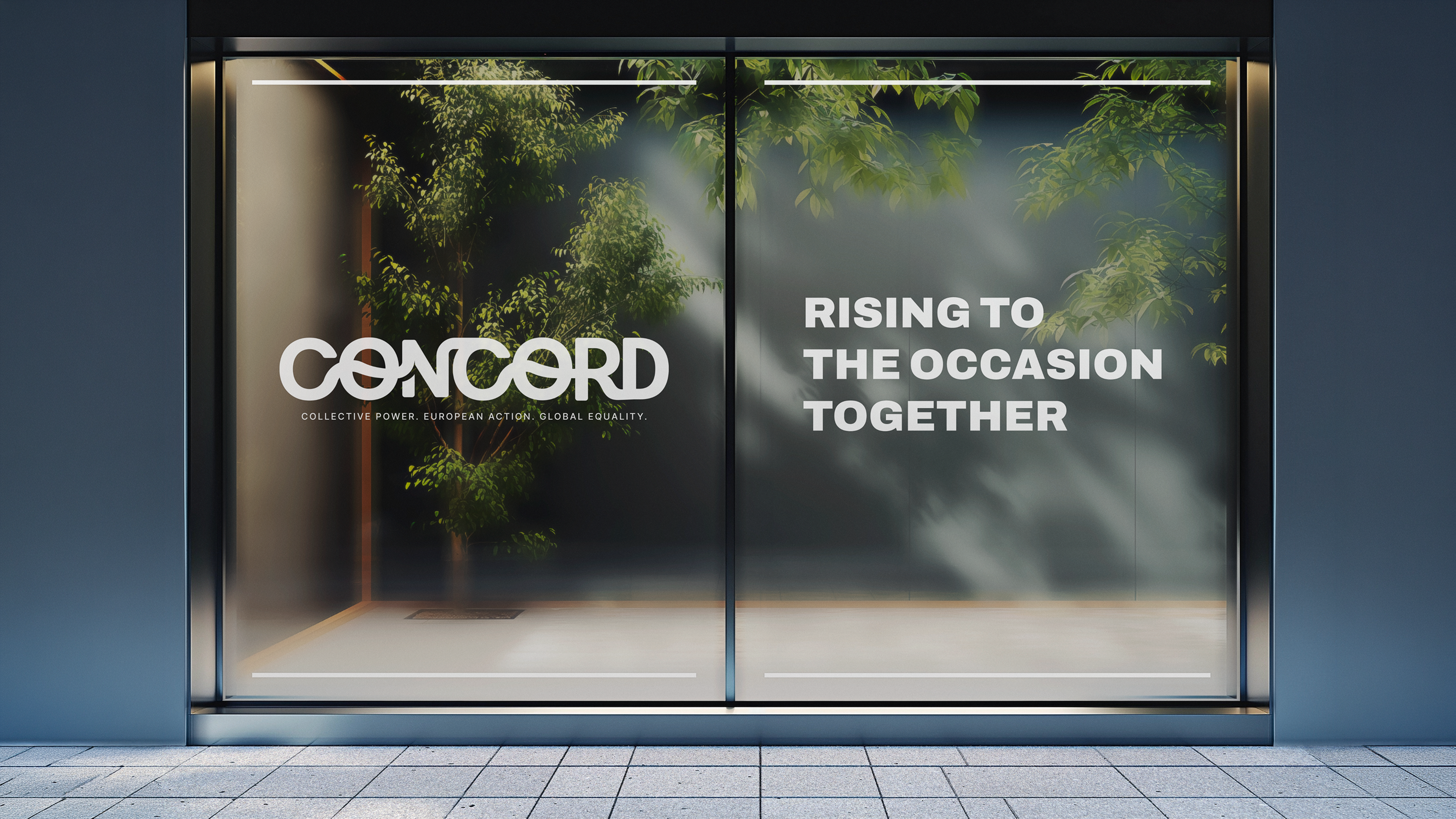
We drew the wordmark as one continuous line, with each letter connecting to the next. The individual letters stay distinct, but together they form one uninterrupted shape. It is a simple expression of CONCORD as a confederation: many different organisations connected by a shared purpose.
The wordmark also balances the two qualities the research identified. Its weight gives it presence and confidence, while the rounded loops and connections keep it open and approachable.
There was no need for an additional symbol. Connection and plurality are already present in the name and in the way the letters are drawn. Keeping the identity focused on the wordmark also means it sits comfortably alongside the identities of CONCORD’s members without competing with them.
Three ideas sit behind the wordmark: solidarity, in the way the letters connect without hierarchy; continuity, in the uninterrupted line; and plurality, in six distinct characters forming one word.
The pattern
The pattern develops the same idea further. Built from interlocking geometric forms derived from the wordmark, it gives report covers, digital communications, events and key visuals a strong graphic element.
A second, quieter application uses an enlarged section of the wordmark positioned at the edge of the page. It gives simpler materials such as letterheads, business cards and member-facing templates a recognisable CONCORD element without overwhelming the content.
Colour
The colour system was simplified significantly. The hot pink members already knew became the main brand colour, used for the wordmark, headlines and key statements. Orange provides an accent and is used sparingly. Cream creates a softer background for most layouts.
A very dark navy carries body text and captions. At that weight and in that context it works as an alternative to black rather than as a second brand colour.
Typography
Archivo Black and Extra Bold are used for display text, with Inter Tight for body copy. A 1:1.5 type scale gives a consistent hierarchy across applications. Both typefaces are open source, so the secretariat and member organisations can use them without additional licensing.
Imagery
The imagery principles were defined as part of the identity. Visual choices should feel institutional rather than charitable, favour abstraction over literal representation, show dignity and agency, and stay clean and bold. The guidelines include one test: “If it could sit in a fundraising leaflet, it is not for us.”
Directions set aside
A lighter refresh was considered, but the research showed that leadership wanted the change to be clearly visible. A separate symbol was explored and felt unnecessary alongside the wordmark, with the risk of competing with members’ identities.
Photography was considered as a way to show people and shifting power more directly. In practice, questions of consent, data protection, consistency across 58 organisations and the concerns raised by the communications team made it difficult to build a sustainable identity around photography.
Three routes went to the board on 22 April. The board chose the bold evolution.
Implementation
The final guidelines run to 30 pages and cover wordmark variants, approved colour combinations, typography hierarchy and scale, both versions of the pattern, imagery principles and practical applications including document hierarchy, business cards, email signatures, report covers and key visuals.
Internal and external document templates were created so the secretariat can produce consistent materials without relying on Penrose for day-to-day design work. The open-source typefaces make the system equally easy for member organisations to adopt.
The decision-making process was structured to work within a confederation. With 58 member organisations, consultation is an important part of how CONCORD works, but the project also needed clear points at which decisions could be made.
Consultation was therefore focused on a limited number of stages, with the reasoning behind each direction documented: interviews with the director, the treasurer and a board member from one of CONCORD’s global networks; director sign-off; board consultation on 22 April; input from a small group of communications representatives from the membership; and the presentation of the finished identity at the General Assembly on 16 June.
What Happened
The new identity launched at CONCORD’s General Assembly on 16 June 2026.
Its first major publication was the 2027 strategy, Rising to the Occasion Together, published in June 2026. The 25-page strategy uses the new wordmark, pattern, colour palette and typography system throughout. The redesigned website went live on 14 September 2026.
CONCORD introduced the identity to its LinkedIn audience in its own words:
“As we keep evolving towards being ever bolder and reliable experts and conveners, we thought our visual identity should reflect that too. After two days at the General Assembly, we feel our new logo represents our Confederation more than ever: one continuous line, with each letter looping into the next.”
How CONCORD is read by the institutional partners, policymakers and prospective funders it works with is the longer-term measure. That will become clearer as the identity is used consistently across the organisation’s communications over the coming months.
Credits
Penrose: Sorin Pavel, brand strategy; Andrei Cotruț, art direction; Cătălina Puiu, graphic design; Victor Jantea, motion graphics.
CONCORD: Camilla Falsetti, Tanya Cox, Michela Mansoldo.