CEMR Identity Facelift
The Client
The Council of European Municipalities and Regions (CEMR / CCRE) is the first and most comprehensive European association of local and regional governments (established in 1951), supporting cities, municipalities, and rural areas to engage European institutions and advance shared priorities.
The Assignment
CEMR commissioned Penrose CDB to develop a renewed brand system and a complete library of communication templates to strengthen coherence and speed up internal and external production.
The scope included:
-
Presentation templates for internal and external use
-
Position paper templates and generic document templates
-
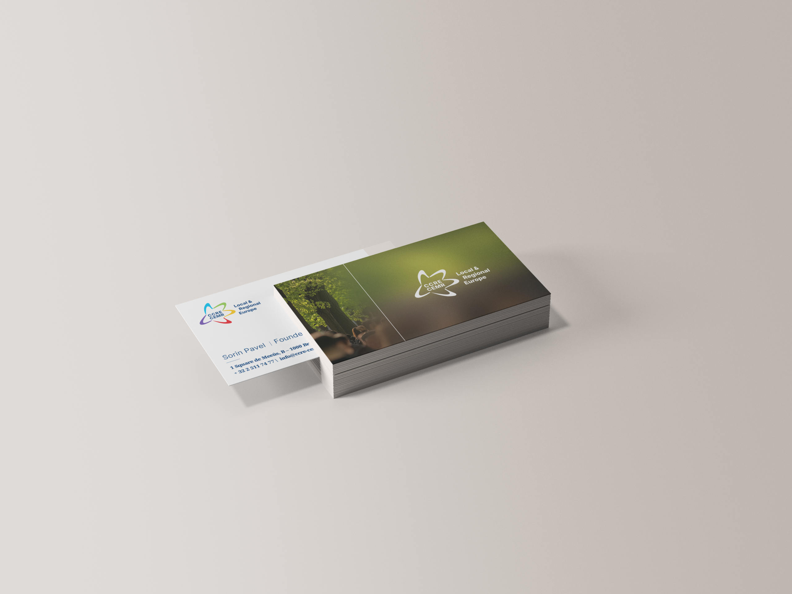
Letter/circular email formats and email signatures
-
A set of social media templates
-
Video elements and a practical video style guide
-
A basic study style guide adaptable to multiple topics
All deliverables had to be:
-
Created in Canva, ensuring day-to-day usability by non-designers
-
Delivered in English and French
-
Supported by clear, user-friendly instructions and revision cycles with the CEMR team
The Challenge
CEMR’s communications span formal policy outputs, institutional correspondence, social formats, and video—often produced by different team members under time pressure. The challenge was to create a system that:
-
Ensures instant recognisability and consistency across formats and channels
-
Is simple to use in practice, not just “nice on paper” (Canva-first requirement)
-
Works seamlessly in two languages and supports long-form publishing as well as short-form assets
-
Integrates cleanly with EU-funded communication contexts, where funding statements and disclaimer patterns must be applied consistently and correctly across materials
Our Approach
We built the toolkit around a few core design principles—then translated them into reusable components and templates.
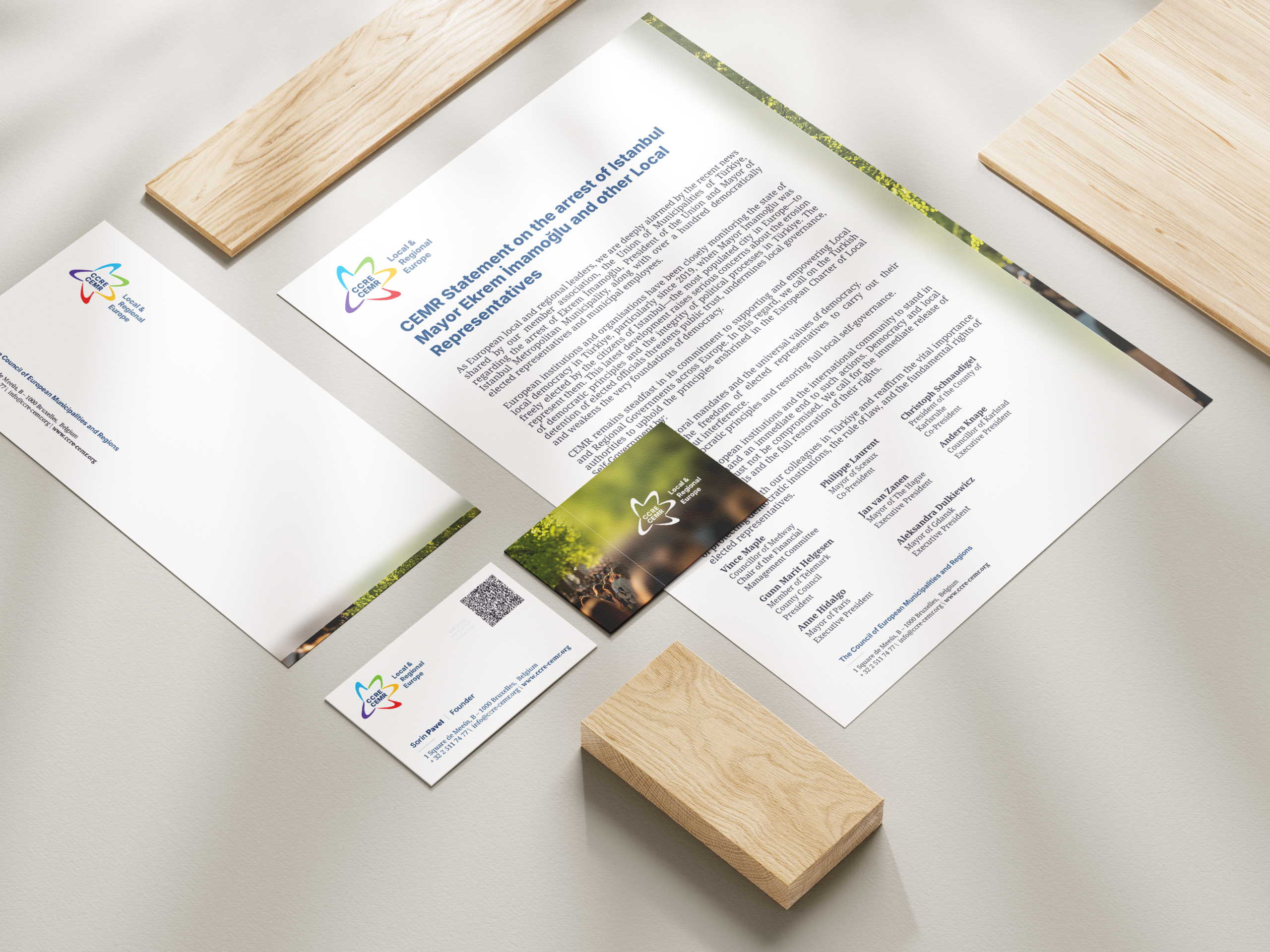
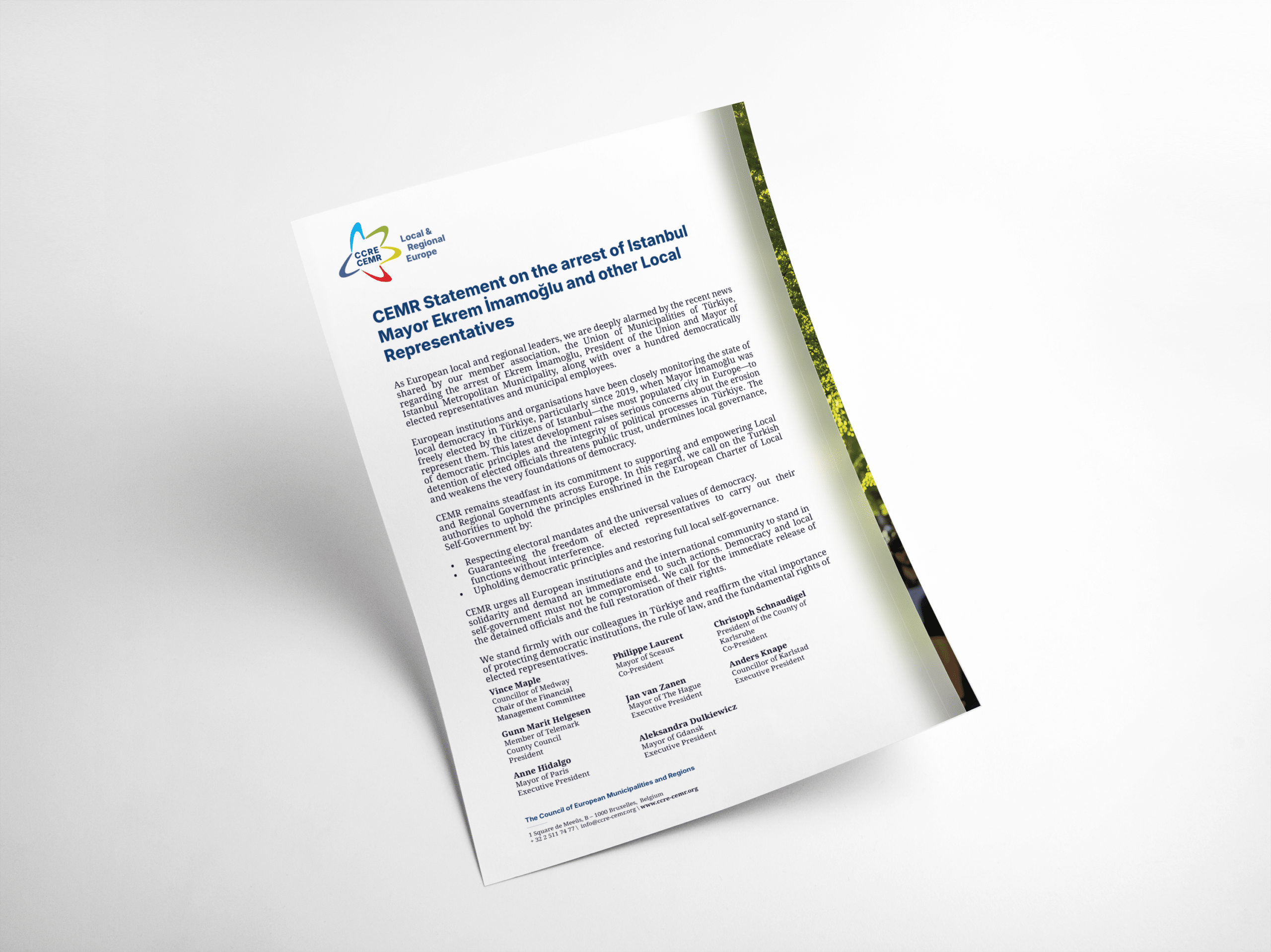
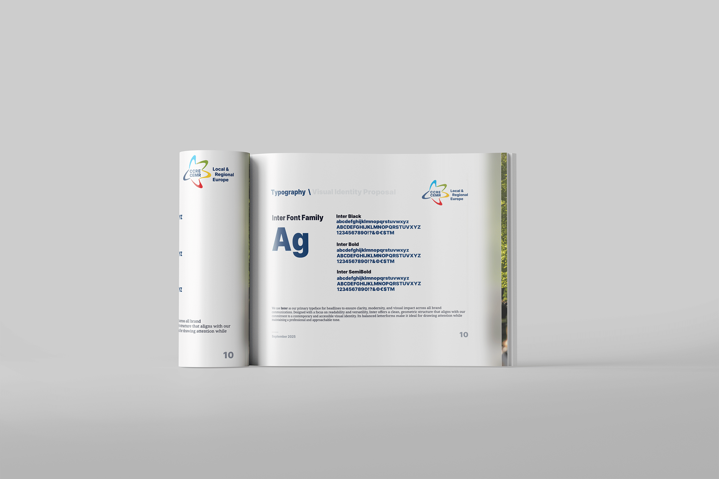
1) A recognisable editorial style, designed for readability
The visual identity combines institutional credibility with a modern editorial feel:
-
A high-contrast typographic hierarchy (bold, clear headlines with a more text-friendly body style) to support long documents and policy content.
-
Generous spacing and structured layouts to keep dense information approachable and scannable across both print-like documents and digital formats.
-
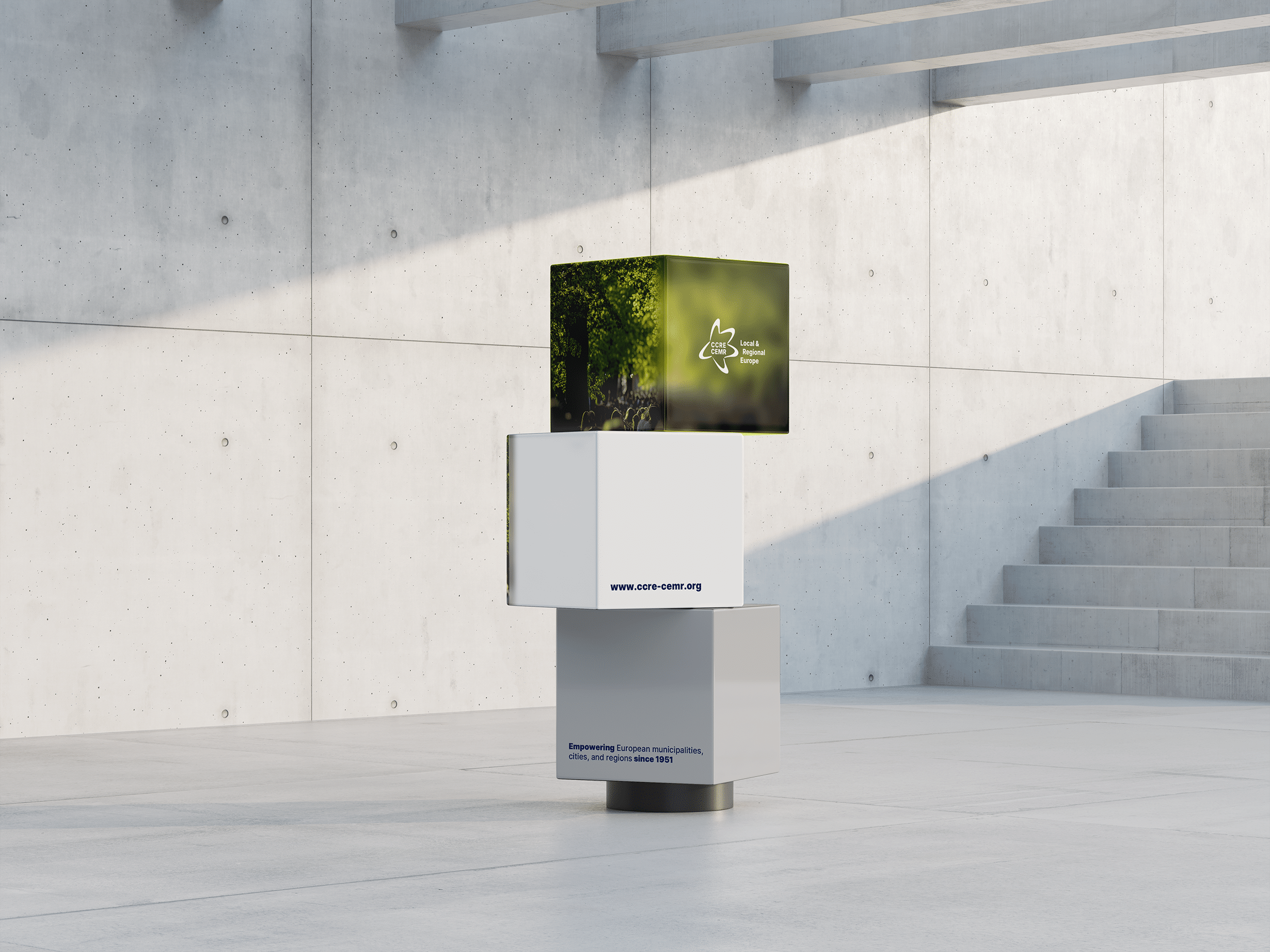
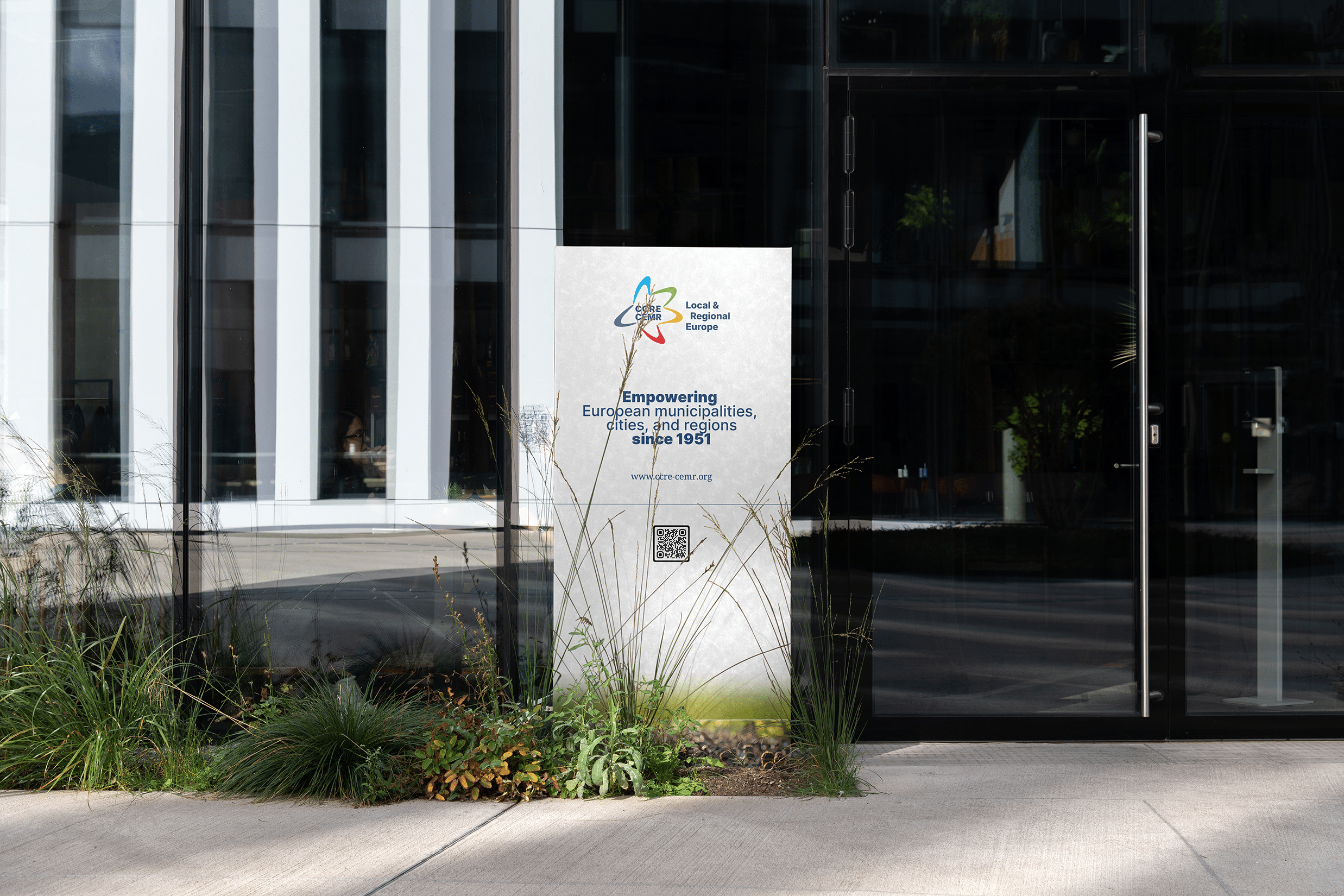
A palette built around deep, institutional tones with controlled accent colours to help categorise content and create emphasis without visual noise.
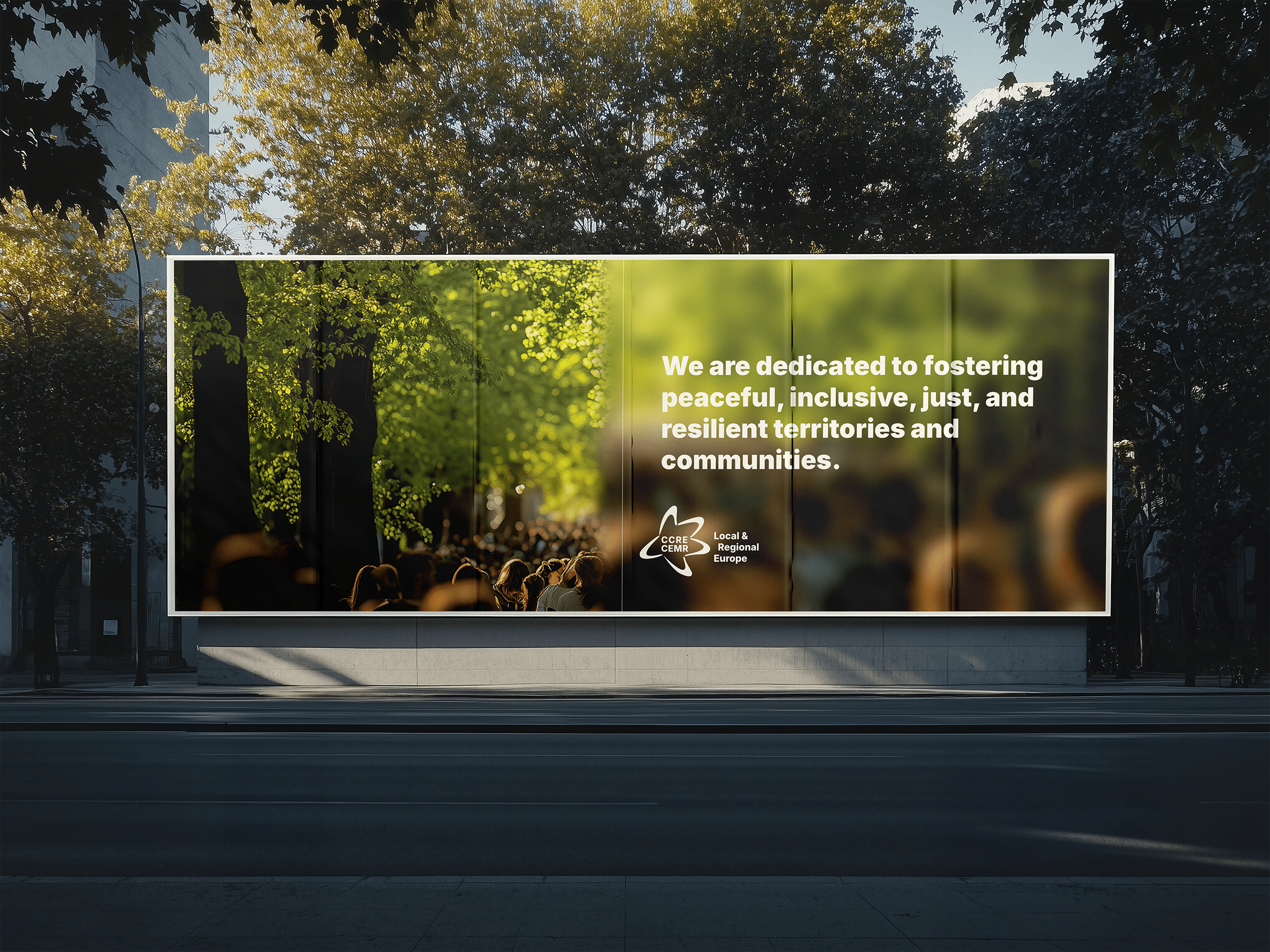
2) A signature image language for covers and dividers
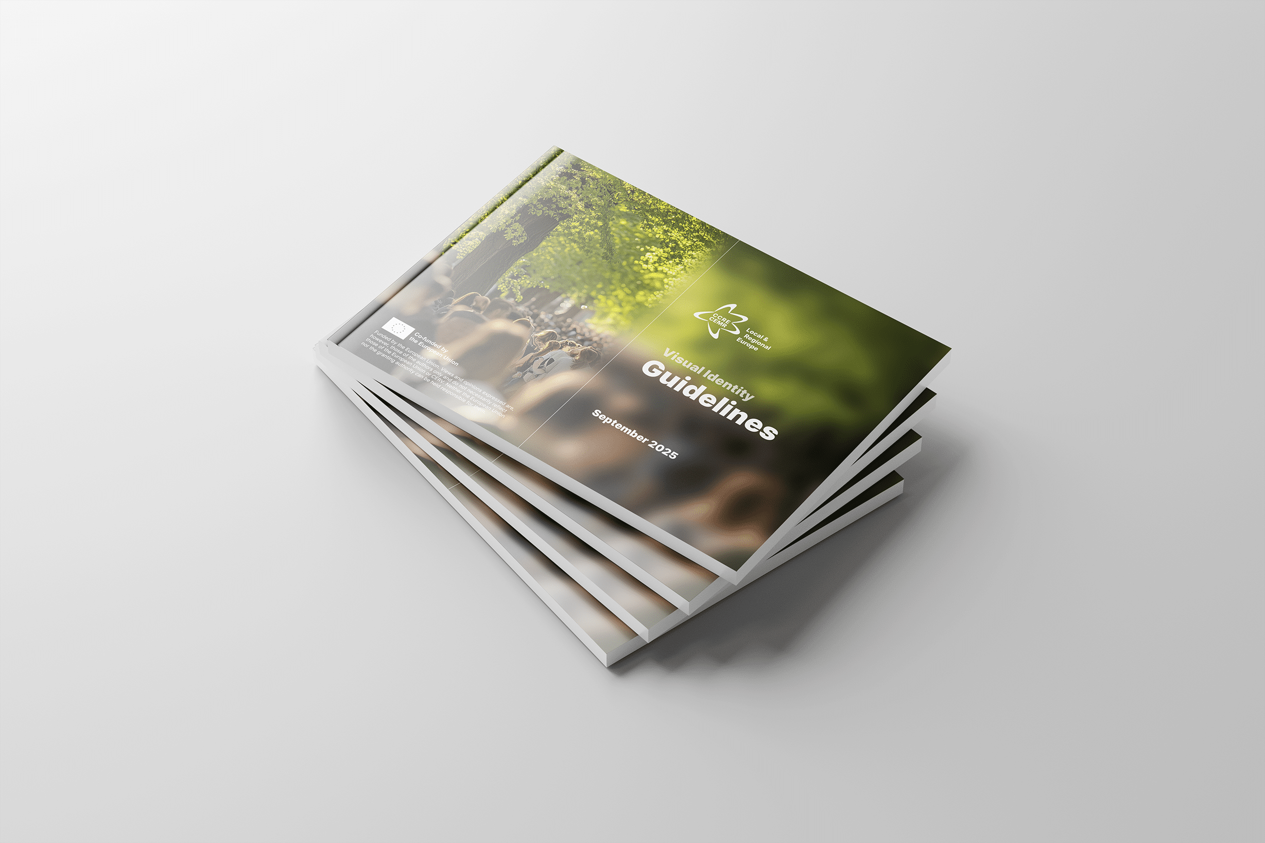
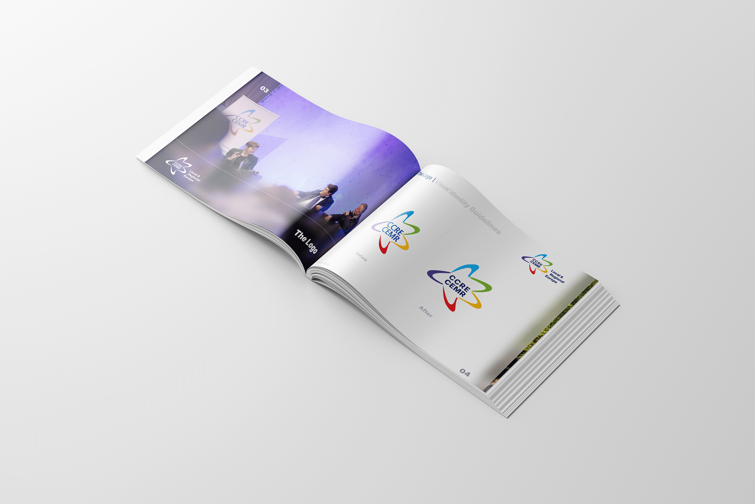
To avoid generic “institutional” visuals, we introduced a distinctive cover and divider treatment that uses photography as a narrative layer. The guidelines define a layered-image approach using a soft blur so text remains readable while the image still carries mood and meaning. This creates a consistent “CEMR look” across reports, section openers, and campaign materials.
3) Template-first design for real production workflows
Instead of one-off layouts, we delivered a modular system: reusable blocks, repeatable page structures, and predictable typography rules—so outputs are on-brand by default and easy to assemble in Canva. This reduces production time and supports consistent quality across teams.
4) Motion consistency through practical video rules
The video guidelines establish repeatable rules for:
-
Lower-thirds / name tags positioning and formatting
-
A subtle watermark treatment
-
Quote overlays and text boxes with readability support
-
End screens and thumbnails for consistent identity across channels
5) Governance and handover
Because the ToR required templates that the team could use independently, we produced not only the assets but also the practical rules and examples needed to keep work consistent over time—especially important for bilingual publishing and EU-funded communications.