Biodeck
The Client
Prodplast is one of Romania’s largest plastics producers, with industrial roots dating back to 1957. After several unsuccessful privatisation cycles, new ownership and management initiated a strategic repositioning: moving away from short-term, single-use plastics and building a future-facing portfolio aligned with sustainability. In 2017, Prodplast took an early-mover decision to create a dedicated bioplastics division—anticipating that EU regulation would soon reshape the market, including the upcoming EU Single-Use Plastics (SUP) Directive, which would later become mandatory in Romania
The Assignment
Penrose CDB was contracted to create and launch a new consumer-facing brand for Prodplast’s biodegradable, plant-based product line. The brief covered:
- Brand strategy and positioning for a new category in Romania
- Naming, tagline, and brand identity system
- Packaging design and sales materials
- Communications and marketing strategy to introduce the division and build demand in a market with limited awareness and no strong regulatory pressure at the time
The goal was to position the new brand as a credible, innovative, and sustainable alternative—ready for both consumer adoption and imminent regulatory change.
The Challenge
Arrayo’s positioning spans multiple domains with very different expectations:
One brand, multiple divisions: the identity had to speak credibly to technology-driven FinTech clients while also resonating with the precision and trust requirements of life sciences.
Avoiding “generic consulting” visuals: the client wanted to move away from typical stock imagery and predictable industry tropes, without losing clarity or professionalism.
Expressing data complexity simply: the brand needed a visual language that could convey interconnected systems, transformation, and insight—without becoming overly technical or abstract.
Our Approach
We developed Biodeck as a category-shaping brand that could educate, persuade, and scale:
Brand strategy & naming
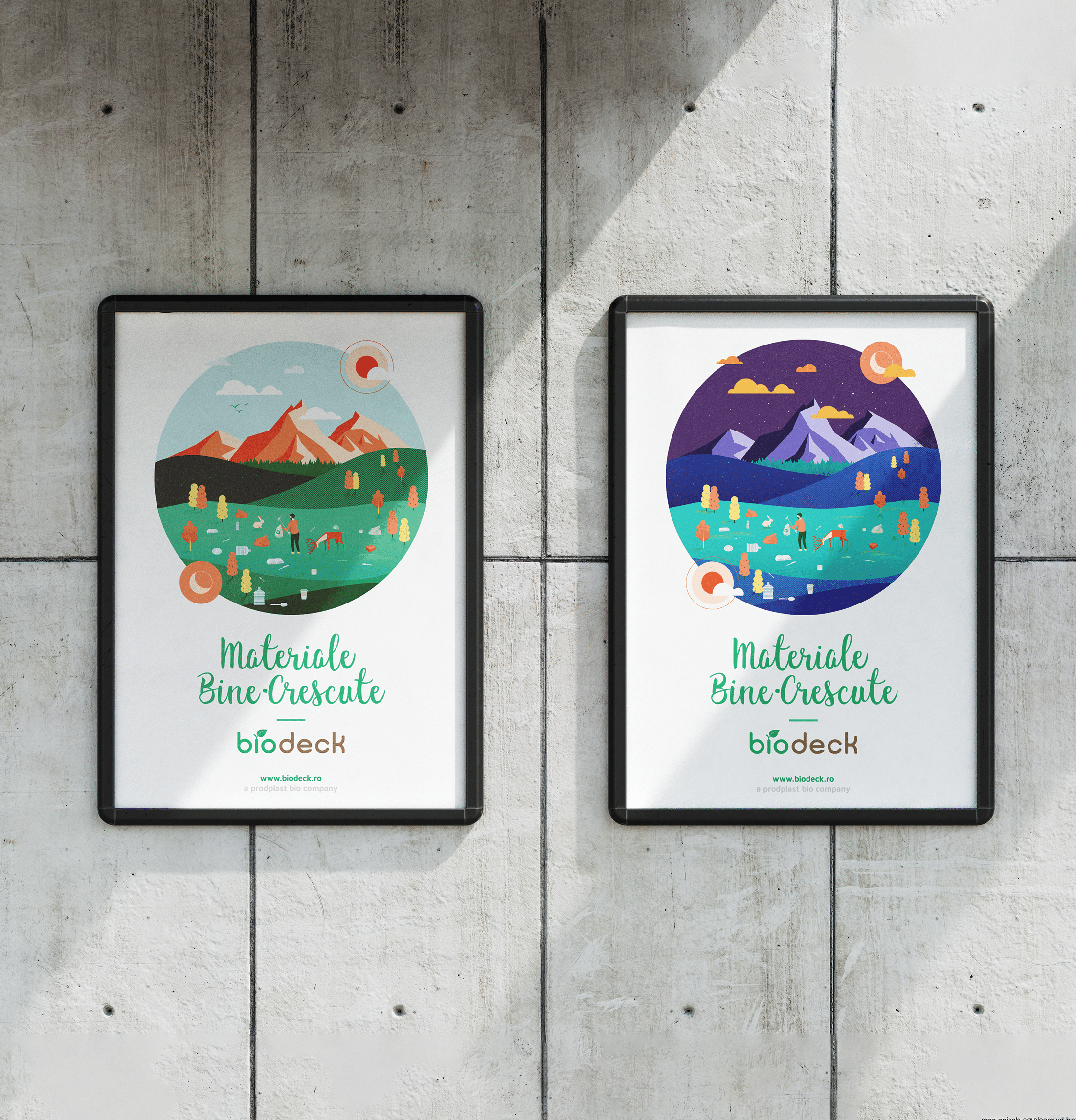
We positioned Biodeck as an accessible, modern sustainability brand—credible enough for B2B procurement and attractive for end consumers. The name “Biodeck” was chosen for memorability, clarity, and ease of pronunciation, while the tagline “Materials well raised” expressed the product’s plant-based, responsible ethos.
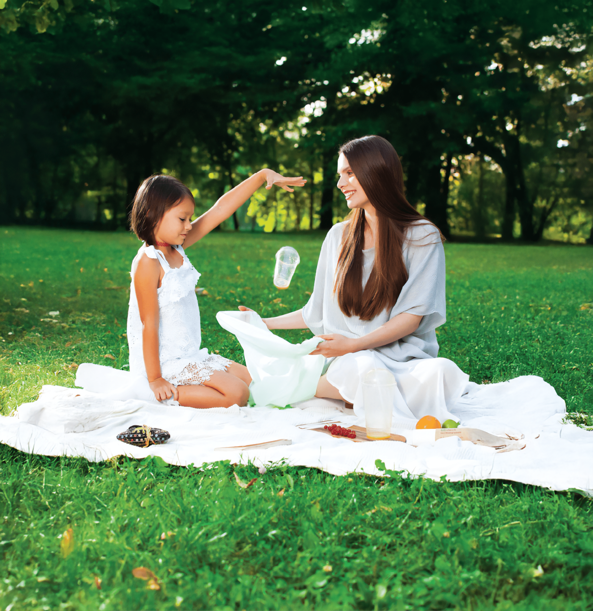
Identity, packaging & communication system
We created a vibrant, distinctive visual identity and packaging approach designed to stand out at point-of-sale while communicating eco-benefits with clarity. Sales and marketing materials reinforced consistency across channels and supported distributor adoption.
Market education
We built communications around simple, understandable narratives—helping consumers and buyers understand “why biodegradable,” “what it changes,” and “how to choose responsibly,” at a time when behaviour change was not yet regulation-driven.
Commercial Success
Biodeck achieved 65% market share of bioplastics in Romania. The bioplastics division generated €16 million turnover, representing 50.5% of Prodplast’s total income—demonstrating both the commercial viability of eco-friendly products and the value of early positioning ahead of regulatory change.