Client: Team Arrayo | Project: Brand Development & Web Design
Commenced: February 2023 | Finalized: Octombrie 2024 | Web: www.teamarrayo.com
The Client
Arrayo is a professional services firm with deep roots in financial services and life sciences, operating from Boston and New York. Arrayo’s positioning centres on helping organisations make sense of complex data—designing automated processes and integrated systems to collect, organise, transform, and visualise information to support better decision-making.
The Assignment
Arrayo engaged us to modernise their brand and digital presence while preserving the equity of their existing identity. Our brief focused on:
Retaining Arrayo’s existing logo and symbol as core legacy identifiers
Refreshing the wider visual ecosystem to better reflect innovation, confidence, and sector expertise
Creating a clear brand book that enables consistent rollout across touchpoints
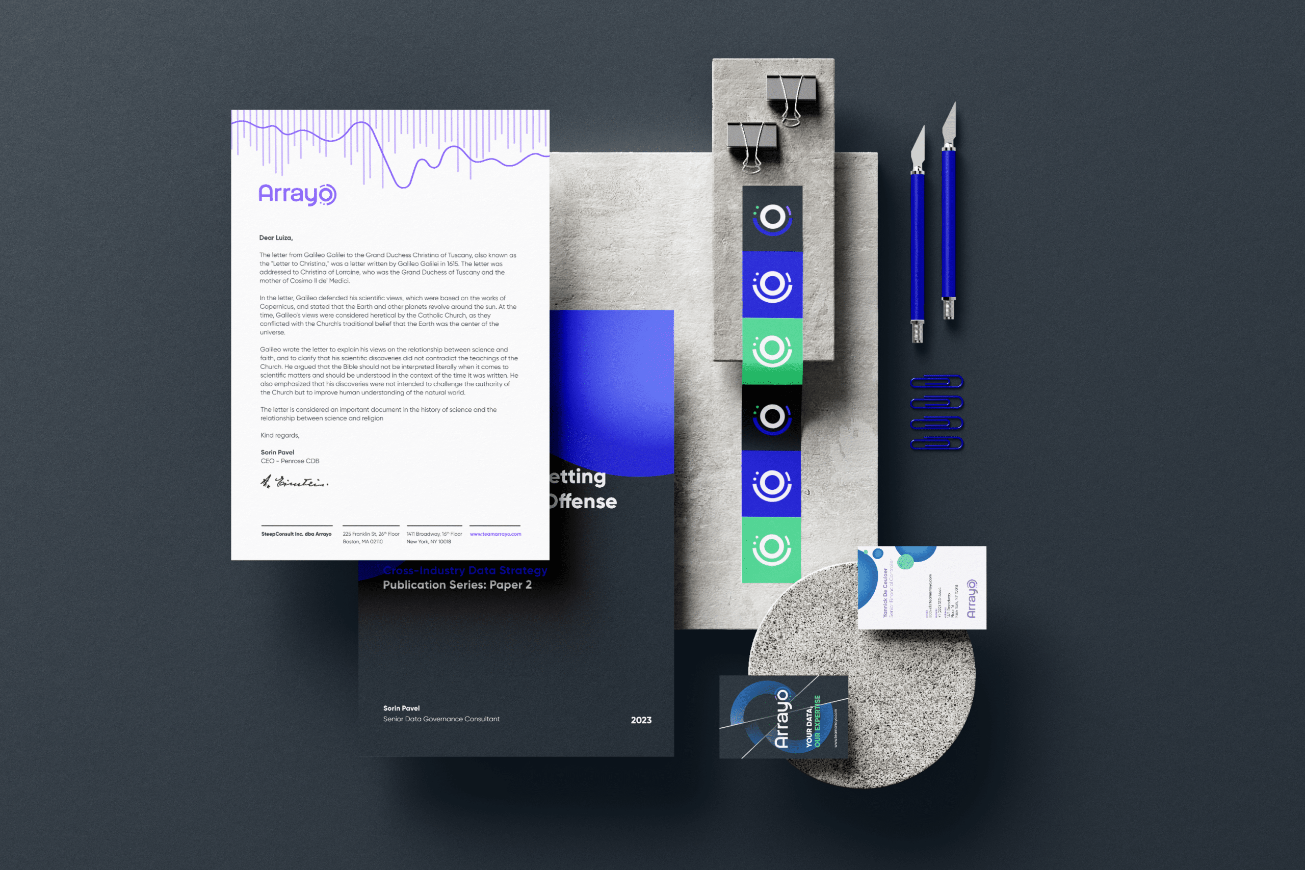
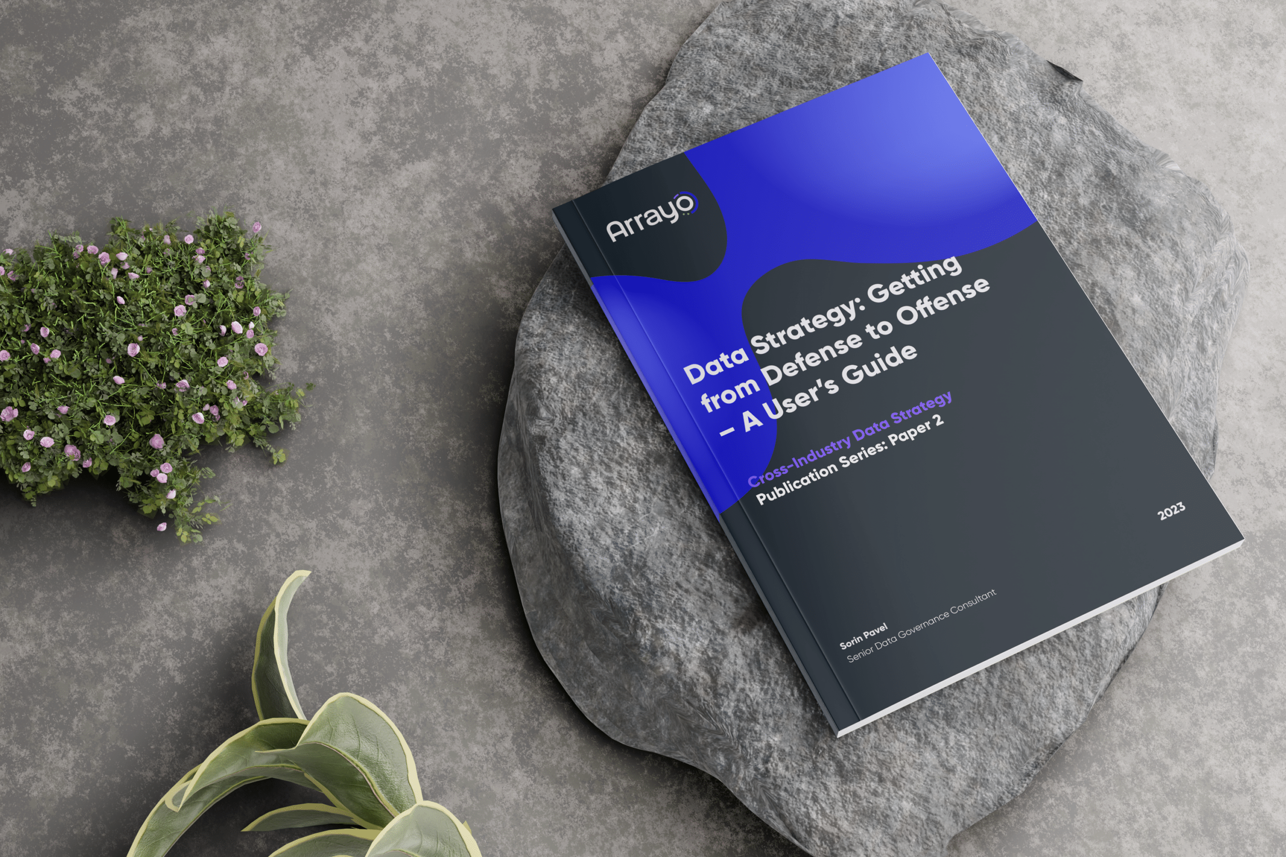
Delivering a renewed set of communications assets, including stationery, social templates, and a redesigned website, supported by motion/animation elements that help communicate the firm’s dual specialisms
This work needed to strengthen brand recognition while supporting distinct market narratives across FinTech and Life Sciences audiences.
The Challenge
Arrayo’s positioning spans multiple domains with very different expectations:
One brand, multiple divisions: the identity had to speak credibly to technology-driven FinTech clients while also resonating with the precision and trust requirements of life sciences.
Avoiding “generic consulting” visuals: the client wanted to move away from typical stock imagery and predictable industry tropes, without losing clarity or professionalism.
Expressing data complexity simply: the brand needed a visual language that could convey interconnected systems, transformation, and insight—without becoming overly technical or abstract.
Our Approach
1) Research-led brand definition
We ran interviews and focus groups with Arrayo’s staff and clients to understand how the organisation is perceived, where it differentiates, and how each division speaks to its audiences. These insights shaped the brand tone, message hierarchy, and content structure used across the website and collateral.
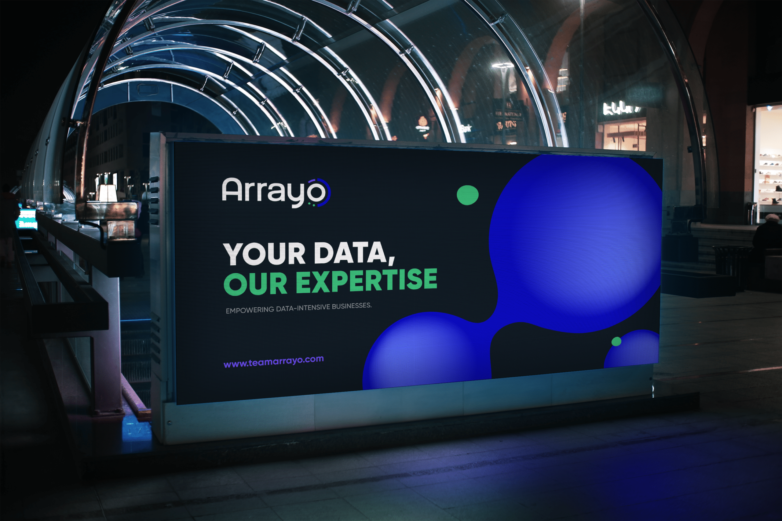
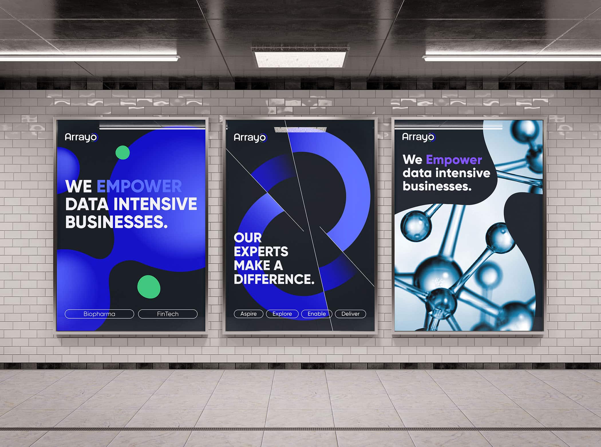
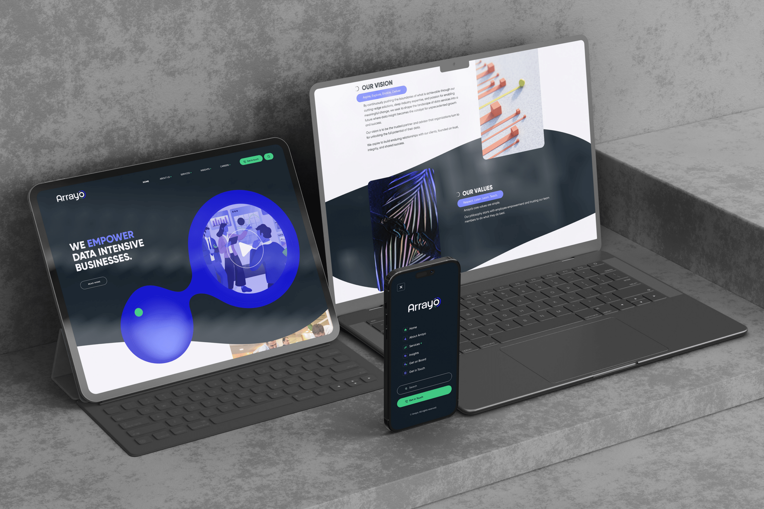
2) A bold, contemporary visual language—built around “data in motion”
We retained the core logo but rebuilt the broader identity around a confident, modern system:
A high-contrast typographic approach to project clarity and authority
A bold colour palette that feels innovative and energetic, suitable for digital-first communications
A distinctive “key visual” system designed to represent the interconnectedness and fluidity of data moving through platforms—supporting storytelling across campaigns, slides, and web pages
3) Sub-identities under one umbrella
To accommodate different audience expectations without fragmenting the brand, we created sub-identity cues within the same system—allowing each division to feel tailored while staying recognisably “Arrayo” across all channels.
4) Practical rollout across touchpoints
We translated the system into a usable toolkit: logo usage rules and safe-spacing, guidance for typography and colour, graphic style rules, people-centric photography direction, and real applications across stationery and social media—ensuring the identity works consistently in everyday production.
Outcome
The refreshed identity gave Arrayo a more distinctive presence in a competitive market, while clearly communicating their dual specialisms and strengthening brand consistency across teams. Feedback from staff and clients highlighted the new look as a dynamic, credible expression of Arrayo’s mission to empower data-intensive businesses.